Basic Tutorial
Install
- Download the plugin
- Copy/Cut the plugin and paste it to your
pluginsfolder - Start the server to let it load
- Stop the server
- Make some configs and menus
- Start the server and voila
Add a menu
- Go to the
plugins/BetterGUI/menufolder - Create a ".yml" file
- Open the created file
- Add some menu settings and buttons
- Save the file
- Reload the plugin
- Done
Add an addon
- Download the addon
- Go to the
plugins/BetterGUI/addonfolder - Copy/Cut the downloaded jar file and paste it to the folder
- Start/Restart the server
- Done
Command & Permission
| Command | Permission | Description |
|---|---|---|
bettergui | bettergui.help | Show available commands and menu commands |
addons | bettergui.addons | Get the loaded addons |
openmenu <filename.yml> [player] [args] | bettergui.openmenu | Open the specific menu (for a specific player) |
reloadmenu | bettergui.reload | Reload all menus |
reloadplugin | bettergui.reload | Reload the plugin |
getvariables | bettergui.variable | Get the registered variables |
getvariables <filename.yml> | bettergui.variable | Get the registered variables for a menu |
gettemplatebuttons | bettergui.templatebuttons | Get the registered template buttons |
| bettergui.<filename>.yml | The permission that is required to open the menu | |
| bettergui.openmenu.bypass | Allow the player to open all menus |
Config & Message
config.yml
# The default type when loading menus from the "menu" folder
default-menu-type: simple

# The default type when loading buttons from the "menu" folder
default-button-type: simple

# Enable methics
metrics: true

# Use BetterGUI's Click Type with support for number keys
use-modern-click-type: false

# Whether the plugin replaces all similar variables on every check
replace-all-variables-each-check: true

# Force the inventory to be updated every refresh time
forced-update-inventory: false

# Use the legacy button that supports the old settings
use-legacy-button: true

# Command Override
alternative-command-manager:
  # Enable the override
  enable: false
  # Ignore case-sensitive when checking commands
  case-insensitive: true
  # Should we ignore the commands in ignored-commands
  # If set to false, the plugin will do the opposite (override the commands in ignored-commands)
  should-ignore: true
  # The list of ignored commands
  ignored-commands:
  - warp test
messages.yml
prefix: '&f[&bBetterGUI&f] '
prefix: '&f[&bBetterGUI&f] '
no-permission: '&cYou don''t have permission to do this'
player-only: '&cYou should be a player to do this'
success: '&aSuccess'
menu-required: '&cYou should specify a menu'
menu-not-found: '&cThat menu does not exist'
cooldown-message: '&cWait for {cooldown_second} secs ({cooldown}) before clicking again'
have-met-requirement-placeholder: 'Yes'
invalid-item: '&cUnable to get required item. Inform the staff'
invalid-number: '&cError converting! {input} is not a valid number'
invalid-amount: '&cInvalid amount of {input}! Will be set to 1 by default'
invalid-condition: '&cInvalid condition! Please inform the staff'
player-not-found: '&cThe player is not found. Maybe he is offline or didn''t join your server'
FAQs
Q: Why does this plugin exist?
A: I used Chest Commands GUI to make menus for a long time. Some other GUI plugins (like DeluxeMenus and BossShop) are awesome, but I'm lazy to learn just to create the menu I want. I want a plugin with the same format as Chest Commands GUI and the features I need. Therefore, I created this.
Q: Why does it look like Chest Commands?
A: Before starting this plugin, I also made a fork for Chest Commands called "Chest Commands GUI - Forked". Due to some frustrating problems while working with it, I decided to shut it down and make my own. I keep the old style because it's the simplest one and many people have been using it for years.
Q: Why should I use this plugin?
A: I don't know. I'm bad at giving you a motivation to use this. There are even a lot of GUI plugins that are somehow better than this. But this plugin preserves some basic features of a GUI plugin should have (like Chest Commands, one of the famous plugin). You can use this to make some basic or animated menus. The style of the menu settings is fairly simple to learn (but the wiki may not). You can join my Discord to get support, I'm happy to help you
TL;DR: Basic features, simple style, good support
Q: Why don't you combine all features from addons into one big plugin?
A: One of the goals of this plugin is to create a plugin that can be used by any type of servers. Since I don't know which feature is commonly used, combining all features would be a waste of resources, as some functions are rarely used. So I give the users the choice of choosing which features they want.
Q: Why does X not work?
A: Join my Discord server. I'm there to help you
Q: How to use X?
A: Read the wiki
Q: Why don't you add support for other head plugins? Like HeadDatabase, EpicHeads, HeadsPlus, etc
A: I know you want to easily setup your heads in BetterGUI with their IDs instead of UUIDs, Texture URLs, or Names. However, these head plugins limit their API to just get their items from their databases instead of modifying existing heads. It's annoying to do a workaround to apply your settings to their given heads. Moreover, some head plugins are paid plugins, so I don't buy them and therefore don't have them in my account to test their functions. Finally, it just doesn't make any sense.
Q: Why don't you add a migrator from other GUI plugins? Like Chest Commands GUI, DeluxeMenus, BossShop, TrMenu, etc
A: Those plugins combine a lot of features into one plugin only. BetterGUI has a different approach, only useful features are in the main plugin, Others are in addons. I won't support all features of these plugins in BetterGUI, because I don't have any reason to create and maintain a converter from their plugins. One more thing, These plugins are not abandoned, the authors still support and update them (Maybe not in a frequent time), so why don't you use them?
Q: Why are you slow in helping us on your plugins?
A: I'm a human, you know. I have a life, and get busy with it. My plugins are free and I only do these plugins in my free-time, to fulfill my own needs. Therefore, my help support is voluntary, not mandatory, so are my Discord helpers. I may answer your questions when I have time, and I don't have a responsibility to answer your question instantly. Well, my time is important than yours, don't expect me to spend my busy time for free, but if it's in my free time, I can help you.
Q: I don't like the wiki. Don't waste my time. Make it easy to use already. I don't understand how to use it. I'll give you 1 star for this.
A: So you are not a patient person, and want to do everything fast? Well, then you will not get anything useful from this wiki, or any wiki from any big plugins. It takes time to learn something, I don't even encourage you to use this plugin. Your choice is yours. Your time is yours. But sometimes a few things in your life cannot be done fast. Even if it can, it may be done poorly, so I want to avoid it and do slowly and steadily. If you are finding a plugin that is easy or fast to create your dream menus, or has an in-game editor, this is not the place, choose another one. But if you choose this plugin, spend some time reading the full wiki, as you may miss features that are useful. Don't be this meme
Q: Can you add X to your plugin?
A: Before requesting, you should check if your request already exists on the Addon Downloader. If it does not exist, you can either join my Discord server or create an issue.
Menu
Description
- Menus are what BetterGUI is for. It's the thing displayed to the player.
- There are many built-in types of Menu. A developer can also make his own menu and register to the plugin.
- Generally, a menu contains 2 sections:
menu-settingsandButton - You can set the type of menu by setting the
menu-typevalue in themenu-settingssection
Example
menu-settings:
  name: '&c&lExample Menu'
  rows: 6
  command: menu
  auto-refresh: 5
  open-action:
    - 'tell: &eYou opened the example menu'
  close-action:
    - 'tell: &cYou closed the example menu'

# Buttons
spawn-cmd:
  COMMAND: 'spawn'
  NAME: '&u/spawn'
  LORE:
    - 'It just executes /spawn'
    - 'as the player who clicked.'
  ID: ender_pearl
  POSITION-X: 1
  POSITION-Y: 2
Built-ins
Simple Menu
Format
menu-settings:
  menu-type: simple # You don't need to set this type. It's the default value

  # The actions when the player opens the menu
  open-action:
  - action
  - action
  - action
  ...

  # The actions when the player closes the menu
  close-action:
  - action
  - action
  - action
  ...

  # The type of the display inventory
  # https://hub.spigotmc.org/javadocs/spigot/org/bukkit/event/inventory/InventoryType.html
  inventory-type: <inventory-type>
  #inventory: <inventory-type>

  # The rows <1-6> of the inventory if the type is CHEST
  rows: <1-6>

  # How frequently the menu will refresh itself
  auto-refresh: <ticks>
  #ticks: <ticks>

  # The requirement before the player can open the menu
  view-requirement:
    <requirement-set>
    <requirement-set>
    <requirement-set>
    ...

  # The requirement before the player can close the menu
  close-requirement:
    <requirement-set>
    <requirement-set>
    <requirement-set>
    ...

  # The permission required to open the menu
  permission: bettergui.test

  # The command to open the menu
  command:
  - command1
  - command2
  ...

  # The title of the inventory
  title: <name>
  #name: <name>

  # Save the display to the cache for later use
  # This option is mainly used to fix a "self-open" issue when the player open the same menu
  cached: <true/false>

  # The creator to create the inventory. Mainly used to create custom inventories provided by addons.
  creator: default

  # The list of argument processors to process the arguments of the command to open the menu
  argument-processor:
  - <argument-processor>
  - <argument-processor>

# This is a special button. It will fill all empty slots of the inventory (You don't need to set this button)
default-button:
  <button-settings>

button1:
  <button-settings>
button2:
  <button-settings>
...
Description
This is the default menu type of BetterGUI, represents a chest-like GUI.
Note
- None of the
menu-settingsis required to get the menu working. - The
open-actionandclose-actionuse the Action value. - The
view-requirementandclose-requirementuse the Requirement Set value. - The
argument-processoruse the Argument Processor value.
Example
menu-settings:
  name: '&c&lExample Menu'
  rows: 6
  command: menu
  auto-refresh: 5
  open-action:
    - 'tell: &eYou opened the example menu'
  close-action:
    - 'tell: &cYou closed the example menu'

default-icon:
  type: animated
  child:
    frame1:
      id:
        - RED_STAINED_GLASS_PANE
        - STAINED_GLASS_PANE:14
    frame2:
      id:
        - GREEN_STAINED_GLASS_PANE
        - STAINED_GLASS_PANE:13
    frame3:
      id:
        - BLUE_STAINED_GLASS_PANE
        - STAINED_GLASS_PANE:11

# Buttons
spawn-cmd:
  COMMAND: 'spawn'
  NAME: '&u/spawn'
  LORE:
    - 'It just executes /spawn'
    - 'as the player who clicked.'
  ID: ender_pearl
  POSITION-X: 1
  POSITION-Y: 2

durability-armor:
  NAME: '&aDamaged armor'
  LORE:
    - 'This armor is damaged.'
  ID: diamond helmet
  DAMAGE: 100
  POSITION-X: 2
  POSITION-Y: 2
Args Menu
Deprecated: This menu type is deprecated. Use Simple Menu with Store Argument Processor instead
Format
menu-settings:
  menu-type: args
  min-args: <number>
  args:
  - arg1
  - arg2
  - arg3
  ...
  min-args-action:
  - action
  - action
  - action
  ...
  default-args: "string with space"
  <other-settings>

button1:
  <button-settings>
button2:
  <button-settings>
...
Description
- Args Menu is the same as Simple Menu, with 4 more sections in the
menu-settingsmin-argssets the minimum amount of arguments in the command to open the menuargssets the argumentsmin-args-actionsets the Action when the number of arguments is lower thanmin-argsdefault-argssets the default arguments
Note
- When using this menu, the menu will create some Variables:
{merged_args}returns the completed arguments that the player typed to open the menu{arg_<arg>}returns the value of the argument at the<arg>position from the menu
Example
menu-settings:
  menu-type: args

  # The minimum number of arguments is 2
  min-args: 2

  # Register 2 arguments and create 2 variables: {arg_test} and {arg_otest}
  args:
  - test
  - otest

  # Set the default arguments of "test" and "otest" to "hello" and "world"
  default-args: "hello world"

  # The action when failed to meet the min-args
  min-args-action: "tell: &cAt least 2 arguments"
  ...

# The button
button:
  id: stone
  name: "&bTest Arguments"
  lore:
  - "Arg 1: {arg_test}"
  - "Arg 2: {arg_otest}"
  - "Merged Args: {merged_args}"
Addon Downloader
Format
menu-settings:
  menu-type: addon

  # The name of the menu
  name: '&c&lAddon Downloader'

  # The rows of the menu
  rows: 3

  # The command to open the menu
  command:
    - addondownloader
    - addondl

  # The period in ticks to refresh the menu
  auto-refresh: 5

# The button for each addon
button:
  material:
    - LIGHT_BLUE_STAINED_GLASS_PANE
    - STAINED_GLASS_PANE:3
  name: "&f{name} &c- &4{status}"
  lore:
    - "&f{description}"
    - "&fAuthors: &e{author}"
    - "&fVersion: &e{version}"
    - ""
    - "&bLeft click &fto download"
    - "&bRight click &fto get the source code"
    - "&bMiddle click &fto see the wiki"
Description
- This is a special menu that displays the available addons of BetterGUI.
- You can view the addons and read their wiki
- You can also download addons and they'll be installed automatically (Requires restarting the server after downloading to enable the addons)
Slot
Before talking about Button, let's talk about Slot first.
Slot is a coordinate which is used to determine where the item will be placed in the menu. In BetterGUI, there are 2 ways to specify a slot:
position-xandposition-yslot
position-x and position-y
If you are comfortable with the grid layout, you can set the slot by specifying the X and Y coordinates.
Here are all coordinates in a 9x6 grid:
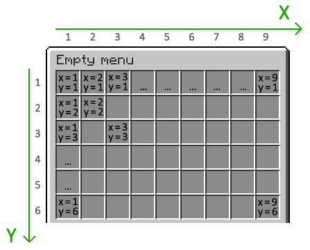
Example:
position-x: 1
position-y: 1
slot
This is the easiest way to specify a slot. You can use the slot number directly.
Here are all slots in a 9x6 grid:
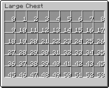
Example:
slot: 0
Multiple Slots
You can also specify multiple slots for an item. This is useful if you want to create a button that takes up more than one slot.
slot: 0, 1, 2, 3, 4, 5, 6, 7, 8
If you want to specify a range of slots, you can use the range format (<first>-<last>).
slot: 0-8
If you want to go crazy and specify both a range and a list of slots, you can do that too.
slot: 0-8, 9, 17, 18-26
Button
Description
- A button is what is shown in the menu.
- When the player clicks a button, some actions are executed.
- A button can also be updated.
- There are many built-in types of button. A developer can make his own button and register to the plugin.
- You can specify the type of button by setting the
typeoption. By default, it will take the value ofdefault-button-typefromconfig.yml
Example
simple-button: #
  slot: 1
  id: cobblestone
  name: "&bThis is a simple button"
  lore:
  - ""
  - "&fThis is a lore"
  action: "tell: &eYou clicked"
  close-on-click: true

animated-icon:
  slot: 2
  type: animated
  update: 5
  async: false
  child:
    frame_icon1:
      name: "&cFrame 1"
      id: red_wool
      lore:
        - "This is part of an animated icon"
    frame_icon2:
      name: "&aFrame 2"
      id: green_wool
      lore:
        - "This is part of an animated icon"
    frame_icon3:
      name: "&bFrame 3"
      id: light_blue_wool
      lore:
        - "This is part of an animated icon"
Built-ins
- Empty Button
- Dummy Button
- Air Button
- Null Button
- Simple Button
- Animated Button
- Predicate Button
- List Button
- Template Button
Empty Button
Format
button-name:
  type: empty
Description
This is the simplest and useless button. This represents nothing.
Dummy Button
Format
button-name:
  type: dummy # aliases: raw
  modifier1: <value1>
  modifier2: <value2>
  modifier3: <value3>
  ...
Description
This is a decorative button. You can only set the display item of the button through Item Modifiers
Example
dummy-button:
  type: dummy
  id: STONE
  name: "&eThis is a dummy button"
Air Button
Format
button-name:
  type: air
  # command:
  action:
  - <action>
  - <action>
  - <action>
  ...
  close-on-click: <true/false>
Description
- This button represents the Air item, which the player can't see.
- You can only set two settings:
action(command) andclose-on-click
Example
air-button:
  type: air
  command:
  - "tell: &aOh..."
  - "delay: 30"
  - "tell: &aUhhhh... Hello"
  close-on-click: true
Null Button
Format
button-name:
  type: null
  # command:
  action:
  - <action>
  - <action>
  - <action>
  ...
  close-on-click: <true/false>
Description
- This is similar to Air Button, but this button represents nothing.
- The difference is that, while Air Button overrides the display item and the actions of a slot, this button only overrides the actions of a slot.
Example
null-button:
  type: null
  command:
  - "tell: &aOh..."
  - "delay: 30"
  - "tell: &aUhhhh... Hello"
  close-on-click: true
Simple Button
Format
button-name:
  type: simple # You don't need to set this value. It's the default value
  modifier1: <value1>
  modifier2: <value2>
  modifier3: <value3>
  ...
  # command:
  action:
  - <action>
  - <action>
  - <action>
  ...
  close-on-click: <true/false>
Description
- This is a combination of Dummy Button and Air Button
- You can set the display item through Item Modifiers, and also set the 2 settings:
action(command) andclose-on-click
Example
simple-button:
  id: cobblestone
  name: "&bThis is a simple button"
  lore:
  - ""
  - "&fThis is a lore"
  action: "tell: &eYou clicked"
  close-on-click: true
Animated Button
Format
button-name:
  type: animated # aliases: animate, anim
  update: <ticks>
  async: <true/false>
  shift: <number>
  reverse: <true/false>
  child:
    button1:
      <button-settings>
    button2:
      <button-settings>
    button3:
      <button-settings>
    ...
Description
- This is a dynamic button.
- This will iterate through all the
childbuttons on everyupdateticks - You can set the
asyncvalue to make theupdatetask asynchronously - You can set the
shiftvalue to determine the start frame of the button- If you set a positive value (call
n), then-th frame will be the start frame - If you set a negative value (call
n), then-th frame from the bottom will be the start frame
- If you set a positive value (call
- You can set the
reversevalue to flip the child frames, so the frames will go bottom-up
Example
animated-icon:
  type: animated
  update: 5
  async: false
  child:
    frame_icon1:
      name: "&cFrame 1"
      id: red_wool
      lore:
        - "This is part of an animated icon"
    frame_icon2:
      name: "&aFrame 2"
      id: green_wool
      lore:
        - "This is part of an animated icon"
    frame_icon3:
      name: "&bFrame 3"
      id: light_blue_wool
      lore:
        - "This is part of an animated icon"
Predicate Button
Format
button-name:
  type: predicate # aliases: requirement
  button:
    <button-settings>
  fallback:
    <button-settings>
  view-requirement:
    <requirement-set>
    <requirement-set>
    <requirement-set>
    ...
  check-only-on-creation: <true/false>
  click-requirement:
    left:
      <requirement-set>
      <requirement-set>
      <requirement-set>
      ...
    right:
      <requirement-set>
      <requirement-set>
      <requirement-set>
      ...
    middle:
      <requirement-set>
      <requirement-set>
      <requirement-set>
      ...
    ...
    default:
      <requirement-set>
      <requirement-set>
      <requirement-set>
      ...
Description
- This button will show the
buttonif only the player meets theview-requirement, Otherwise thefallbackbutton will be shown. - You can set the
click-requirementvalue if you want the plugin to check requirements when the player clicks the button. - You can set the
check-only-on-creationvalue to make the button only checkview-requirementwhen the player opens the menu.
Example
permission:
  SLOT: 1
  type: predicate
  CLICK-REQUIREMENT:
    default:
      permission:
        PERMISSION: bettergui.test
        fail-command: 'tell: &cYou don''t have the correct permission!'
  button:
    COMMAND: 'tell: &a[v] You have the correct permission!'
    NAME: '&8Permission test'
    LORE:
      - 'To use this item, you need the'
      - 'permission "bettergui.test".'
      - 'Otherwise, a configurable error'
      - 'message will be displayed.'
    ID: iron bars
level-view-requirement:
  type: predicate
  slot: 2
  button:
    id: exp_bottle
    name: "&cA exp bottle"
    lore:
      - "You will see this icon when the level is higher than 5"
  fallback:
    id: stone
    name: "&cA stone"
    lore:
      - "You will see this icon when the level is lower than 5"
  view-requirement:
    level:
      level: 5
List Button
Format
button-name:
  type: list
  keep-current-index: <true/false>
  child:
    button1:
      <button-settings>
    button2:
      <button-settings>
    button3:
      <button-settings>
    ...
Description
- This button will look through all the
childbuttons (top-down) and display a button if it can be shown - You can set the
keep-current-indexvalue to make this button only check when the player opens the menu
Example
list-icon:
  type: list
  keep-current-index: false
  child:
    level_5:
      type: predicate
      button:
        id: grass
        name: "&aYou are in Level 5"
      view-requirement:
        level:
          level: 5
    level_3:
      type: predicate
      button:
        id: netherrack
        name: "&cYou are in Level 3"
      view-requirement:
        level:
          level: 3
    low_level:
      id: bedrock
      name: "&cYou are low level"
Template Button
Format
button-name:
  type: template
  template: <name> # The name from template folder
  variable:
    <variable1>: <value1>
    <variable2>: <value2>
    ...
  <button-settings>
Description
- This button reduces the time you make the same button for every slots by setting it in a single template button in the
templatefolder- The
templatefolder is basically a folder containingymlfiles defining common buttons to use in all menus - You can get the registered template buttons by using the command
gettemplatebuttons
- The
- You can use the
variableoption and set the variables for the template button. That will help you to create many buttons with different attributes from one single template button.
Example
Using Template Button
- Normal Case
# Not using template
button1:
  id: stone
  name: "&cThis is button"
  lore:
  - "This is a line"
  - "This is a 2 line"
  - "This is a 3 line"
  - "This is a 4 line"
  command: "tell: &cYou clicked"

button2:
  id: stone
  name: "&cThis is button"
  lore:
  - "This is a line"
  - "This is a 2 line"
  - "This is a 3 line"
  - "This is a 4 line"
  command: "tell: &cYou clicked this again"
- Using Template Button
# Using template
button1:
  type: template
  template: test # The name from template folder
  command: "tell: &cYou clicked"
button2:
  type: template
  template: test # The name from template folder
  command: "tell: &cYou clicked this again"

# Template File
test:
  id: stone
  name: "&cThis is button"
  lore:
  - "This is a line"
  - "This is a 2 line"
  - "This is a 3 line"
  - "This is a 4 line"
Use variable option
# This will create 4 buttons with different XP amount. These buttons give XP to the player
test-xp-100:
  type: template
  template: test-xp
  variable:
    xp: 100

test-xp-200:
  type: template
  slot: 12
  template: test-xp
  variable:
    xp: 200

test-xp-300:
  type: template
  template: test-xp
  variable:
    xp: 300

test-xp-400:
  type: template
  template: test-xp
  variable:
    xp: 400

# Template File
test-xp:
  id: paper
  name: "&eGive &f{xp} XP"
  lore:
  - ""
  - "&fThis is a test template button"
  command: "console: xp {xp} {player}"

# Notice that the template button has {xp} in it. It will be replaced with the value from the variables of the button using this template button
Action
Description
- Actions are used when you want to execute something on certain events (broadcast everyone when the player clicked the button, etc).
- There are many built-in types of actions. There will be listed in the sections below. A developer can also create his own action and register to this plugin.
Example
hello:
  COMMAND: # Here are the actions
  - 'tell: &eHello There'
  - 'delay: 60'
  - 'tell: &eHello Again'
  NAME: '&u&lHello Button'
  ID: stone
  POSITION-X: 1
  POSITION-Y: 1
Built-ins
- Back Menu
- Close Menu
- Open Menu
- Update Menu
- Console Executor
- Player Executor
- OP Executor
- Permission Executor
- Broadcast Message
- Tell Message
- Play Sound
- Delay
Back Menu
Format
back-menubackmenu
Description
This action will send the player to his previous menu, or close the current menu if there is no previous menu
Close Menu
Format
close-menuclosemenu
Description
This action will close the current menu
Open Menu
Format
open-menu: <menu_name>open: <menu_name>menu: <menu_name>
Description
This action will open the menu named <menu_name>
Example
open-menu: test.ymlopen: test.ymlmenu: test.yml
Update Menu
Format
update-menuupdatemenu
Description
This action will execute the update task of the current menu
Console Executor
Format
console: <command>
Description
This action will execute the command <command> as the console (terminal)
Example
console: say Hello {player}!
Player Executor
Format
<command>player: <command>
Description
This action will execute the command <command> as a player
Example
spawnplayer: warp pvpplayer: me Hello World!
Note
This is the default type of all actions, so you can specific the action without the prefix player:
OP Executor
Format
op: <command>
Description
This action will execute the command <command> as an operator (/op)
Example
op: stop
Note
- This action will give the player OP
/op, execute the<command>and then de-op the player - Since it uses
/op, this action is considered "dangerous". A hacker can use a Crasher to exploit the action
Permission Executor
Format
permission: <permission> <command>permission: <permission_1>;<permission_2>;<permission_3> <command>
Description
This action will give the <permission> to the player, execute the <command> and then retrieve the <permission>
Example
permission: essentials.fly flypermission: essentials.gamemode;essentials.gamemode.creative gamemode 1
Note
This is a safe way to execute the commands that require a specific permission, without touching the /op command
Broadcast Message
Format
broadcast: <message>
Description
This action will send the <message> to every online players
Example
broadcast: Hello
Tell Message
Format
tell: <message>
Description
This action will send the <message> to the player
Example
tell: You there?
Play Sound
Format
sound: <sound>, [volume], [pitch]sound: <sound> [volume] [pitch]raw-sound: <sound>, [volume], [pitch]raw-sound: <sound> [volume] [pitch]
Description
- This action will send the
<sound>to the player - You can specify the
[volume]and the[pitch]of the<sound>. Those are optional
Example
sound: BLOCK_NOTE_BLOCK_PLINGsound: BLOCK_NOTE_BLOCK_PLING 1 2
Note
<sound>supports Minecraft's sound name, so it also supports custom sounds from Resource Pack. If the<sound>can not be found, the action is simply ignored
Delay
Format
delay: <ticks>
Description
This action will delay the action flow in <ticks> ticks (20 ticks = 1 second)
Example
delay: 20delay: 100
Requirement Set
Description
- A requirement set is a set of requirements that the player are required to pass.
- It consists of:
- The Requirements
- The
success-commandwhen the player passes all requirements - The
fail-commandwhen the player doesn't pass any of the requirements (rarely used)
Example
check-condition:
  slot: 1
  type: predicate
  CLICK-REQUIREMENT: # Click Requirement
    default: # Click type
      permission: # Requirement set name
        permission: # The permission requirement
        - bettergui.test
        - bettergui.test.1
        level: 10 # The level requirement
        fail-command: 'tell: &cYou don''t meet the requirements!'
        success-command: 'tell: &a[v] You passed the requirements!'
  button:
    NAME: '&8Requirement Test'
    LORE:
      - 'To use this item, you need to pass all requirements.'
      - 'Otherwise, a configurable error'
      - 'message will be displayed.'
    ID: iron bars
Requirement
Description
- Requirement is one of the interesting parts of the plugin.
- It is used when you want to check if the player meets some sort of requirements before doing anything (Check the level before opening the menu, etc).
- There are many built-in types of requirements, which will be listed below. A developer can also make his own requirement type and register it to the plugin.
Example
permission-list:
  slot: 1
  type: predicate
  CLICK-REQUIREMENT: # Click Requirement
    default: # Click type
      permission: # Requirement set name
        PERMISSION: # Here we are
        - bettergui.test
        - bettergui.test.1
        fail-command: 'tell: &cYou don''t have the correct permission!'
  button:
    COMMAND: 'tell: &a[v] You have the correct permission!'
    NAME: '&8Permission test'
    LORE:
      - 'To use this item, you need the'
      - 'required permissions.'
      - 'Otherwise, a configurable error'
      - 'message will be displayed.'
    ID: iron bars
Built-ins
Cooldown Requirement
Format
cooldown: <seconds>
Description
This requirement will check if the player is not in a cooldown timer (seconds). After checking successfully, the cooldown timer will start for the player.
Example
cooldown:
  slot: 1
  type: predicate
  button:
    COMMAND: 'tell: &e You will need to wait 10 seconds to click again'
    NAME: '&aCooldown'
    LORE:
      - 'This is a example of icon with cooldown'
    ID: paper
  click-requirement: # Click Requirement
    default: # Click type
      test-cooldown: # Requirement Set name
        cooldown: 10 # Here we are
      fail-command:
        - "tell: &cWait until the cooldown is finished"
Level Requirement
Format
level: <level>
level:
  value: <level>
  take: <true/false>
Description
- This requirement will check if the level of the player is higher or equal to the
<level> - You can specify the
takevalue (trueorfalse) to allow/disallow the plugin to take the level of the player alter checking successfully
Example
test-view-requirement:
  type: predicate
  slot: 1
  button:
    id: exp_bottle
    name: "&cA exp bottle"
    lore:
      - "You will see this icon when the level is higher than 5"
  view-requirement: # View Requirement
    level: # Requirement Set name
      level: 5 # Here we are
test-click-requirement:
  type: predicate
  slot: 1
  button:
    id: exp_bottle
    name: "&cA level checker"
    command: "tell: &aYou reached level 5"
  click-requirement: # Click Requirement
    default: # Click type
      test-level: # Requirement Set name
        level: # Here we are
          value: 5
          take: true # Take the level
      fail-command:
        - "tell: &cTrain more"
Permission Requirement
Format
permission: <permission>
permission:
- <permission>
- <permission>
- <permission>
...
Description
This requirement will check if the player has the <permission>
Example
permission:
  slot: 1
  type: predicate
  CLICK-REQUIREMENT: # Click Requirement
    default: # Click type
      permission: # Requirement set name
        PERMISSION: bettergui.test # Here we are
        fail-command: 'tell: &cYou don''t have the correct permission!'
  button:
    COMMAND: 'tell: &a[v] You have the correct permission!'
    NAME: '&8Permission test'
    LORE:
      - 'To use this item, you need the'
      - 'permission "bettergui.test".'
      - 'Otherwise, a configurable error'
      - 'message will be displayed.'
    ID: iron bars
permission-list:
  slot: 2
  type: predicate
  CLICK-REQUIREMENT: # Click Requirement
    default: # Click type
      permission: # Requirement set name
        PERMISSION: # Here we are
        - bettergui.test
        - bettergui.test.1
        fail-command: 'tell: &cYou don''t have the correct permission!'
  button:
    COMMAND: 'tell: &a[v] You have the correct permission!'
    NAME: '&8Permission test'
    LORE:
      - 'To use this item, you need the'
      - 'required permissions.'
      - 'Otherwise, a configurable error'
      - 'message will be displayed.'
    ID: iron bars
Note
- You can add
-before<permission>to indicate that the plugin should check if the player doesn't have the<permission>
Condition Requirement
Format
condition: <condition>
Description
This requirement will check if <condition> is true, yes, on or 0
Example
test-view-requirement:
  type: predicate
  slot: 1
  button:
    id: exp_bottle
    name: "&cA exp bottle"
    lore:
      - "You will see this icon when the level is 0"
  view-requirement: # View Requirement
    level: # Requirement Set name
      condition: "{level}" # Here we are
Item Modifier
Description
- Item Modifier is the property of an item. It describes what the final item should be.
- There are a lot of built-in modifiers for items. A developer can also make his own modifier and register to the plugin.
Example
stone-button:
  slot: 1
  id: stone
  name: "&cThis is a stone button"
  lore:
  - "This is just a stone button"
  - "&uNothing special"
Built-ins
Material Modifier
Format
material: <material>
id: <material>
mat: <material>
raw-material: <material>
raw-id: <material>
raw-mat: <material>
Description
- This modifier will set the
<material>of the item - You can set multiple materials as a list for the plugin to check for one available material. This helps Setup Makers to support both old and new version of the material
Example
stone-button:
  slot: 1
  id: stone
player-head:
  slot: 2
  id:
  - player_head
  - skull_item:3
Note
Name Modifier
Format
name: "<name>"
Description
This modifier will set the display <name> of the item
Example
stone-button:
  slot: 1
  id: stone
  name: "&cThis is a stone button"
Lore Modifier
Format
lore: <lore>
lore:
- <lore>
- <lore>
- <lore>
...
Description
This modifier will set the <lore> of the item
Example
stone-button:
  slot: 1
  id: stone
  name: "&cThis is a stone button"
  lore:
  - "This is just a stone button"
  - "&uNothing special"
Amount Modifier
Format
amount: <amount>
Description
This modifier will set the <amount> of the item
Example
stone-button:
  slot: 1
  id: stone
  amount: 10
  name: "&cThis is 10 stone buttons"
  lore:
  - "This is just 10 stone buttons"
  - "&uNothing special"
Durability Modifier
Format
durability: <durability>
damage: <durability>
Description
This modifier will set the <durability> of the item
Example
durability-armor:
  NAME: '&aDamaged armor'
  LORE:
    - 'This armor is damaged.'
  ID: diamond helmet
  DAMAGE: 100
  POSITION-X: 1
  POSITION-Y: 1
Enchantment Modifier
Format
enchantment:
- <enchantment>, [level]
- <enchantment>, [level]
- <enchantment>, [level]
...
enchant:
- <enchantment>, [level]
- <enchantment>, [level]
- <enchantment>, [level]
...
enc:
- <enchantment>, [level]
- <enchantment>, [level]
- <enchantment>, [level]
...
Description
- This modifier will add the
<enchantment>s to the item - You can set the
[level]of the<enchantment>. It's optional.
Example
enchanted-sword:
  NAME: '&aEnchanted sword'
  LORE:
    - 'This sword is glowing.'
  ID: diamond_sword
  ENCHANTMENT:
    - "durability, 1"
  POSITION-X: 1
  POSITION-Y: 1
Note
Item Flag Modifier
Format
flag:
- <flag>
- <flag>
- <flag>
...
item-flags:
- <flag>
- <flag>
- <flag>
...
itemflag:
- <flag>
- <flag>
- <flag>
...
itemflags:
- <flag>
- <flag>
- <flag>
...
item-flag:
- <flag>
- <flag>
- <flag>
...
Description
This modifier will add the <flag> to the item
Example
enchanted-sword-flag:
  NAME: '&aEnchanted sword'
  LORE:
    - 'This sword is glowing. (literally)'
  ID: diamond_sword
  ENCHANTMENT:
    - "durability, 1"
  FLAG:
    - HIDE_ENCHANTS
  POSITION-X: 1
  POSITION-Y: 1
Note
Potion Effect Modifier
Format
potion:
- <potion>, [duration], [amplifier]
- <potion>, [duration], [amplifier]
- <potion>, [duration], [amplifier]
...
effect:
- <potion>, [duration], [amplifier]
- <potion>, [duration], [amplifier]
- <potion>, [duration], [amplifier]
...
Description
- This modifier will add the
<potion>effect to the item. - You can set the
[duration]and[amplifier]of the<potion>effect. These are optional.
Example
potion:
  position-x: 1
  position-y: 1
  name: "&bPotion"
  id: potion
  potion:
    - "SPEED"
    - "WEAKNESS, 30, 1"
Note
Skull Modifier
Format
skull: <skull>
head: <skull>
skull-owner: <skull-owner>
Description
- This modifier will set the
<skull>of the item <skull>accepts a player name, an UUID (unique id), an Base64 value, or atexture.minecraft.netURL
Example
skull:
  position-x: 1
  position-y: 1
  name: "&bSkull"
  id: player_head
  skull: "HSGamer"
  #skull: "7acc67dc-8b84-4f8d-b7ad-ec81e758f5a1"
  #skull: "http://textures.minecraft.net/texture/ffcdae586b52403b92b1857ee4331bac636af08bab92ba5750a54a83331a6353"
  #skull: "eyJ0ZXh0dXJlcyI6eyJTS0lOIjp7InVybCI6Imh0dHA6Ly90ZXh0dXJlcy5taW5lY3JhZnQubmV0L3RleHR1cmUvZmZjZGFlNTg2YjUyNDAzYjkyYjE4NTdlZTQzMzFiYWM2MzZhZjA4YmFiOTJiYTU3NTBhNTRhODMzMzFhNjM1MyJ9fX0="

per-player-skull:
  position-x: 2
  position-y: 1
  name: "&bPer Player Skulls"
  id: player_head
  skull: "{player}"
NBT Modifier
Format
nbt: <nbt>
nbt-data: <nbt>
Description
This modifier will apply the <nbt> to the item
Example
custom-model-chestplate:
  id: leather_chestplate
  nbt:
    CustomModelData: 104230
  #nbt: "{CustomModelData:104230}"
  name: "&aCustom Model Chestplate"
  lore:
    - "This is a custom model chestplate"
  position-x: 1
  position-y: 1

colored-leather-chestplate:
  id: leather_chestplate
  nbt:
    display:
      color: 16175144
  #nbt: "{display:{color:16175144}}"
  name: "&aColored Leather Chestplate"
  lore:
    - "This is a colored leather chestplate"
  position-x: 2
  position-y: 1
Note
- This modifier will reset all item settings. Therefore, It's recommended to order the settings in the following pattern:
ID (Material),NBT,other item settings
Variable
Description
- Variable (or sometimes Placeholder) is a special string that will be replaced to a value that is relative to the player.
- Variables can be seen as the string inside curly brackets
{}. We will see some of these variables in the next section. - An admin can use the command
/getvaraiblesto get the list of registered variables - You can use variables in your text by putting them in curly brackets. For example,
Hello {player}!will say hello to the player, with{player}replaced to the player's name.
Built-ins
{player}returns the player's name{uuid}returns the unique id of the player{online}returns the number of online players{max_players}returns the max capacity of players in the server{world}returns the current world of the player{world_env}returns the environment of the current world of the player{x}returns the current X position of the player{y}returns the current Y position of the player{z}returns the current Z position of the player{bed_world}returns the current world of the player's bed{bed_world_env}returns the environment of the current world of the player's bed{bed_x}returns the current X position of the player's bed{bed_y}returns the current Y position of the player's bed{bed_z}returns the current Z position of the player's bed{exp}returns the experiences (XP) of the player{level}returns the level of the player{exp_to_level}returns the required XP to go to the next level{food_level}returns the food level of the player{ip}returns the IP address of the player{biome}returns the current biome in the player's current location{ping}returns the latency of the player's connection{random_<i>}or{random_<i1>:<i2}}returns a random number from 0 to<i>, or from<i1>to<i2>
Menu variables
- Variables start with
menu_are called Menu Variables. - Those variables are generated by the menu.
- To use variables from another menu:
{menu_<menu_name>.yml_<variable>- Example: If you use Args Menu in a menu called
test.ymland want to use{merged_args}in other menus, you can use{menu_test.yml_merged_args}
- Example: If you use Args Menu in a menu called
Hook to PlaceholderAPI
- You can use placeholders from PlaceholderAPI in your text.
- You can also use variables from BetterGUI to other plugins via PlaceholderAPI
- The format for this is
%bettergui_<variable>%(<variable>is a variable without the curly brackets{}) - For example, this is the placeholder to use
{player}in other plugins:%bettergui_player%
Argument Processor
Description
- An argument processor is a tool to process the argument part of the command to open the menu.
- Some menus support argument processors. You can set the argument processor in the
argument-processorsection of themenu-settingssection. - Some menus support multiple argument processors. The argument processors are executed in the order they are specified in the
argument-processorsection. - More information on each argument processor can be found in its own page.
Built-in
Store Argument Processor
Format
menu-settings:
  argument-processor: # Add the processor to the menu
  - store-argument

  min-args: <number>
  args:
  - arg1
  - arg2
  - arg3
  ...
  min-args-action:
  - action
  - action
  - action
  ...
  default-args: "string with space"
  <other-settings>

button1:
  <button-settings>
button2:
  <button-settings>
...
Description
- This is a processor to store the arguments as Variables. It introduces 4 more sections in the
menu-settingsmin-argssets the minimum amount of arguments in the command to open the menuargssets the argumentsmin-args-actionsets the Action when the number of arguments is lower thanmin-argsdefault-argssets the default arguments
Note
- When using this processor, the menu will create some Variables:
{merged_args}returns the completed arguments that the player typed to open the menu{arg_<arg>}returns the value of the argument at the<arg>position from the menu
Example
menu-settings:
  argument-processor:
  - store-argument

  # The minimum number of arguments is 2
  min-args: 2

  # Register 2 arguments and create 2 variables: {arg_test} and {arg_otest}
  args:
  - test
  - otest

  # Set the default arguments of "test" and "otest" to "hello" and "world"
  default-args: "hello world"

  # The action when failed to meet the min-args
  min-args-action: "tell: &cAt least 2 arguments"
  ...

# The button
button:
  id: stone
  name: "&bTest Arguments"
  lore:
  - "Arg 1: {arg_test}"
  - "Arg 2: {arg_otest}"
  - "Merged Args: {merged_args}"
Message Color
Basic Color
- Some options that accepts a string can also support colors in that string
- You can use colors to "colorize" the string. If you have been using other plugins that interact with messages and texts, you may be familiar with some color characters (
&c,&b, etc) or a combination of color and transformation (&c&l,&b&o&l, etc). - Color codes
- You can use
&uto get the random color for the text
HEX Color
- After the 5.0 update, BetterGUI now supports HEX color (the thing with 3 Red Green Blue values) in texts and messages.
- You can use it by using the HEX format
&#rrggbb(rr,ggandbbare the value of the red, green and blue channel of the color, from00toFF) - For example,
&#FF0000represents the red color.&#FF0000Hello World!will return the redHello World! - HEX Color
Click Types
Description
- You may notice, in the example menu, there are some weird values in
command(action) andclick-requirement. - What are those
left,right,middleanddefault? - Those are called the click types. It indicates the different behaviors of the button on different click types (left-click, right-click, middle-click, etc).
- List of Click Types
- Along with the clicktypes, you can set a
defaultclick type, whose behaviors will be set on all available click types.
In action
COMMAND:
  LEFT: 'tell: &cYou left-clicked'
  RIGHT: 'tell: &cYou right-clicked'
  MIDDLE: 'tell: &cYou middle-clicked'
  # Default for every click types
  DEFAULT:
    - "tell: &cUnknown click type"
    - "tell: Left, Right, Middle only"
In click-requirement
click-requirement:
  left:
    test:
      cooldown: 10
  right:
    test:
      cooldown: 20
  middle:
    test:
      cooldown: 30
  default:
    test:
      cooldown: 40
    fail-command:
      - "tell: &cCalm down"
NUMBER_KEY with number key
- The format:
NUMBER_KEY_<0-8> - You can set the
NUMBER_KEYclick type with a number key (from0to8, specify the1to9number key) - This requires
use-modern-click-typeto be enabled
Advanced Cooldown
Config.yml
# Format:
# <name>: <value>
#
# Example:
# simple-cooldown: 100
simple-cooldown: 100
cooldown-10000: 10000
cooldown-999: 999
Variable
<name>is the cooldown name from theconfig.yml
advanced_cooldown_<name>advanced_cooldown_<name>_soradvanced_cooldown_<name>_secondsadvanced_cooldown_<name>_moradvanced_cooldown_<name>_minutesadvanced_cooldown_<name>_horadvanced_cooldown_<name>_hoursadvanced_cooldown_<name>_format_<time-format>- Example Format:
advanced_cooldown_<name>_format_HH:mm:ss
- Example Format:
Requirement
Format
advanced-cooldown: <name>
Description
- This requirement will check if the player is not in a cooldown timer named
<name>. - After checking the requirement, the addon will start the cooldown timer for the player.
Example
advanced-cooldown:
  slot: 1
  id: clock
  name: "&cAdvanced Cooldown"
  command:
    - "tell: &aHello"
  click-requirement:
    left:
      test:
        advanced-cooldown: "simple-cooldown" # from config.yml
      fail-command:
        - "tell: &cYou need to wait {advanced_cooldown_simple-cooldown_s} seconds"
    right:
      test:
        advanced-cooldown: "cooldown-10000" # from config.yml
      fail-command:
        - "tell: &cYou need to wait {advanced_cooldown_cooldown-10000_s} seconds"
    middle:
      test:
        advanced-cooldown: "cooldown-999" # from config.yml
      fail-command:
        - "tell: &cYou need to wait {advanced_cooldown_cooldown-999_s} seconds"
Time Format
| character | duration element |
|---|---|
| y | years |
| M | months |
| d | days |
| H | hours |
| m | minutes |
| s | seconds |
| S | milliseconds |
- Example:
HH:mm:ss: show hours, minutes and secondsYY:MM:dd HH:mm:ss: show years, months, days, hours, minutes and seconds
AnvilGUI
Format
# Settings
menu-settings:
  menu-type: anvil

  # The title of the menu
  title: <name>

  # The text to show when the player opens the menu
  text: <text>

  # The commands executed when the player clicks the result slot (the last slot)
  complete-action:
  - action
  - action
  ...

  # The commands executed when closing the menu
  close-action:
  - action
  - action
  ...

  # Whether the addon prevents the player from closing the menu
  prevent-close: <true/false>

  # The commands to open the menu
  command:
  - command1
  - command2
  ...

  # Whether the addon will clear the user's input when completed
  clear-input-on-complete: <true/false>

# Left Button
left-button:
  modifier1: <value1>
  modifier2: <value2>
  modifier3: <value3>
  ...

# Right Button
right-button:
  modifier1: <value1>
  modifier2: <value2>
  modifier3: <value3>
  ...

# Left Button (for simplier menu)
button:
  modifier1: <value1>
  modifier2: <value2>
  modifier3: <value3>
  ...
Description
- This is a special menu type only for getting inputs.
- In this menu type, the addon only apply ONE icon.
Note
- The
complete-actionandclose-actionuse the Action value. - The
left-button,right-buttonandbuttonuse the Button value. - The menu will register a Menu Variable named
{anvil_input}to get the player's input.
Example
menu-settings:
  menu-type: anvil
  command: testanvil
  title: "&cTest Anvil"
  text: "What is your name?"
  clear-input-on-complete: true
  complete-action:
  - "tell: &aHello, {anvil_input}"
  prevent-close: true
  close-action:
  - "tell: &cYou closed the menu"

button:
  id: paper
ASCII-Placholders
Config.yml
# This is the config for all static variables
# Format: {ascii_<name_of_variable>}
# Example: {ascii_<3}, {ascii_*}, {ascii_cross}, e.g.
#
# List of unicode symbols: http://www.fileformat.info/info/unicode/index.htm
<3: \u2764
"*": \u2605
"**": \u2739
"p": \u2022
"v": \u2714
"+": \u25C6
"++": \u2726
"x": \u2588
"/": \u258C
"cross": \u2720
"arrow_right": \u27A1
"arrow_left": \u2B05
"arrow_up": \u2B06
"arrow_down": \u2B07
Variable
{ascii_<name>}gets the value (symbol) from theconfig.ymlat the key<name>
Block Listener
Command
| Command | Permission | Description |
|---|---|---|
setblockmenu <menu> [args] | bettergui.setblock | Set the block the user looking at to be the trigger to open the <menu> with the arguments [args] |
removeblockmenu | bettergui.removeblock | Remove the open-menu trigger of the block the user looking at |
Bungee Link
Depend: BungeeCord or its forks
Action
Send To Server
Format
server: <server-name>
Description
This action will send the player to the server <server-name>
Example
send-to-pvp:
  slot: 1
  id: diamond sword
  name: "&c&lPVP"
  lore:
  - "&fGo to PVP Server"
  command: "server: pvp"
Alert
Format
alert: <message>
Description
This action will send <message> to all servers in the network
Example
ping-everyone:
  slot: 1
  id: paper
  name: "&ePing @everyone"
  command: "alert: &b&l@everyone"
Complex Text Sender
Action
json: <json_text>json-broadcast: <json_text>json-action: <json_text>json-broadcast-action: <json_text>legacy-action: <text>legacy-broadcast-action: <text>
Item Gotcha
Config.yml
stone:
  id: STONE
  amount: 32

advanced_stone:
  id: STONE
  amount: "32"
  name: "&c{player}'s Stone"
  lore:
    - "A dummy Stone"
    - ''
    - "&kYes, it's very dummy and stupid"
Create an item
- The config should be easy if you are familiar with Button and, particularly, Dummy Button
- Yes, you can think of the
config.ymlas a Menu setup, but with dummy buttons - Therefore, if you want to make an item, you can set it up in the
config.ymlas how you did in your menu (Name, Material, Lore, etc)
Command
| Command | Permission | Description |
|---|---|---|
giveitem <item_name> | bettergui.items | Give <item_name> to the player |
Action
Format
give: <item>give: <item>, <amount>give: <material>, <amount>
Description
This action will give the player the <item> (specified in the config.yml) or
the <material> with the <amount>
Example
give-stone:
  slot: 1
  id: stone
  name: "&cGive me stone"
  command: "give: stone"

give-advanced-stone:
  slot: 2
  id: stone
  name: "&cGive me advanced stone"
  command: "give: advanced_stone"

give-kits:
  slot: 3
  id: diamond sword
  name: "&cGive kits"
  command:
  - "give: DIAMOND_SWORD"
  - "give: STONE, 10"
Requirement
Format
item: <item>
item:
  value: <item>
  take: <true/false>
item: <item>, [amount]
item:
  value: <item>, [amount]
  take: <true/false>
item: "<item>, [amount]: [format]"
item:
  value: "<item>, [amount]: [format]"
  take: <true/false>
Description
- This requirement will check if the player has the
<item>(specified in theconfig.yml) in his inventory - You can set the
amountvalue to specify the amount of<item>the requirement should check - You can set the
formatvalue with 2 valuestrueif you want the requirement to convert the<item>to the final item and check that item with the player's inventoryfalseif you want the requirement to check simplier (the material, then item modifiers, and finally the amount).
- You can set the
takevalue (trueorfalse) to allow/disallow the plugin to take the items of the player alter checking successfully
Example
take-stone:
  slot: 1
  type: predicate
  button:
    id: stone
    name: "&cTake Stone"
  click-requirement:
    left:
      take-one: # Take one stone
        item: "stone"
    right:
      take-ten: # Take ten stone
        item: "stone, 10"
    middle:
      take-multi: # Take 10 stone and 1 cobblestone
        item:
          value:
            - "stone, 10"
            - "cobblestone"
          take: true
    default:
      check-stone: # Check (not take) if the player has 20 stone
        item:
          value:
            - "stone, 20"
          take: false
Item Listener
Command
| Command | Permission | Description |
|---|---|---|
setitemmenu <menu> [isLeftClick] [isRightClick] [args] | bettergui.setitemmenu | Set the item the user holding to be the trigger to open the <menu> with the arguments [args]. You can enable [isLeftClick] & [isRightClick] (true/false) to specify if the menu can be opened by left-clicking and/or right-clicking the item |
removeitemmenu | bettergui.removeitemmenu | Remove the open-menu trigger of the item the user holding |
NPC Opener
Depend: Citizens
Command
| Command | Permission | Description |
|---|---|---|
setnpcmenu <menu> [isLeftClick] [isRightClick] [args] | bettergui.setnpcmenu | Set the NPC the user selecting to be the trigger to open the <menu> with the arguments [args]. You can enable [isLeftClick] & [isRightClick] (true/false) to specify if the menu can be opened by left-clicking and/or right-clicking the NPC |
removenpcmenu | bettergui.removenpcmenu | Remove the open-menu trigger of the NPC the user selecting |
OptEco Bridge
Depend: OptEcoPrime
Variable
{points}gets the points the player having
Action
Format
give-point: <point>
Description
This action gives <point> to the player
Example
give-point:
  slot: 1
  id: emerald
  name: "&cGive points"
  command: "give-point: 10"
Requirement
Format
point: <value>
point:
  value: <value>
  take: <true/false>
Description
- This requirement checks if the player has at least
<value>points - You can set the
takevalue (trueorfalse) to allow/disallow the plugin to take the points of the player alter checking successfully
Example
check-points:
  slot: 1
  id: emerald
  name: "&cTake Points"
  click-requirement:
    left:
      take-point: # Take 10 points
        point: 10
    right:
      check-point: # Check if the players has 10 points
        point:
          value: 10
          take: false
        success-action: "tell: &a You have enough points"
        fail-action: "tell: &a You don't have enough points"
PlayerPoints Bridge
Depend: PlayerPoints
Variable
{points}gets the points the player having
Action
Format
give-point: <point>
Description
This action gives <point> to the player
Example
give-point:
  slot: 1
  id: emerald
  name: "&cGive points"
  command: "give-point: 10"
Requirement
Format
point: <value>
point:
  value: <value>
  take: <true/false>
Description
- This requirement checks if the player has at least
<value>points - You can set the
takevalue (trueorfalse) to allow/disallow the plugin to take the points of the player alter checking successfully
Example
check-points:
  slot: 1
  id: emerald
  name: "&cTake Points"
  click-requirement:
    left:
      take-point: # Take 10 points
        point: 10
    right:
      check-point: # Check if the players has 10 points
        point:
          value: 10
          take: false
        success-action: "tell: &a You have enough points"
        fail-action: "tell: &a You don't have enough points"
TokenManager Bridge
Depend: TokenManager
Variable
{tokens}gets the tokens the player having
Action
Format
give-token: <token>
Description
This action gives <token> to the player
Example
give-token:
  slot: 1
  id: emerald
  name: "&cGive tokens"
  command: "give-token: 10"
Requirement
Format
token: <value>
token:
  value: <value>
  take: <true/false>
Description
- This requirement checks if the player has at least
<value>tokens - You can set the
takevalue (trueorfalse) to allow/disallow the plugin to take the tokens of the player alter checking successfully
Example
check-tokens:
  slot: 1
  id: emerald
  name: "&cTake tokens"
  click-requirement:
    left:
      take-token: # Take 10 tokens
        token: 10
    right:
      check-token: # Check if the players has 10 tokens
        token:
          value: 10
          take: false
        success-action: "tell: &a You have enough tokens"
        fail-action: "tell: &a You don't have enough tokens"
Vault Bridge
Depend: Vault
Variable
{money}gets the money the player having{money_formatted}gets the money the player having (formatted){group}gets the group the player is currently in
Action
Format
give-money: <money>
Description
This action gives <money> to the player
Example
give-money:
  slot: 1
  id: emerald
  name: "&cGive money"
  command: "give-money: 10"
Requirement
Money
Format
money: <value>
money:
  value: <value>
  take: <true/false>
Description
- This requirement checks if the money the player having is at least
<value> - You can set the
takevalue (trueorfalse) to allow/disallow the plugin to take the money of the player alter checking successfully
Example
check-money:
  slot: 1
  id: emerald
  name: "&cTake money"
  click-requirement:
    left:
      take-money: # Take 10 money
        money: 10
    right:
      check-money: # Check if the players has 10 money
        money:
          value: 10
          take: false
        success-action: "tell: &a You have enough money"
        fail-action: "tell: &a You don't have enough money"
Group
Format
group: <name>
Decription
This requirement checks if the player is in the group <name>
Example
check-group:
  slot: 1
  id: stone
  name: "&cStone Group"
  click-requirement:
    default:
      stone-group: # Check if the player is in the "stone" group
        group: stone
        success-action: "tell: &aYou are welcome"
        fail-action: "tell: &cGet out of here"
Switch Icon
Format
button-name:
  type: switch
  child:
    button1:
      <button-settings>
    button2:
      <button-settings>
    button3:
      <button-settings>
    ...
Description
This is a button that changes everytime the user clicks
Example
switch-icon:
  type: switch
  child:
    frame_icon1:
      name: "&cFrame 1"
      id: red_wool
    frame_icon2:
      name: "&aFrame 2"
      id: green_wool
    frame_icon3:
      name: "&bFrame 3"
      id: light_blue_wool
Target Menu
Format
menu-settings:
  argument-processor:
  - target # To use settings from Target Menu
  ...

...
Description
This is Argument Processor that supports specifying the target player to do actions with
Note
The menu will register 2 Menu Variables:
{target_<variable_name>}to fetch the variable<variable_name>of the target player- Example:
{player}->{target_player}{ping}->{target_ping}{exp_to_level}->{target_exp_to_level}
- Example:
{target_papi_<placeholder_name>}to fetch the PlaceholderAPI's placeholder<placeholder_name>of the target player
Example
Target Menu
menu-settings:
  argument-processor: target
  name: "&c&lTest Target &f&l| &a&lCurrent: &4&l{target_player}"
  command: target
  rows: 1

info:
  slot: 0
  name: "&bTarget Info"
  id: paper
  lore:
  - "&dWorld: &f{target_world}"
  - "&dPing: &f{target_ping}"
  - "&dLocation: &f{target_x} {target_y} {target_z}"

fly:
  slot: 1
  name: "&bToggle Fly"
  id: feather
  command: "console: fly {target_player}"
Target Menu with Store Argument Processor
menu-settings:
  arg-processor:
  - target # To use settings from Target Menu
  - store # To use settings from Store Argument Processor

  # The settings of Store Argument Processor
  min-args: 2
  args:
  - test
  - otest
  default-args: "hello world"
  min-args-action: "tell: &cAt least 2 arguments"

  command: testarg
  title: "{target_player}"

button:
  slot: 1
  id: stone
  name: "&bTest Arguments"
  lore:
  - "Arg 1: {arg_test}"
  - "Arg 2: {arg_otest}"
  - "Merged Args: {merged_args}"
World And Region
Depend: WorldGuard (for Region & Flag)
Variable
{region}gets the name of the region the user standing on{flag_<flag_name>}gets the status of the flag<flag_name>at the region the user standing on
Requirement
World
Format
world: <world_name>
world:
- <world_name>
- <world_name>
Description
This requirement checks if the player is at the world <world_name>
Region
Format
region: <region_name>
region:
- <region_name>
- <region_name>
Description
This requirement checks if the player is at the region <region_name>
Region Owner
Format
region-owner: <region_name>
region-owner:
- <region_name>
- <region_name>
Description
This requirement checks if the player is the owner of the region <region_name>
Region User
Format
region-user: <region_name>
region-user:
- <region_name>
- <region_name>
Description
This requirement checks if the player is the user of the region <region_name>
Flag
Format
flag:
  flag1: <value1>
  flag2: <value2>
  flag3: <value3>
  ...
Description
This requirement checks if the status of the flag at the region the player standing on matches the value
XCross
Description
This addon integrates XSeries to BetterGUI so that you can use version-independent values in some item modifiers & actions.
Item Modifier
Material Modifier
Format
xmaterial: <material>
xid: <material>
xmat: <material>
Description
- This modifier will set the
<material>of the item
Example
stone-button:
  slot: 1
  xid: stone
player-head:
  slot: 2
  xid: player_head
Enchantment Modifier
Format
xenchantment:
- <enchantment>, [level]
- <enchantment>, [level]
- <enchantment>, [level]
...
xenchant:
- <enchantment>, [level]
- <enchantment>, [level]
- <enchantment>, [level]
...
xenc:
- <enchantment>, [level]
- <enchantment>, [level]
- <enchantment>, [level]
...
Description
- This modifier will add the
<enchantment>s to the item - You can set the
[level]of the<enchantment>. It's optional.
Example
enchanted-sword:
  NAME: '&aEnchanted sword'
  LORE:
    - 'This sword is glowing.'
  ID: diamond_sword
  XENCHANTMENT:
    - "durability, 1"
  POSITION-X: 1
  POSITION-Y: 1
Potion Effect Modifier
Format
xpotion:
- <potion>, [duration], [amplifier]
- <potion>, [duration], [amplifier]
- <potion>, [duration], [amplifier]
...
xeffect:
- <potion>, [duration], [amplifier]
- <potion>, [duration], [amplifier]
- <potion>, [duration], [amplifier]
...
Description
- This modifier will add the
<potion>effect to the item. - You can set the
[duration]and[amplifier]of the<potion>effect. These are optional.
Example
potion:
  position-x: 1
  position-y: 1
  name: "&bPotion"
  id: potion
  xpotion:
    - "SPEED"
    - "WEAKNESS, 30, 1"
Skull Modifier
Format
xskull: <skull>
xhead: <skull>
Description
- This modifier will set the
<skull>of the item <skull>accepts a player name, an UUID (unique id), an Base64 value, or atexture.minecraft.netURL
Example
skull:
  position-x: 1
  position-y: 1
  name: "&bSkull"
  id: player_head
  xskull: "HSGamer"
  #xskull: "7acc67dc-8b84-4f8d-b7ad-ec81e758f5a1"
  #xskull: "http://textures.minecraft.net/texture/ffcdae586b52403b92b1857ee4331bac636af08bab92ba5750a54a83331a6353"
  #xskull: "eyJ0ZXh0dXJlcyI6eyJTS0lOIjp7InVybCI6Imh0dHA6Ly90ZXh0dXJlcy5taW5lY3JhZnQubmV0L3RleHR1cmUvZmZjZGFlNTg2YjUyNDAzYjkyYjE4NTdlZTQzMzFiYWM2MzZhZjA4YmFiOTJiYTU3NTBhNTRhODMzMzFhNjM1MyJ9fX0="

per-player-skull:
  position-x: 2
  position-y: 1
  name: "&bPer Player Skulls"
  id: player_head
  xskull: "{player}"
Action
Play Sound
Format
xsound: <sound>, [volume], [pitch]xsound: <sound> [volume] [pitch]
Description
- This action will send the
<sound>to the player - You can specify the
[volume]and the[pitch]of the<sound>. Those are optional
Example
xsound: BLOCK_NOTE_BLOCK_PLINGxsound: BLOCK_NOTE_BLOCK_PLING 1 2
PaperSpec
Description
This addon add functions that only work on PaperMC and its forks.
Requirement: Paper 1.18 or newer is required for this addon to work.
Menu Settings
Menu Title
Set the creator option of the menu-settings to be mini-title.
Then you can use MiniMessage formatting for the inventory title.
menu-settings:
  name: '<red><b>A inventory title generated by MiniMessage'

  creator: "mini-title"
  # ...
Item Modifiers
Skull Modifier
Format
paper-skull: <skull>
paper-head: <skull>
skull$: <skull>
head$: <skull>
Description
- This modifier will set the
<skull>of the item <skull>accepts a player name or an UUID (unique id)
Example
skull:
  position-x: 1
  position-y: 1
  name: "&bSkull"
  id: player_head
  paper-skull: "HSGamer"
  # paper-skull: "7acc67dc-8b84-4f8d-b7ad-ec81e758f5a1"

per-player-skull:
  position-x: 2
  position-y: 1
  name: "&bPer Player Skulls"
  id: player_head
  paper-skull: "{player}"
DisplayName & Lore Modifiers
Format
mini-name: <minimessage formatting text>
mini-lore:
- <minimessage formatting text>
- <minimessage formatting text>
- ...
Description
You can use MiniMessage formatting for the name and lore of your menu items. Just make sure you use the new format above instead of the original name and lore modifiers.
There are aliases for the modifiers. You can also use:
name$for themini-namemodifierlore$for themini-loremodifier
Note that the legacy color codes (&c, &3) does not work in the new format.
Example
minimessage:
  position-x: 1
  position-y: 1
  mini-name: "<rainbow>Rainbow Name"
  mini-lore:
    - "<b>Bold text"
    - "<aqua>Simple color!"
    - "<#00ff00>R G B color!"
    - "<gradient:green:blue>Gradient color!"
    - "<transition:#00ff00:#ff0000:0>Transition color!"
    - "<font:myfont:custom_font>Uses a custom font from a resource pack"
    - "<lang:block.minecraft.diamond_block> <- this is a translatable text"
EvalExtra
Description
- This is an addon to apply math expressions in some settings of the menu
- With this, you can write advanced math in menu. Especially, this addon is useful to write advanced conditions in Condition Requirement
Example
stone:
  id: stone
  amount: "25 + 3"
stone:
  id: stone
  amount: "FLOOR(SQRT(18))" # The amount will be the floor value of the square root of 18, which is 4
test-view-requirement:
  type: predicate
  slot: 1
  button:
    id: exp_bottle
    name: "&cA exp bottle"
    lore:
      - "You will see this icon when the level is higher than 5"
  view-requirement:
    level:
      condition: "{level} > 5" # This will check if the player's level is higher than 5
Operator
- The basic is the use of math operators in the expressions (
+,-,*,/, etc) - Examples:
amount: "5 + 7" # The amount will be 11
amount: "{level} % 64 + 1" # The amount will be from 1 to 64, based on the level
- Along with math operators, you can also use Boolean operators (
>,<,=,>=,<=, etc) to compare values. - Example:
condition: "{level} > 5" # This will check if the player's level is higher than 5
Function
- Functions are the process of "input to output", take the input and returns the corresponding output.
- Functions
- Example:
amount: "FLOOR(SQRT(18))" # The amount will be the floor value of the square root of 18, which is 4
String Functions
- This addon also accepts comparing strings with String Functions
- It includes:
STRCT("this", "is")check ifisis inthis(thiscontainsis)STREDW("String", "ing")check ifStringends withingSTREQ("str1", "str1")check ifstr1equalsstr1STREQIC("str1", "str1")check ifstr1equalsstr1(case-insensitive)STRLEN("Hello World")get the length ofHello WorldSTRMP("String", "String-?")check ifStringmatches the RegExr patternString-?STRSTW("String", "Str")check ifStringstarts withStr
Dynamic Title
Description
This is an addon for your existing menus. This enables updating inventory titles.
How to use
Set the creator option of the menu-settings to be dynamic-title
menu-settings:
  name: '&u&lExample Menu'

  creator: "dynamic-title"
  # ...
More settings
menu-settings:
  name: '&u&lExample Menu'

  # The creator to enable Dynamic Title
  creator: "dynamic-title"

  # How often the title should update in ticks (20 ticks = 1 second)
  title-period: 5

  # The title template
  # The list of title "frames" that will be displayed in order (when the title refreshes)
  title-template:
  - "&u-"
  - "&u--"
  - "&u---"
  - "&u----"
  - "&u-----"
  - "%original%"
  - "&u-----"
  - "&u----"
  - "&u---"
  - "&u--"
  - "&u-"
  - ""
Note
- Sometimes when you close the menu, the menu will not be closed. It's a known (and wont-fix) bug because of how the packet is sent. You may have to set the
title-periodhigher to reduce the chance the bug occurs.
ItemBridge Hook
Depend: ItemBridge
Format
itembridge: <id>
item-bridge: <id>
Description
This item modifier allows you to use the item with the <id> from ItemBridge in your menus.
Note
This item modifier is order-sensitive. You have to set it before other modifiers.
Example
test-itembridge:
  slot: 0
  itembridge: "minecraft:stone"
  name: "&bItemBridge"
MetaPlay
Description
This addon adds a new variable to get and set metadata of players. This can be used to store data for the player.
Variable
{meta_<key>}gets the value from the metadata of the player at the key<key>{meta_number_<key>}gets the value from the metadata of the player at the key<key>and converts it to a number
Action
meta: <key> <value>sets the value of the metadata of the player at the key<key>to<value>meta-number: <key> <value>sets the value of the metadata of the player at the key<key>to<value>as a numbermeta: <key>removes the value of the metadata of the player at the key<key>
Note: In <value> you can use the variable {value} to get the previous value of the metadata.
Example
T:
  id: diamond
  name: "&b&lMeta: &f{meta_number_diamond_count}"
  command:
    left: "meta-number: diamond_count {value} + 1" # Requires EvalExtra to use expressions
    right: "meta: diamond_count 0"
MaskedGUI
Description
MaskedGUI is an addon for your existing menus. It introduces new advanced features to make more complex menus and allows for more possibilities, while keeping the same level of simplicity if you are familiar with BetterGUI.
Some possible menus you can make with this addon are:
Get Started
After downloading, follow this guide to install the addon.
To start using the addon in your menu, simply set menu-type of menu-settings to masked.
menu-settings:
  menu-type: masked
  name: '&c&lExample Menu'
  rows: 6
  ...
Slot Grid
Let's extend the concept of Slot to add more features to it.
Start with this simple menu
menu-settings:
  menu-type: masked
  command: demo
  title: "&c&lDemo"
  rows: 6

demo-slot:
  slot: 0-53
  id: emerald
You can see that I have set the slot to 0-53 which means that the demo-slot will be applied to all slots in the menu.
What if I want to use slot to specify a grid of slots, like a 3x3 grid in the middle of the menu?
Here is where I'll introduce a new format for slot called Slot Grid.
slot: <x1>-<y1>-<x2>-<y2>
<x1> and <y1> are the coordinates of the top-left corner of the grid.
<x2> and <y2> are the coordinates of the bottom-right corner of the grid.
For example, I can replicate the previous menu by using slot: 1-1-9-6.
demo-slot:
  slot: 1-1-9-6
  id: emerald
Or I can make a 3x3 grid in the middle of the menu by using slot: 4-2-6-4.
demo-slot:
  slot: 4-2-6-4
  id: emerald
Cool, right? But what if I want only the outer border of the grid?
You can put -o at the end of the slot to specify that you want the outer border of the grid.
demo-slot:
  slot: 1-1-9-6-o
  id: emerald
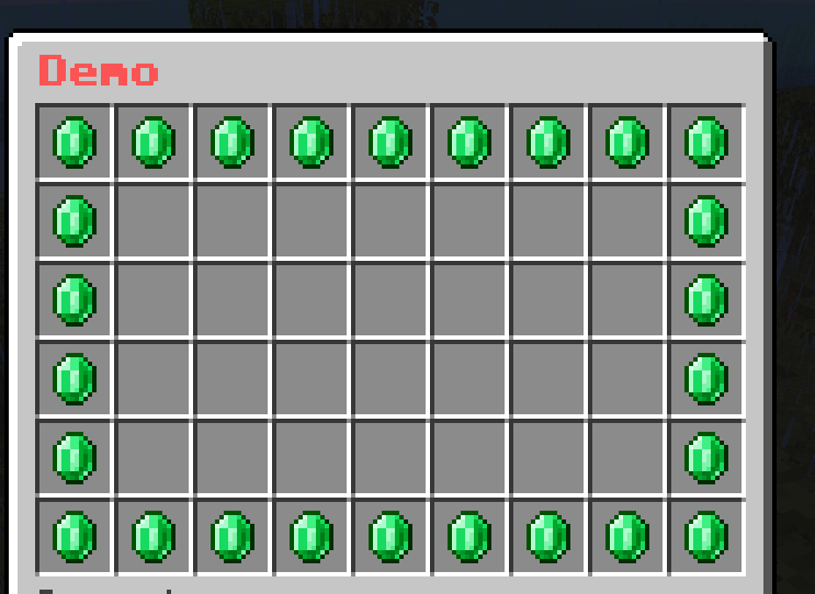
Mask
Mask is a new component in which you can specify the logic on how the Buttons are displayed. This creates new possibilities to make more creative menus from your crazy ideas.
You can use this to make a simple menu
... or a more complex menu
Built-in
- Simple Mask
- Multi-Slot Mask
- Pattern Mask
- Progress Mask
- Hybrid Mask
- Animated Mask
- One-Time Animated Mask
- Predicate Mask
- List Mask
- Button Paginated Mask
- Sequence Paginated Mask
- Mask Paginated Mask
- Template Mask
Simple Mask
This is the default mask if you don't specify any mask. That means that all Buttons are Simple Mask by default.
multi-slot:
  mask: simple # You can omit this line. It's the default mask.
  slot: 0-8,45,46,47-52
  type: animated
  update: 10
  child:
    frame1:
      name: ' '
      id:
        - black stained glass pane
        - STAINED_GLASS_PANE:15
    frame2:
      name: ' '
      id:
        - gray stained glass pane
        - STAINED_GLASS_PANE:7
    frame3:
      name: ' '
      id:
        - white stained glass pane
        - STAINED_GLASS_PANE
Multi-Slot Mask
It's the same as the Simple Mask but there is a special feature when you add multiple Buttons.
Format
mask-name:
  mask: multislot
  slot: <slot>
  child:
    button-name-1:
      <button-settings>
    button-name-2:
      <button-settings>
    ...
Example
demo-slot:
  mask: multislot
  slot: 1-1-9-6
  child:
    emerald-button:
      id: emerald
      name: "&a&lEmerald"
demo-slot:
  mask: multislot
  slot: 1-1-9-6
  child:
    emerald-button:
      id: emerald
      name: "&a&lEmerald"
    diamond-button:
      id: diamond
      name: "&b&lDiamond"
demo-slot:
  mask: multislot
  slot: 1-1-9-6
  child:
    emerald-button:
      id: emerald
      name: "&a&lEmerald"
    diamond-button:
      id: diamond
      name: "&b&lDiamond"
    redstone-button:
      id: redstone
      name: "&c&lRedstone"
You may now understand what is the special feature of this mask. This mask will loop through the child buttons and display them for each slot in the slot section.
Pattern Mask
It is a mask that allows you to create a pattern of buttons. The Buttons are elements that can be used to draw on a grid-like pattern.
Format
mask-name:
  mask: pattern
  pattern:
    - "xxxxxxxxx"
    - "x       x"
    - "x       x"
    - "x       x"
    - "xxxxxxxxx"
  child:
    button-name-1:
      <button-settings>
    button-name-2:
      <button-settings>
    ...
Note
pattern: The pattern that will be drawn. The pattern is a list of strings. Each string represents a row of the pattern. The length of each string must be the same. The character in the string represents the button that will be drawn on that position. The character must be unique.- The name of each button in the
childsection is the character that is used to draw on the pattern. The character must be unique.
Example
demo-slot:
  mask: pattern
  pattern:
    - "xxxxxxxxx"
    - "x       x"
    - "x       x"
    - "x       x"
    - "x       x"
    - "xxxxxxxxx"
  child:
    x:
      id: emerald
      name: "&a&lEmerald"
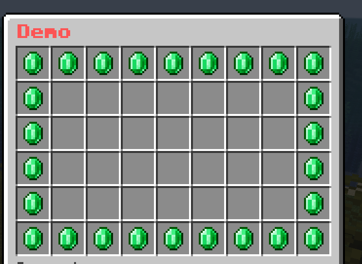
demo-slot:
  mask: pattern
  pattern:
    - "xxxxxxxxx"
    - "x       x"
    - "x 1 1 1 x"
    - "x  2 2  x"
    - "x       x"
    - "xxxxxxxxx"
  child:
    x:
      id: black_stained_glass_pane
      name: "&r"
    ' ':
      id: gray_stained_glass_pane
      name: "&r"
    1:
      id: emerald
      name: "&a&lEmerald"
    2:
      id: diamond
      name: "&b&lDiamond"
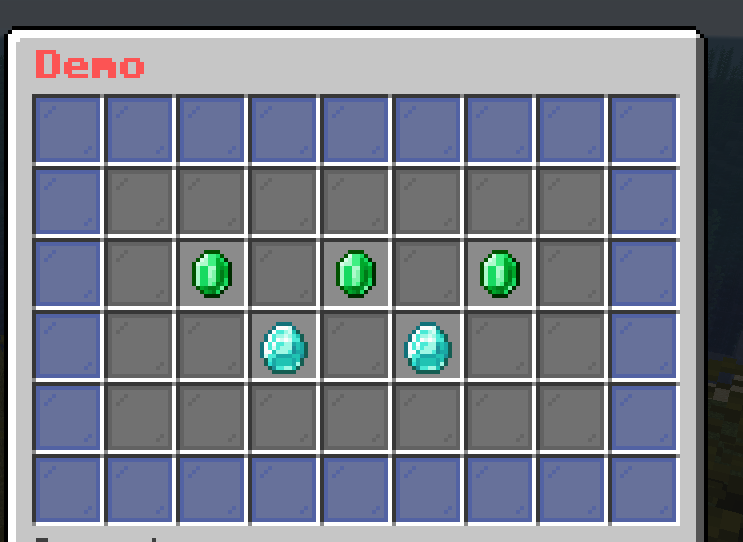
Progress Mask
It is a mask that shows the progress of the player. It is useful for showing the progress of the player in a quest or a game.
Format
mask-name:
  mask: progress
  slot: <slot>
  current: <current-value>
  max: <max-value>
  current-button:
    <button-settings>
  max-button:
    <button-settings>
Note
current: The current value of the progress. It can be a number or a placeholder.max: The max value of the progress. It can be a number or a placeholder.current-button: The button that represents the filled part of the progress.max-button: The button that represents the empty part of the progress.
Example
demo-slot:
  mask: progress
  current: "{level}"
  max: 45
  slot: 1-1-9-5
  current-button:
    id: green_stained_glass_pane
    name: "&a&lCurrent: &e{level}"
  max-button:
    id: red_stained_glass_pane
    name: "&c&lMax: &e45"
Don't worry about the weird last row. I'll explain it later.
Hybrid Mask
This mask is a combination of multiple masks. It is useful for grouping masks for better organization.
Format
mask-name:
  mask: hybrid
  child:
    mask-1:
      <mask-settings>
    mask-2:
      <mask-settings>
    ...
Example
demo-slot:
  mask: hybrid
  child:
    mask-1:
      slot: 1-1-9-5
      id: green_stained_glass_pane
      name: "&a&lMask 1"
    mask-2:
      slot: 1-6-9-6
      id: red_stained_glass_pane
      name: "&c&lMask 2"
demo-slot:
  mask: hybrid
  child:
    progress-level:
      mask: progress
      current: "{level}"
      max: 45
      slot: 1-1-9-5
      current-button:
        id: green_stained_glass_pane
        name: "&a&lCurrent: &e{level}"
      max-button:
        id: red_stained_glass_pane
        name: "&c&lMax: &e45"
    give-xp:
      slot: "1-6-9-6"
      id:
        - EXPERIENCE_BOTTLE
        - EXP_BOTTLE
      name: "&eGive &f10 XP"
      lore:
        - ""
        - "&fLevel: {level}"
      click-requirement:
        old-version:
          version: 13
          success-action: "console: xp add {player} 10 points"
          fail-action: "console: xp 10 {player}"

To explain what was missed in the example of Progress Mask, the last row is the Simple Mask that gives the player 10 XP. I used the Hybrid Mask to group the Progress Mask and the Simple Mask together.
Animated Mask
Similar to Animated Button, this mask iterates through a list of masks and displays them in a sequence to create an animation.
Format
mask-name:
  mask: animated
  update: <ticks>
  async: <true/false>
  child:
    mask-1:
      <mask-settings>
    mask-2:
      <mask-settings>
    ...
Note
update: The number of ticks between each frame.async: Whether the animation will be played asynchronously.
Example
demo-slot:
  mask: animated
  update: 5
  child:
    frame1:
      slot: 0-53
      id: red_stained_glass_pane
      name: "&c&lFrame 1"
    frame2:
      slot: 0-53
      id: green_stained_glass_pane
      name: "&a&lFrame 2"
    frame3:
      slot: 0-53
      id: blue_stained_glass_pane
      name: "&9&lFrame 3"
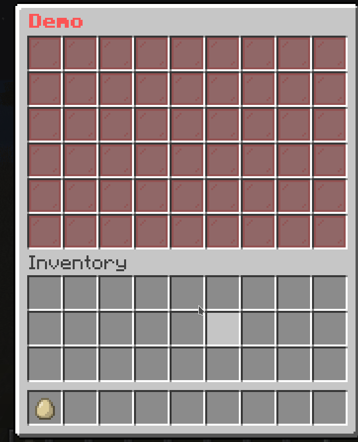
demo-slot:
  mask: animated
  update: 5
  child:
    frame1:
      slot: 0-8
      id: black_stained_glass_pane
      name: "&c&lFrame 1"
    frame2:
      slot: 9-17
      id: black_stained_glass_pane
      name: "&c&lFrame 2"
    frame3:
      slot: 18-26
      id: black_stained_glass_pane
      name: "&c&lFrame 3"
    frame4:
      slot: 27-35
      id: black_stained_glass_pane
      name: "&c&lFrame 4"
    frame5:
      slot: 36-44
      id: black_stained_glass_pane
      name: "&c&lFrame 5"
    frame6:
      slot: 45-53
      id: black_stained_glass_pane
      name: "&c&lFrame 6"
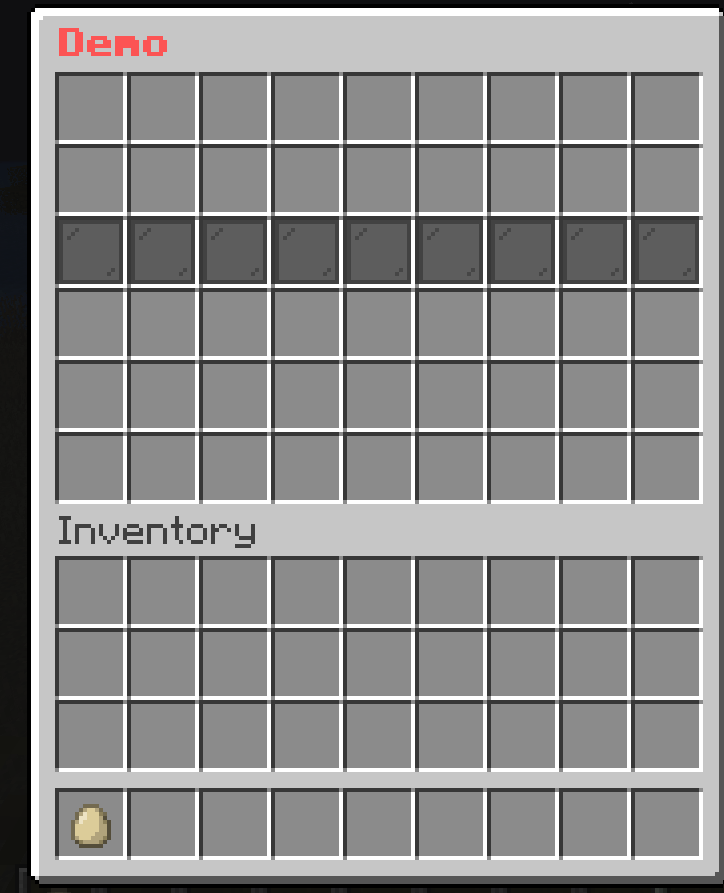
demo-slot:
  mask: animated
  update: 5
  child:
    frame1:
      slot: 1-1-9-6
      mask: multislot
      child:
        button1:
          id: red_stained_glass_pane
          name: "&r"
        button2:
          id: black_stained_glass_pane
          name: "&r"
    frame2:
      slot: 1-1-9-6
      mask: multislot
      child:
        button1:
          id: black_stained_glass_pane
          name: "&r"
        button2:
          id: red_stained_glass_pane
          name: "&r"
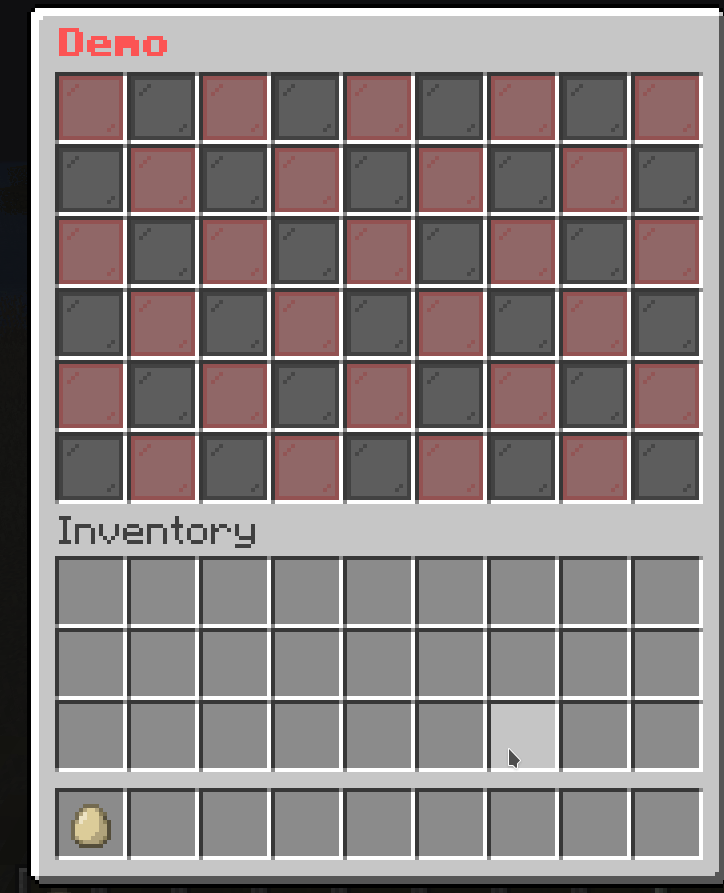
One-Time Animated Mask
This is a special type of Animated Mask that only plays once. It will not loop back to the first frame after it reaches the last frame.
Format
mask-name:
  mask: animated
  update: <ticks>
  async: <true/false>
  keep-last: <true/false>
  child:
    mask-1:
      <mask-settings>
    mask-2:
      <mask-settings>
    ...
Note
keep-last: Whether the last frame will be kept after the animation is finished. The default value isfalse.
Example
demo-slot:
  mask: one-time-animated
  update: 5
  child:
    frame1:
      slot: 0-8
      id: black_stained_glass_pane
      name: "&c&lFrame 1"
    frame2:
      slot: 9-17
      id: black_stained_glass_pane
      name: "&c&lFrame 2"
    frame3:
      slot: 18-26
      id: black_stained_glass_pane
      name: "&c&lFrame 3"
    frame4:
      slot: 27-35
      id: black_stained_glass_pane
      name: "&c&lFrame 4"
    frame5:
      slot: 36-44
      id: black_stained_glass_pane
      name: "&c&lFrame 5"
    frame6:
      slot: 45-53
      id: black_stained_glass_pane
      name: "&c&lFrame 6"
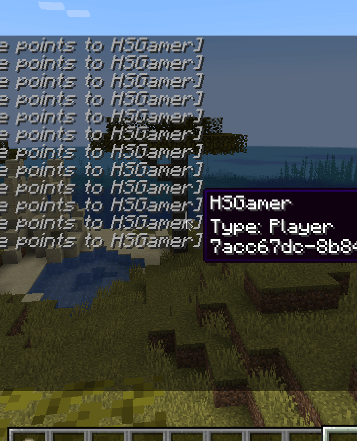
Predicate Mask
This is a conditional mask. It will show the mask if the requirement is met. If not, it will show the fallback mask.
Format
mask-name:
  mask: predicate
  view-requirement:
    <requirement-set>
    <requirement-set>
    <requirement-set>
    ...
  check-only-on-creation: <true/false>
  success:
    <mask-settings>
  fallback:
    <mask-settings>
Note
success: The mask that will be shown if theview-requirementis met. If you don't set it, the mask will be empty.fallback: The mask that will be shown if theview-requirementis not met. If you don't set it, the mask will be empty.view-requirement: The set of requirements that must be met for thesuccessmask to be shown.check-only-on-creation: If this value is set totrue, the plugin will only check theview-requirementwhen the player opens the menu.
Example
demo-slot:
  mask: predicate
  view-requirement:
    test-level:
      level:
        value: 10
        take: false
  success:
    mask: pattern
    pattern:
      - "...xxx..."
      - "..x...x.."
      - "..x...x.."
      - "..x...x.."
      - "...xxx..."
    child:
      x:
        id: green_stained_glass_pane
        name: "&a&lSuccess"
  fallback:
    mask: pattern
    pattern:
      - "..x...x.."
      - "...x.x..."
      - "....x...."
      - "...x.x..."
      - "..x...x.."
    child:
      x:
        id: red_stained_glass_pane
        name: "&c&lFail"
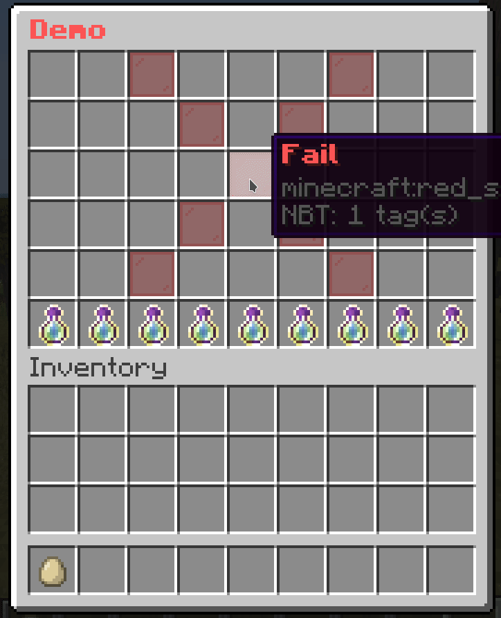
List Mask
This is a conditional mask that loops through a list of masks and display a mask if it can be shown.
It can be used with Predicate Mask to make more complex checks.
Format
mask-name:
  mask: list
  child:
    mask1:
      <mask-settings>
    mask2:
      <mask-settings>
    ...
Example
demo-slot:
  mask: list
  child:
    level-10:
      mask: predicate
      view-requirement:
        test-level:
          level:
            value: 10
            take: false
      success:
        mask: pattern
        pattern:
          - "..x..xxx."
          - ".xx..x.x."
          - "..x..x.x."
          - "..x..x.x."
          - ".xxx.xxx."
        child:
          x:
            id: green_stained_glass_pane
            name: "&a&lYou have reached level 10!"
    level-5:
      mask: predicate
      view-requirement:
        test-level:
          level:
            value: 5
            take: false
      success:
        mask: pattern
        pattern:
          - "...xxx..."
          - "...x....."
          - "...xxx..."
          - ".....x..."
          - "...xxx..."
        child:
          x:
            id: green_stained_glass_pane
            name: "&a&lYou have reached level 5!"
    level-0:
      mask: pattern
      pattern:
        - "...xxx..."
        - "...x.x..."
        - "...x.x..."
        - "...x.x..."
        - "...xxx..."
      child:
        x:
          id: red_stained_glass_pane
          name: "&c&lFail"
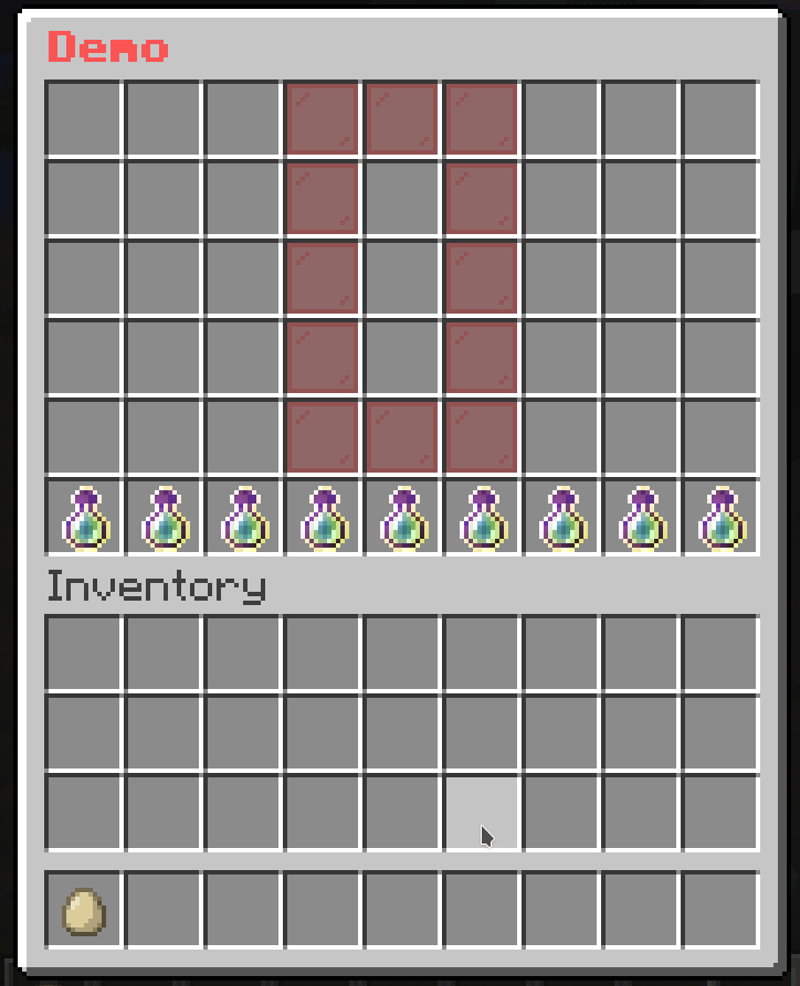
Button Paginated Mask
This is a mask that allows you to paginate Buttons. This is useful when you have a lot of buttons and you want to split them into multiple pages.
Format
mask-name:
  mask: button-paginated
  slot: <slot>
  cycle: <true/false>
  signal: <signal>
  child:
    button-1:
      <button-settings>
    button-2:
      <button-settings>
    ...
Note
cycle: Whether the buttons should cycle when you reach the end of the page. If this is set totrue, then when you reach the end of the page, it will go back to the first page. If this is set tofalse, then when you reach the end of the page, it will stop at the last page.signal: The signal name used by actions to change the page.
Action
next-page: <signal>: Changes the page to the next page.previous-page: <signal>: Changes the page to the previous page.
Example
# The paginated mask
demo-slot:
  mask: button-paginated
  slot: 1-7
  cycle: false
  signal: demo-page-signal # This is the signal name used by actions to change the page.
  child:
    button1:
      id: red_stained_glass_pane
      name: "&c&lButton 1"
    button2:
      id: green_stained_glass_pane
      name: "&a&lButton 2"
    button3:
      id: blue_stained_glass_pane
      name: "&9&lButton 3"
    button4:
      id: yellow_stained_glass_pane
      name: "&e&lButton 4"
    button5:
      id: purple_stained_glass_pane
      name: "&5&lButton 5"
    button6:
      id: orange_stained_glass_pane
      name: "&6&lButton 6"
    button7:
      id: pink_stained_glass_pane
      name: "&d&lButton 7"
    button8:
      id: black_stained_glass_pane
      name: "&0&lButton 8"
    button9:
      id: white_stained_glass_pane
      name: "&f&lButton 9"
    button10:
      id: gray_stained_glass_pane
      name: "&7&lButton 10"
    button11:
      id: light_gray_stained_glass_pane
      name: "&8&lButton 11"

# The button to go to the previous page
previous-button:
  slot: 0
  id: arrow
  name: "&c&lPrevious"
  command: "previous-page: demo-page-signal" # The action to change the page

# The button to go to the next page
next-button:
  slot: 8
  id: arrow
  name: "&a&lNext"
  command: "next-page: demo-page-signal" # The action to change the page
Sequence Paginated Mask
This is the same as the Button Paginated Mask. The only difference is that this mask assumes each button as a page, so it will "shift" the buttons to the left or right depending on the page.
Format
mask-name:
  mask: sequence-paginated
  slot: <slot>
  cycle: <true/false>
  signal: <signal>
  child:
    button-1:
      <button-settings>
    button-2:
      <button-settings>
    ...
Note
cycle: Whether the buttons should cycle when you reach the end of the page. If this is set totrue, then when you reach the end of the page, it will go back to the first page. If this is set tofalse, then when you reach the end of the page, it will stop at the last page.signal: The signal name used by actions to change the page.
Action
next-page: <signal>: Changes the page to the next page.previous-page: <signal>: Changes the page to the previous page.
Example
# The paginated mask
demo-slot:
  mask: sequence-paginated
  slot: 1-7
  cycle: false
  signal: demo-page-signal # This is the signal name used by actions to change the page.
  child:
    button1:
      id: red_stained_glass_pane
      name: "&c&lButton 1"
    button2:
      id: green_stained_glass_pane
      name: "&a&lButton 2"
    button3:
      id: blue_stained_glass_pane
      name: "&9&lButton 3"
    button4:
      id: yellow_stained_glass_pane
      name: "&e&lButton 4"
    button5:
      id: purple_stained_glass_pane
      name: "&5&lButton 5"
    button6:
      id: orange_stained_glass_pane
      name: "&6&lButton 6"
    button7:
      id: pink_stained_glass_pane
      name: "&d&lButton 7"
    button8:
      id: black_stained_glass_pane
      name: "&0&lButton 8"
    button9:
      id: white_stained_glass_pane
      name: "&f&lButton 9"
    button10:
      id: gray_stained_glass_pane
      name: "&7&lButton 10"
    button11:
      id: light_gray_stained_glass_pane
      name: "&8&lButton 11"

# The button to go to the previous page
previous-button:
  slot: 0
  id: arrow
  name: "&c&lPrevious"
  command: "previous-page: demo-page-signal" # The action to change the page

# The button to go to the next page
next-button:
  slot: 8
  id: arrow
  name: "&a&lNext"
  command: "next-page: demo-page-signal" # The action to change the page
Mask Paginated Mask
Unlike Button Paginated Mask, this mask paginates Masks instead of Buttons.
Format
mask-name:
  mask: mask-paginated
  cycle: <true/false>
  signal: <signal>
  child:
    mask-1:
      <mask-settings>
    mask-2:
      <mask-settings>
    ...
Note
cycle: Whether the buttons should cycle when you reach the end of the page. If this is set totrue, then when you reach the end of the page, it will go back to the first page. If this is set tofalse, then when you reach the end of the page, it will stop at the last page.signal: The signal name used by actions to change the page.
Action
next-page: <signal>: Changes the page to the next page.previous-page: <signal>: Changes the page to the previous page.
Example
# The paginated mask
demo-slot:
  mask: mask-paginated
  cycle: false
  signal: demo-page-signal # This is the signal name used by actions to change the page.
  child:
    0:
      mask: pattern
      pattern:
        - "...xxx..."
        - "...x.x..."
        - "...x.x..."
        - "...x.x..."
        - "...xxx..."
      child:
        x:
          id: red_stained_glass_pane
          name: "&c&l0"
    1:
      mask: pattern
      pattern:
        - "....x...."
        - "...xx...."
        - "....x...."
        - "....x...."
        - "...xxx..."
      child:
        x:
          id: red_stained_glass_pane
          name: "&a&l1"
    2:
      mask: pattern
      pattern:
        - "...xxx..."
        - ".....x..."
        - "...xxx..."
        - "...x....."
        - "...xxx..."
      child:
        x:
          id: red_stained_glass_pane
          name: "&b&l2"
    3:
      mask: pattern
      pattern:
        - "...xxx..."
        - ".....x..."
        - "...xxx..."
        - ".....x..."
        - "...xxx..."
      child:
        x:
          id: red_stained_glass_pane
          name: "&d&l3"
    4:
      mask: pattern
      pattern:
        - "...x.x..."
        - "...x.x..."
        - "...xxx..."
        - ".....x..."
        - ".....x..."
      child:
        x:
          id: red_stained_glass_pane
          name: "&e&l4"
    5:
      mask: pattern
      pattern:
        - "...xxx..."
        - "...x....."
        - "...xxx..."
        - ".....x..."
        - "...xxx..."
      child:
        x:
          id: red_stained_glass_pane
          name: "&f&l5"

# The button to go to the previous page
previous-button:
  slot: 18
  id: arrow
  name: "&c&lPrevious"
  command: "previous-page: demo-page-signal" # The action to change the page

# The button to go to the next page
next-button:
  slot: 26
  id: arrow
  name: "&a&lNext"
  command: "next-page: demo-page-signal" # The action to change the page
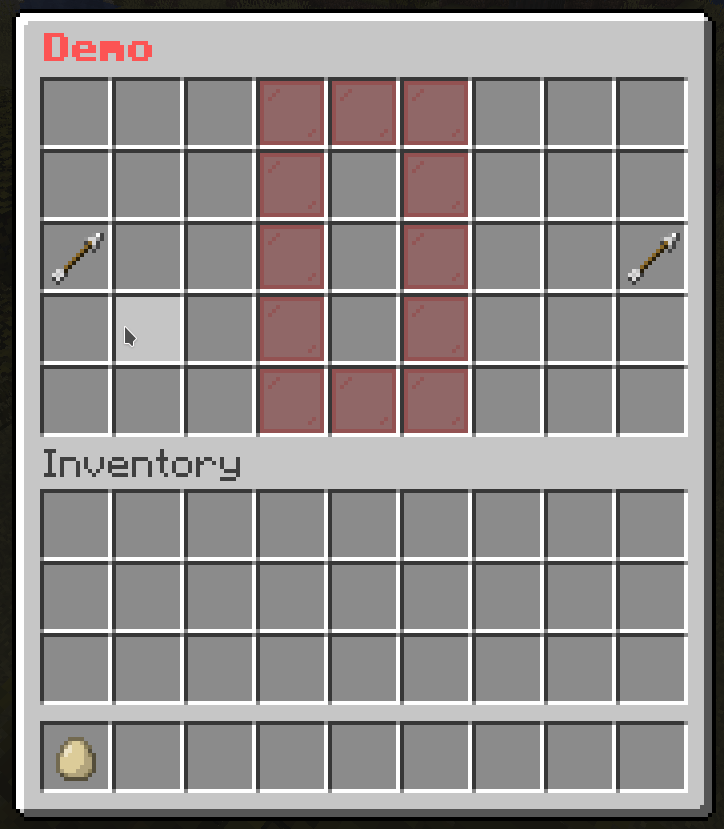
Template Mask
While you are creating menus with masks, you may find yourself repeating the same mask settings over and over again. This is where the template mask comes in handy. It allows you to create a template mask and use it in other masks.
Format
mask-name:
  mask: template
  template: <name> # The name from template folder
  variable:
    <variable1>: <value1>
    <variable2>: <value2>
    ...
  <mask-settings>
Template Folder
The template folder (located at plugins/BetterGUI/addon/MaskedGUI/template) is a folder containing yml files defining common masks to use in all menus. That means you can create a template mask by simply creating a yml file in the template folder, add the common mask settings, and use it in other masks.
Note
variable: The variable is a way to pass values to the template mask. Check out Usevariableoption for more information.
Example
# Template File
test-pattern:
  mask: pattern
  button:
    "*":
      id: purple_stained_glass_pane
      name: "&b&lBody"
    "x":
      id: red_stained_glass_pane
      name: "&c&lTarget"
    "#":
      id: pink_stained_glass_pane
      name: "&a&lHead"
demo-slot:
  mask: animated
  update: 3
  child:
    1:
      mask: template
      template: test-pattern
      pattern:
      - "......x.."
      - "........."
      - "........."
    2:
      mask: template
      template: test-pattern
      pattern:
      - "......x.."
      - "........."
      - "#........"
    3:
      mask: template
      template: test-pattern
      pattern:
      - "......x.."
      - "........."
      - "*#......."
    4:
      mask: template
      template: test-pattern
      pattern:
      - "......x.."
      - "........."
      - "**#......"
    5:
      mask: template
      template: test-pattern
      pattern:
      - "......x.."
      - "..#......"
      - "***......"
    6:
      mask: template
      template: test-pattern
      pattern:
      - "..#...x.."
      - "..*......"
      - ".**......"
    7:
      mask: template
      template: test-pattern
      pattern:
      - "..*#..x.."
      - "..*......"
      - "..*......"
    8:
      mask: template
      template: test-pattern
      pattern:
      - "..**#.x.."
      - "..*......"
      - "........."
    9:
      mask: template
      template: test-pattern
      pattern:
      - "..***#x.."
      - "........."
      - "........."
    10:
      mask: template
      template: test-pattern
      pattern:
      - "..****#.."
      - "........."
      - "........."
    11:
      mask: template
      template: test-pattern
      pattern:
      - "...****.."
      - "......#.."
      - "........."
    12:
      mask: template
      template: test-pattern
      pattern:
      - "....***.."
      - "......*.."
      - "......#.."
    13:
      mask: template
      template: test-pattern
      pattern:
      - ".....**.."
      - "......*.."
      - "......*#."
    14:
      mask: template
      template: test-pattern
      pattern:
      - "......*.."
      - "......*.."
      - "......**#"
    15:
      mask: template
      template: test-pattern
      pattern:
      - "........."
      - "......*.."
      - "......***"
    16:
      mask: template
      template: test-pattern
      pattern:
      - "........."
      - "........."
      - "......***"
    17:
      mask: template
      template: test-pattern
      pattern:
      - "........."
      - "........."
      - ".......**"
    18:
      mask: template
      template: test-pattern
      pattern:
      - "........."
      - "........."
      - "........*"
    19:
      mask: template
      template: test-pattern
      pattern:
      - "........."
      - "........."
      - "........."
Add as a dependency
- Add this in your
<repositories>
    <repository>
      <id>codemc-repo</id>
      <url>https://repo.codemc.io/repository/maven-public/</url>
    </repository>
- Add this in your
<dependencies>
    <dependency>
      <groupId>me.HSGamer</groupId>
      <artifactId>BetterGUI</artifactId>
      <version>VERSION</version>
      <scope>provided</scope>
    </dependency>
Javadocs
https://bettergui-mc.github.io/BetterGUI