Mask
This is a new component in which you can specify the logic on how the Buttons are displayed. This creates new possibilities to make more creative menus from your crazy ideas.
You can use this to make a simple menu
… or a more complex menu
This is a new component in which you can specify the logic on how the Buttons are displayed. This creates new possibilities to make more creative menus from your crazy ideas.
You can use this to make a simple menu
… or a more complex menu
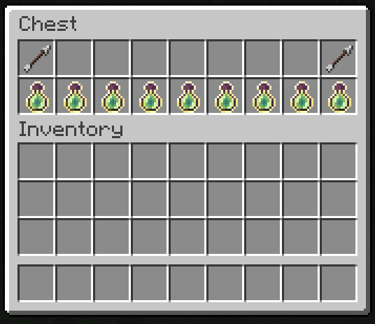
This is the default mask if you don’t specify any mask. That means that all Buttons are Simple Mask by default.
multi-slot:
  mask: simple # You can omit this line. It's the default mask.
  slot: 0-8,45,46,47-52
  type: animated
  update: 10
  child:
    frame1:
      name: ' '
      id:
        - black stained glass pane
        - STAINED_GLASS_PANE:15
    frame2:
      name: ' '
      id:
        - gray stained glass pane
        - STAINED_GLASS_PANE:7
    frame3:
      name: ' '
      id:
        - white stained glass pane
- STAINED_GLASS_PANEIt’s the same as the Simple Mask but there is a special feature when you add multiple Buttons.
mask-name:
  mask: multislot
  slot: <slot>
  child:
    button-name-1:
      <button-settings>
    button-name-2:
      <button-settings>
...demo-slot:
mask: multislot
slot: 1-1-9-6
child:
emerald-button:
id: emerald
name: "&a&lEmerald"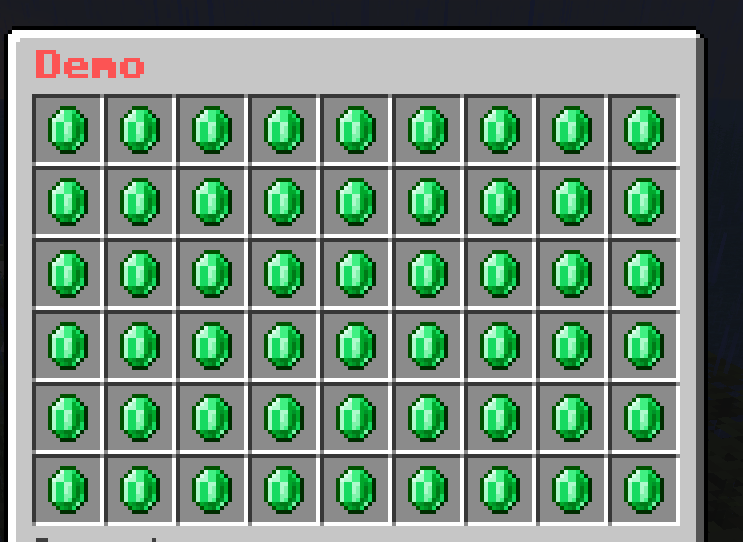
demo-slot:
  mask: multislot
  slot: 1-1-9-6
  child:
    emerald-button:
      id: emerald
      name: "&a&lEmerald"
diamond-button:
id: diamond
name: "&b&lDiamond"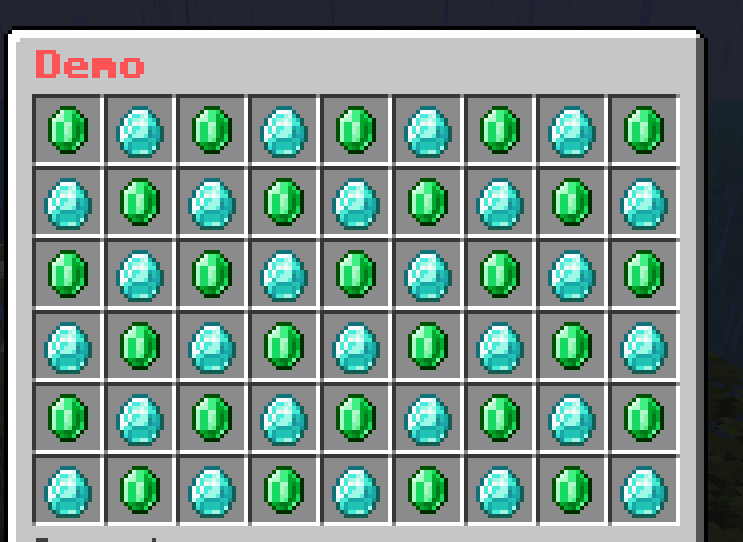
demo-slot:
  mask: multislot
  slot: 1-1-9-6
  child:
    emerald-button:
      id: emerald
      name: "&a&lEmerald"
    diamond-button:
      id: diamond
      name: "&b&lDiamond"
redstone-button:
id: redstone
name: "&c&lRedstone"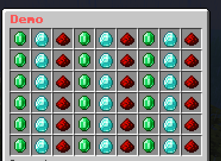
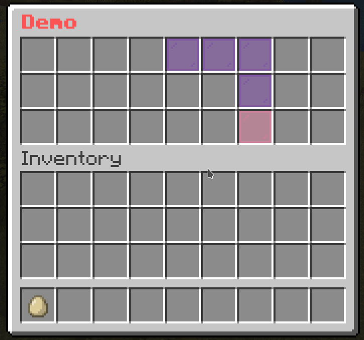
You may now understand what is the special feature of this mask. This mask will loop through the child buttons and display them for each slot in the slot section.
It is a mask that allows you to create a pattern of buttons. The Buttons are elements that can be used to draw on a grid-like pattern.
mask-name:
  mask: pattern
  pattern:
    - "xxxxxxxxx"
    - "x       x"
    - "x       x"
    - "x       x"
    - "xxxxxxxxx"
  child:
    button-name-1:
      <button-settings>
    button-name-2:
      <button-settings>
...pattern: The pattern that will be drawn. The pattern is a list of strings. Each string represents a row of the pattern. The length of each string must be the same. The character in the string represents the button that will be drawn on that position. The character must be unique.child section is the character that is used to draw on the pattern. The character must be unique.demo-slot:
mask: pattern
pattern:
- "xxxxxxxxx"
- "x x"
- "x x"
- "x x"
- "x x"
- "xxxxxxxxx"
child:
x:
id: emerald
name: "&a&lEmerald"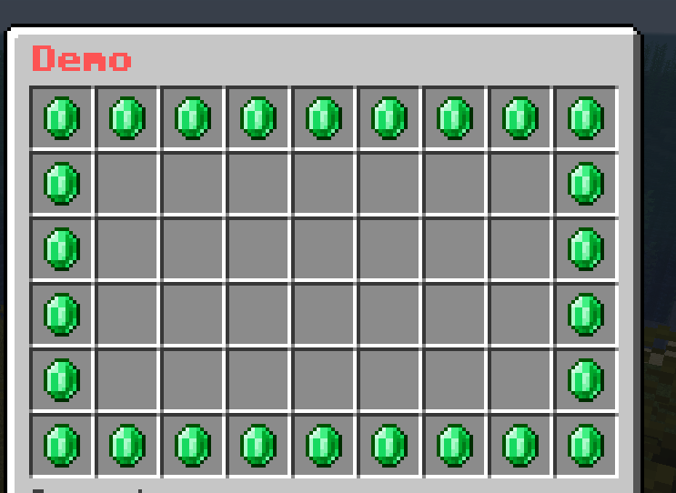
demo-slot:
  mask: pattern
  pattern:
    - "xxxxxxxxx"
    - "x       x"
    - "x 1 1 1 x"
    - "x  2 2  x"
    - "x       x"
    - "xxxxxxxxx"
  child:
    x:
      id: black_stained_glass_pane
      name: "&r"
    ' ':
      id: gray_stained_glass_pane
      name: "&r"
    1:
      id: emerald
      name: "&a&lEmerald"
    2:
      id: diamond
      name: "&b&lDiamond"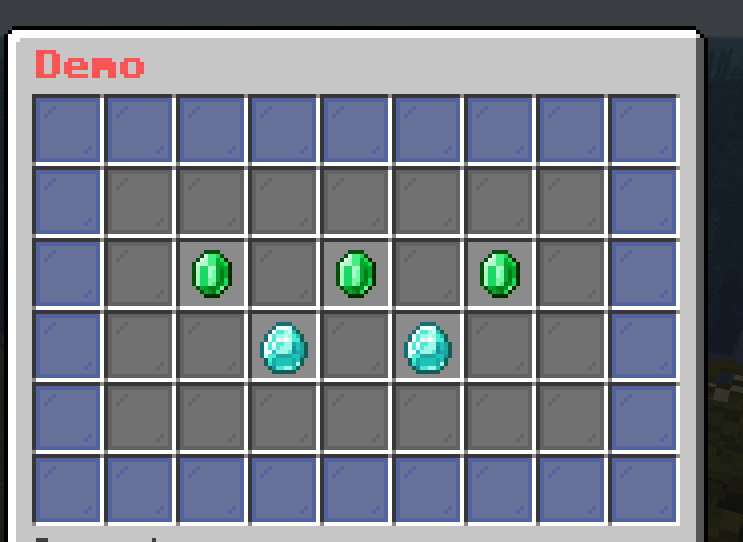
It is a mask that shows the progress of the player. It is useful for showing the progress of the player in a quest or a game.
mask-name:
  mask: progress
  slot: <slot>
  current: <current-value>
  max: <max-value>
  current-button:
    <button-settings>
  max-button:
<button-settings>current: The current value of the progress. It can be a number or a placeholder.max: The max value of the progress. It can be a number or a placeholder.current-button: The Button that represents the filled part of the progress.max-button: The Button that represents the empty part of the progress.demo-slot:
mask: progress
current: "{level}"
max: 45
slot: 1-1-9-5
current-button:
id: green_stained_glass_pane
name: "&a&lCurrent: &e{level}"
max-button:
id: red_stained_glass_pane
name: "&c&lMax: &e45"
Don’t worry about the weird last row. I’ll explain it later.
This mask is a combination of multiple masks. It is useful for grouping masks for better organization.
mask-name:
  mask: hybrid
  child:
    mask-1:
      <mask-settings>
    mask-2:
      <mask-settings>
...demo-slot:
mask: hybrid
child:
mask-1:
slot: 1-1-9-5
id: green_stained_glass_pane
name: "&a&lMask 1"
mask-2:
slot: 1-6-9-6
id: red_stained_glass_pane
name: "&c&lMask 2"
demo-slot:
  mask: hybrid
  child:
    progress-level:
      mask: progress
      current: "{level}"
      max: 45
      slot: 1-1-9-5
      current-button:
        id: green_stained_glass_pane
        name: "&a&lCurrent: &e{level}"
      max-button:
        id: red_stained_glass_pane
        name: "&c&lMax: &e45"
    give-xp:
      slot: "1-6-9-6"
      id:
        - EXPERIENCE_BOTTLE
        - EXP_BOTTLE
      name: "&eGive &f10 XP"
      lore:
        - ""
        - "&fLevel: {level}"
      click-requirement:
        old-version:
          version: 13
          success-action: "console: xp add {player} 10 points"
          fail-action: "console: xp 10 {player}"
To explain what was missed in the example of Progress Mask, the last row is the Simple Mask that gives the player 10 XP. I used the Hybrid Mask to group the Progress Mask and the Simple Mask together.
Similar to Animated Button, this mask iterates through a list of masks and displays them in a sequence to create an animation.
mask-name:
  mask: animated
  update: <ticks>
  child:
    mask-1:
      <mask-settings>
    mask-2:
      <mask-settings>
...update: The number of ticks between each frame.demo-slot:
mask: animated
update: 5
child:
frame1:
slot: 0-53
id: red_stained_glass_pane
name: "&c&lFrame 1"
frame2:
slot: 0-53
id: green_stained_glass_pane
name: "&a&lFrame 2"
frame3:
slot: 0-53
id: blue_stained_glass_pane
name: "&9&lFrame 3"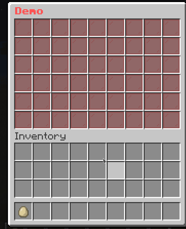
demo-slot:
  mask: animated
  update: 5
  child:
    frame1:
      slot: 0-8
      id: black_stained_glass_pane
      name: "&c&lFrame 1"
    frame2:
      slot: 9-17
      id: black_stained_glass_pane
      name: "&c&lFrame 2"
    frame3:
      slot: 18-26
      id: black_stained_glass_pane
      name: "&c&lFrame 3"
    frame4:
      slot: 27-35
      id: black_stained_glass_pane
      name: "&c&lFrame 4"
    frame5:
      slot: 36-44
      id: black_stained_glass_pane
      name: "&c&lFrame 5"
    frame6:
      slot: 45-53
      id: black_stained_glass_pane
      name: "&c&lFrame 6"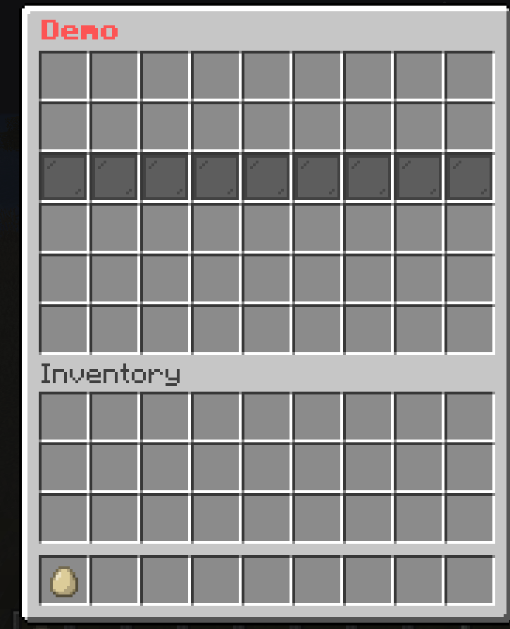
demo-slot:
  mask: animated
  update: 5
  child:
    frame1:
      slot: 1-1-9-6
      mask: multislot
      child:
        button1:
          id: red_stained_glass_pane
          name: "&r"
        button2:
          id: black_stained_glass_pane
          name: "&r"
    frame2:
      slot: 1-1-9-6
      mask: multislot
      child:
        button1:
          id: black_stained_glass_pane
          name: "&r"
        button2:
          id: red_stained_glass_pane
          name: "&r"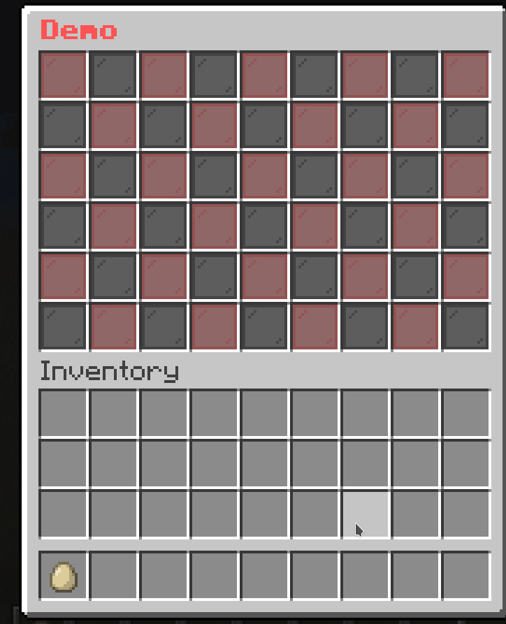
This is a special type of Animated Mask that only plays once. It will not loop back to the first frame after it reaches the last frame.
mask-name:
  mask: animated
  update: <ticks>
  async: <true/false>
  keep-last: <true/false>
  child:
    mask-1:
      <mask-settings>
    mask-2:
      <mask-settings>
...keep-last: Whether the last frame will be kept after the animation is finished. The default value is false.demo-slot:
mask: one-time-animated
update: 5
child:
frame1:
slot: 0-8
id: black_stained_glass_pane
name: "&c&lFrame 1"
frame2:
slot: 9-17
id: black_stained_glass_pane
name: "&c&lFrame 2"
frame3:
slot: 18-26
id: black_stained_glass_pane
name: "&c&lFrame 3"
frame4:
slot: 27-35
id: black_stained_glass_pane
name: "&c&lFrame 4"
frame5:
slot: 36-44
id: black_stained_glass_pane
name: "&c&lFrame 5"
frame6:
slot: 45-53
id: black_stained_glass_pane
name: "&c&lFrame 6"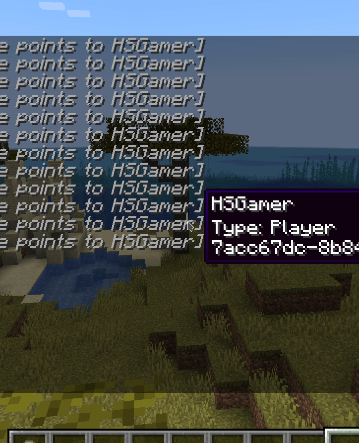
This is a conditional mask. It will show the mask if the requirement is met. If not, it will show the fallback mask.
mask-name:
  mask: predicate
  view-requirement:
    <requirement-set>
    <requirement-set>
    <requirement-set>
    ...
  check-only-on-creation: <true/false>
  success:
    <mask-settings>
  fallback:
<mask-settings>success: The Mask that will be shown if the view-requirement is met. If you don’t set it, the mask will be empty.fallback: The Mask that will be shown if the view-requirement is not met. If you don’t set it, the mask will be empty.view-requirement: The Requirement that must be met for the success mask to be shown.check-only-on-creation: If this value is set to true, the plugin will only check the view-requirement when the player opens the menu.demo-slot:
mask: predicate
view-requirement:
test-level:
level:
value: 10
take: false
success:
mask: pattern
pattern:
- "...xxx..."
- "..x...x.."
- "..x...x.."
- "..x...x.."
- "...xxx..."
child:
x:
id: green_stained_glass_pane
name: "&a&lSuccess"
fallback:
mask: pattern
pattern:
- "..x...x.."
- "...x.x..."
- "....x...."
- "...x.x..."
- "..x...x.."
child:
x:
id: red_stained_glass_pane
name: "&c&lFail"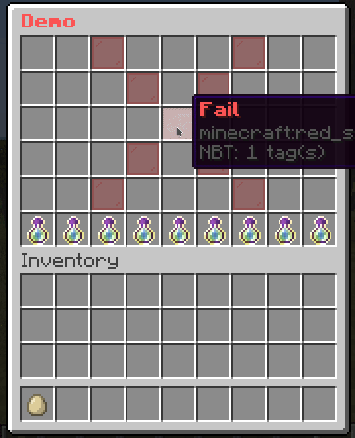
This is a conditional mask that loops through a list of masks and display a mask if it can be shown.
It can be used with Predicate Mask to make more complex checks.
mask-name:
  mask: list
  child:
    mask1:
      <mask-settings>
    mask2:
      <mask-settings>
...demo-slot:
mask: list
child:
level-10:
mask: predicate
view-requirement:
test-level:
level:
value: 10
take: false
success:
mask: pattern
pattern:
- "..x..xxx."
- ".xx..x.x."
- "..x..x.x."
- "..x..x.x."
- ".xxx.xxx."
child:
x:
id: green_stained_glass_pane
name: "&a&lYou have reached level 10!"
level-5:
mask: predicate
view-requirement:
test-level:
level:
value: 5
take: false
success:
mask: pattern
pattern:
- "...xxx..."
- "...x....."
- "...xxx..."
- ".....x..."
- "...xxx..."
child:
x:
id: green_stained_glass_pane
name: "&a&lYou have reached level 5!"
level-0:
mask: pattern
pattern:
- "...xxx..."
- "...x.x..."
- "...x.x..."
- "...x.x..."
- "...xxx..."
child:
x:
id: red_stained_glass_pane
name: "&c&lFail"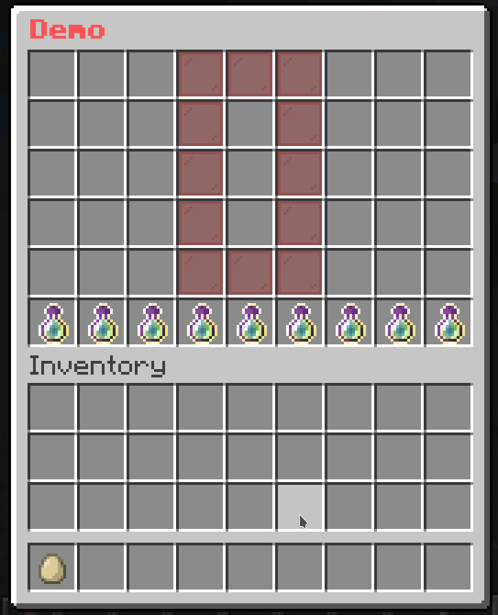
This is a mask that allows you to paginate Buttons. This is useful when you have a lot of buttons and you want to split them into multiple pages.
mask-name:
  mask: button-paginated
  slot: <slot>
  cycle: <true/false>
  signal: <signal>
  child:
    button-1:
      <button-settings>
    button-2:
      <button-settings>
...cycle: Whether the buttons should cycle when you reach the end of the page. If this is set to true, then when you reach the end of the page, it will go back to the first page. If this is set to false, then when you reach the end of the page, it will stop at the last page.signal: The signal name used by actions to change the page.next-page: <signal>: Changes the page to the next page.previous-page: <signal>: Changes the page to the previous page.set-page(<signal>): <page>: Changes the page to <page>.# The paginated mask
demo-slot:
mask: button-paginated
slot: 1-7
cycle: false
signal: demo-page-signal # This is the signal name used by actions to change the page.
child:
button1:
id: red_stained_glass_pane
name: "&c&lButton 1"
button2:
id: green_stained_glass_pane
name: "&a&lButton 2"
button3:
id: blue_stained_glass_pane
name: "&9&lButton 3"
button4:
id: yellow_stained_glass_pane
name: "&e&lButton 4"
button5:
id: purple_stained_glass_pane
name: "&5&lButton 5"
button6:
id: orange_stained_glass_pane
name: "&6&lButton 6"
button7:
id: pink_stained_glass_pane
name: "&d&lButton 7"
button8:
id: black_stained_glass_pane
name: "&0&lButton 8"
button9:
id: white_stained_glass_pane
name: "&f&lButton 9"
button10:
id: gray_stained_glass_pane
name: "&7&lButton 10"
button11:
id: light_gray_stained_glass_pane
name: "&8&lButton 11"
# The button to go to the previous page
previous-button:
slot: 0
id: arrow
name: "&c&lPrevious"
command: "previous-page: demo-page-signal" # The action to change the page
# The button to go to the next page
next-button:
slot: 8
id: arrow
name: "&a&lNext"
command: "next-page: demo-page-signal" # The action to change the page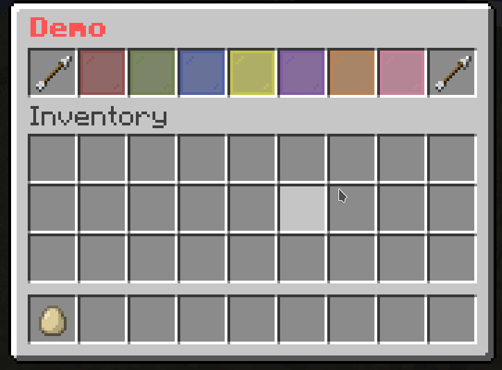
This is the same as the Button Paginated Mask. The only difference is that this mask assumes each button as a page, so it will “shift” the buttons to the left or right depending on the page.
mask-name:
  mask: sequence-paginated
  slot: <slot>
  cycle: <true/false>
  signal: <signal>
  child:
    button-1:
      <button-settings>
    button-2:
      <button-settings>
...cycle: Whether the buttons should cycle when you reach the end of the page. If this is set to true, then when you reach the end of the page, it will go back to the first page. If this is set to false, then when you reach the end of the page, it will stop at the last page.signal: The signal name used by actions to change the page.next-page: <signal>: Changes the page to the next page.previous-page: <signal>: Changes the page to the previous page.set-page(<signal>): <page>: Changes the page to <page>.# The paginated mask
demo-slot:
mask: sequence-paginated
slot: 1-7
cycle: false
signal: demo-page-signal # This is the signal name used by actions to change the page.
child:
button1:
id: red_stained_glass_pane
name: "&c&lButton 1"
button2:
id: green_stained_glass_pane
name: "&a&lButton 2"
button3:
id: blue_stained_glass_pane
name: "&9&lButton 3"
button4:
id: yellow_stained_glass_pane
name: "&e&lButton 4"
button5:
id: purple_stained_glass_pane
name: "&5&lButton 5"
button6:
id: orange_stained_glass_pane
name: "&6&lButton 6"
button7:
id: pink_stained_glass_pane
name: "&d&lButton 7"
button8:
id: black_stained_glass_pane
name: "&0&lButton 8"
button9:
id: white_stained_glass_pane
name: "&f&lButton 9"
button10:
id: gray_stained_glass_pane
name: "&7&lButton 10"
button11:
id: light_gray_stained_glass_pane
name: "&8&lButton 11"
# The button to go to the previous page
previous-button:
slot: 0
id: arrow
name: "&c&lPrevious"
command: "previous-page: demo-page-signal" # The action to change the page
# The button to go to the next page
next-button:
slot: 8
id: arrow
name: "&a&lNext"
command: "next-page: demo-page-signal" # The action to change the page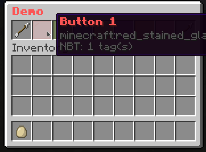
Unlike Button Paginated Mask, this mask paginates Masks instead of Buttons.
mask-name:
  mask: mask-paginated
  cycle: <true/false>
  signal: <signal>
  child:
    mask-1:
      <mask-settings>
    mask-2:
      <mask-settings>
...cycle: Whether the buttons should cycle when you reach the end of the page. If this is set to true, then when you reach the end of the page, it will go back to the first page. If this is set to false, then when you reach the end of the page, it will stop at the last page.signal: The signal name used by actions to change the page.next-page: <signal>: Changes the page to the next page.previous-page: <signal>: Changes the page to the previous page.set-page(<signal>): <page>: Changes the page to <page>.# The paginated mask
demo-slot:
mask: mask-paginated
cycle: false
signal: demo-page-signal # This is the signal name used by actions to change the page.
child:
0:
mask: pattern
pattern:
- "...xxx..."
- "...x.x..."
- "...x.x..."
- "...x.x..."
- "...xxx..."
child:
x:
id: red_stained_glass_pane
name: "&c&l0"
1:
mask: pattern
pattern:
- "....x...."
- "...xx...."
- "....x...."
- "....x...."
- "...xxx..."
child:
x:
id: red_stained_glass_pane
name: "&a&l1"
2:
mask: pattern
pattern:
- "...xxx..."
- ".....x..."
- "...xxx..."
- "...x....."
- "...xxx..."
child:
x:
id: red_stained_glass_pane
name: "&b&l2"
3:
mask: pattern
pattern:
- "...xxx..."
- ".....x..."
- "...xxx..."
- ".....x..."
- "...xxx..."
child:
x:
id: red_stained_glass_pane
name: "&d&l3"
4:
mask: pattern
pattern:
- "...x.x..."
- "...x.x..."
- "...xxx..."
- ".....x..."
- ".....x..."
child:
x:
id: red_stained_glass_pane
name: "&e&l4"
5:
mask: pattern
pattern:
- "...xxx..."
- "...x....."
- "...xxx..."
- ".....x..."
- "...xxx..."
child:
x:
id: red_stained_glass_pane
name: "&f&l5"
# The button to go to the previous page
previous-button:
slot: 18
id: arrow
name: "&c&lPrevious"
command: "previous-page: demo-page-signal" # The action to change the page
# The button to go to the next page
next-button:
slot: 26
id: arrow
name: "&a&lNext"
command: "next-page: demo-page-signal" # The action to change the page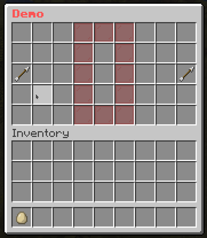
While you are creating menus with masks, you may find yourself repeating the same mask settings over and over again. This is where the template mask comes in handy. It allows you to create a template mask and use it in other masks.
mask-name:
  mask: template
  template: <name> # The name from template folder
  variable:
    <variable1>: <value1>
    <variable2>: <value2>
    ...
<mask-settings>The template folder (located at plugins/BetterGUI/addon/MaskedGUI/template) is a folder containing yml files defining common masks to use in all menus. That means you can create a template mask by simply creating a yml file in the template folder, add the common mask settings, and use it in other masks.
variable: The variable is a way to pass values to the template mask. Check out Use variable option for more information.# Template File
test-pattern:
mask: pattern
button:
"*":
id: purple_stained_glass_pane
name: "&b&lBody"
"x":
id: red_stained_glass_pane
name: "&c&lTarget"
"#":
id: pink_stained_glass_pane
name: "&a&lHead"demo-slot:
mask: animated
update: 3
child:
1:
mask: template
template: test-pattern
pattern:
- "......x.."
- "........."
- "........."
2:
mask: template
template: test-pattern
pattern:
- "......x.."
- "........."
- "#........"
3:
mask: template
template: test-pattern
pattern:
- "......x.."
- "........."
- "*#......."
4:
mask: template
template: test-pattern
pattern:
- "......x.."
- "........."
- "**#......"
5:
mask: template
template: test-pattern
pattern:
- "......x.."
- "..#......"
- "***......"
6:
mask: template
template: test-pattern
pattern:
- "..#...x.."
- "..*......"
- ".**......"
7:
mask: template
template: test-pattern
pattern:
- "..*#..x.."
- "..*......"
- "..*......"
8:
mask: template
template: test-pattern
pattern:
- "..**#.x.."
- "..*......"
- "........."
9:
mask: template
template: test-pattern
pattern:
- "..***#x.."
- "........."
- "........."
10:
mask: template
template: test-pattern
pattern:
- "..****#.."
- "........."
- "........."
11:
mask: template
template: test-pattern
pattern:
- "...****.."
- "......#.."
- "........."
12:
mask: template
template: test-pattern
pattern:
- "....***.."
- "......*.."
- "......#.."
13:
mask: template
template: test-pattern
pattern:
- ".....**.."
- "......*.."
- "......*#."
14:
mask: template
template: test-pattern
pattern:
- "......*.."
- "......*.."
- "......**#"
15:
mask: template
template: test-pattern
pattern:
- "........."
- "......*.."
- "......***"
16:
mask: template
template: test-pattern
pattern:
- "........."
- "........."
- "......***"
17:
mask: template
template: test-pattern
pattern:
- "........."
- "........."
- ".......**"
18:
mask: template
template: test-pattern
pattern:
- "........."
- "........."
- "........*"
19:
mask: template
template: test-pattern
pattern:
- "........."
- "........."
- "........."
This mask allows you to store a list of masks. Then you can make it switch to a specific mask from that list.
mask-name:
  mask: hybrid
  signal: <signal>
  default: <mask-name>
  child:
    mask-1:
      <mask-settings>
    mask-2:
      <mask-settings>
...signal: The signal name used by actions to switch the mask.default: The name of the mask from the child section used as a default mask. If it’s not set, the default mask will be empty.set-mask(<signal>): <mask>: Switch the mask to <mask>demo-slot:
mask: switch
signal: demo-page-signal # This is the signal name used by actions to switch the mask.
default: 0 # The default mask name
child:
0:
mask: pattern
pattern:
- "...xxx..."
- "...x.x..."
- "...x.x..."
- "...x.x..."
- "...xxx..."
child:
x:
id: red_stained_glass_pane
name: "&c&l0"
1:
mask: pattern
pattern:
- "....x...."
- "...xx...."
- "....x...."
- "....x...."
- "...xxx..."
child:
x:
id: red_stained_glass_pane
name: "&a&l1"
2:
mask: pattern
pattern:
- "...xxx..."
- ".....x..."
- "...xxx..."
- "...x....."
- "...xxx..."
child:
x:
id: red_stained_glass_pane
name: "&b&l2"
3:
mask: pattern
pattern:
- "...xxx..."
- ".....x..."
- "...xxx..."
- ".....x..."
- "...xxx..."
child:
x:
id: red_stained_glass_pane
name: "&d&l3"
4:
mask: pattern
pattern:
- "...x.x..."
- "...x.x..."
- "...xxx..."
- ".....x..."
- ".....x..."
child:
x:
id: red_stained_glass_pane
name: "&e&l4"
5:
mask: pattern
pattern:
- "...xxx..."
- "...x....."
- "...xxx..."
- ".....x..."
- "...xxx..."
child:
x:
id: red_stained_glass_pane
name: "&f&l5"
button-1:
slot: 47
name: "&e&l1"
id: arrow
command: "set-mask(demo-page-signal): 1"
button-2:
slot: 48
name: "&e&l2"
id: arrow
command: "set-mask(demo-page-signal): 2"
button-3:
slot: 49
name: "&e&l3"
id: arrow
command: "set-mask(demo-page-signal): 3"
button-4:
slot: 50
name: "&e&l4"
id: arrow
command: "set-mask(demo-page-signal): 4"
button-5:
slot: 51
name: "&e&l5"
id: arrow
command: "set-mask(demo-page-signal): 5"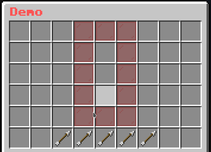
This mask is similar to Button Paginated Mask. The only difference is that this mask will fetch all online players and display each of them as a Button.
mask-name:
  mask: player-list
  slot: <slot>
  cycle: <true/false>
  signal: <signal>
  view-self: <true/false>
  view-offline: <true/false>
  player-update: 20
  viewer-update: 0
  player-condition:
  - condition1
  - condition2
  - condition3
  viewer-condition:
  - condition1
  - condition2
  - condition3
  button:
<button-settings>cycle: Whether the buttons should cycle when you reach the end of the page. If this is set to true, then when you reach the end of the page, it will go back to the first page. If this is set to false, then when you reach the end of the page, it will stop at the last page.signal: The signal name used by actions to change the page.view-self: Whether the mask will display the player that opens then menu.view-offline: Whether the mask will display all offline players instead of just online ones.player-condition: The list of Condition Requirement that the player must meet to appear in the list.viewer-condition: The list of Condition Requirement that the viewer must meet to see the player’s button.player-condition and viewer-condition is that the player-condition will be checked for each online players to gather the list of “passed” players to display in the menu, while viewer-condition will be checked between the viewer (who opens the menu) and the player in the “passed” players to determine if the viewer can see the player in the menu.button: The Button to be displayed for each players.player-update: The ticks to wait before the player list is refreshed.viewer-update: The ticks to wait before the “passed” player list from the viewer view is refreshed.next-page: <signal>: Changes the page to the next page.previous-page: <signal>: Changes the page to the previous page.set-page(<signal>): <page>: Changes the page to <page>.player-condition and button{current_player_<variable_name>} to fetch the variable <variable_name> of the target player{player} -> {current_player}{ping} -> {current_player_ping}{exp_to_level} -> {current_player_exp_to_level}{current_player_papi_<placeholder_name>} to fetch the PlaceholderAPI’s placeholder <placeholder_name> of the target playerdemo-slot:
mask: player-list
signal: demo-page-signal # This is the signal name used by actions to change the page.
slot: 2-1-8-1
view-self: true
button:
id: player_head
skull: "{current_player}"
name: "&c{current_player}"
lore:
- "&eX: &f{current_player_x}"
- "&eY: &f{current_player_y}"
- "&eZ: &f{current_player_z}"
command: "console: tp {player} {current_player}"
close-on-click: true
# The button to go to the previous page
previous-button:
slot: 0
id: arrow
name: "&c&lPrevious"
command: "previous-page: demo-page-signal" # The action to change the page
# The button to go to the next page
next-button:
slot: 8
id: arrow
name: "&a&lNext"
command: "next-page: demo-page-signal" # The action to change the page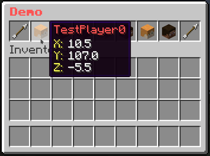
This mask is similar to Button Paginated Mask, but you can specify a list of values and display each of them as a Button.
mask-name:
  mask: value-list
  slot: <slot>
  cycle: <true/false>
  signal: <signal>
  value-update: 20
  viewer-update: 0
  viewer-condition:
  - condition1
  - condition2
  - condition3
  value:
  - value1
  - value2
  - value3
  button:
<button-settings>cycle: Whether the buttons should cycle when you reach the end of the page. If this is set to true, then when you reach the end of the page, it will go back to the first page. If this is set to false, then when you reach the end of the page, it will stop at the last page.signal: The signal name used by actions to change the page.viewer-condition: The list of Condition Requirement that the viewer must meet to see the button.value: The list of valuesbutton: The Button to be displayed for each values.value-update: The ticks to wait before the value list is refreshed.viewer-update: The ticks to wait before the “passed” value list from the viewer view is refreshed.next-page: <signal>: Changes the page to the next page.previous-page: <signal>: Changes the page to the previous page.set-page(<signal>): <page>: Changes the page to <page>.button, you can get the current value from the value list by using the variable {current_value}# The paginated mask
demo-slot:
mask: value-list
slot: 1-7
cycle: false
signal: demo-page-signal # This is the signal name used by actions to change the page.
value:
- red_stained_glass_pane
- green_stained_glass_pane
- blue_stained_glass_pane
- yellow_stained_glass_pane
- purple_stained_glass_pane
- orange_stained_glass_pane
- pink_stained_glass_pane
- black_stained_glass_pane
- white_stained_glass_pane
- gray_stained_glass_pane
- light_gray_stained_glass_pane
button:
id: "{current_value}"
name: "&c&lButton"
# The button to go to the previous page
previous-button:
slot: 0
id: arrow
name: "&c&lPrevious"
command: "previous-page: demo-page-signal" # The action to change the page
# The button to go to the next page
next-button:
slot: 8
id: arrow
name: "&a&lNext"
command: "next-page: demo-page-signal" # The action to change the page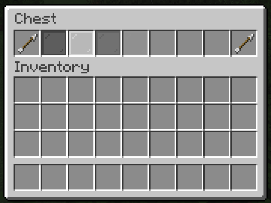
This mask is similar to Button Paginated Mask, but you can specify a list of map-like values and display each of them as a Button.
mask-name:
  mask: key-value-list
  slot: <slot>
  cycle: <true/false>
  signal: <signal>
  value-update: 20
  viewer-update: 0
  viewer-condition:
  - condition1
  - condition2
  - condition3
  value:
  - key1: value1
    key2: value2
    key3: value3
  - key1: value11
    key2: value12
    key3: value13
  - key1: value21
    key2: value22
    key3: value23
  button:
<button-settings>cycle: Whether the buttons should cycle when you reach the end of the page. If this is set to true, then when you reach the end of the page, it will go back to the first page. If this is set to false, then when you reach the end of the page, it will stop at the last page.signal: The signal name used by actions to change the page.viewer-condition: The list of Condition Requirement that the viewer must meet to see the button.value: The list of map-like valuesbutton: The Button to be displayed for each values.value-update: The ticks to wait before the value list is refreshed.viewer-update: The ticks to wait before the “passed” value list from the viewer view is refreshed.next-page: <signal>: Changes the page to the next page.previous-page: <signal>: Changes the page to the previous page.set-page(<signal>): <page>: Changes the page to <page>.button, you can use a key to get the value from the value list by using the variable {key_<name>}value listvalue:
- material: red_stained_glass_pane
name: "Button 1"
- material: green_stained_glass_pane
name: "Button 2"{key_material} to get the material part of the value{key_name} to get the name part of the value# The paginated mask
demo-slot:
mask: key-value-list
slot: 1-7
cycle: false
signal: demo-page-signal # This is the signal name used by actions to change the page.
value:
- material: red_stained_glass_pane
name: Button 1
- material: green_stained_glass_pane
name: Button 2
- material: blue_stained_glass_pane
name: Button 3
- material: yellow_stained_glass_pane
name: Button 4
- material: purple_stained_glass_pane
name: Button 5
- material: orange_stained_glass_pane
name: Button 6
- material: pink_stained_glass_pane
name: Button 7
- material: black_stained_glass_pane
name: Button 8
- material: white_stained_glass_pane
name: Button 9
- material: gray_stained_glass_pane
name: Button 10
- material: light_gray_stained_glass_pane
name: Button 11
button:
id: "{key_material}"
name: "&c&l{key_name}"
# The button to go to the previous page
previous-button:
slot: 0
id: arrow
name: "&c&lPrevious"
command: "previous-page: demo-page-signal" # The action to change the page
# The button to go to the next page
next-button:
slot: 8
id: arrow
name: "&a&lNext"
command: "next-page: demo-page-signal" # The action to change the page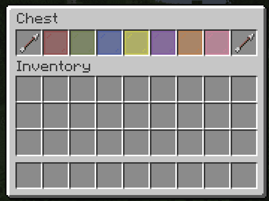
This mask is similar to Button Paginated Mask, but you can filter out the buttons with specific requirements.
mask-name:
  mask: filtered-button-paginated
  slot: <slot>
  cycle: <true/false>
  signal: <signal>
  update: 20
  child:
    button-1:
      <button-settings>
      filter-requirement:
        <requirement-set>
        <requirement-set>
        <requirement-set>
        ...

    button-2:
      <button-settings>
      filter-requirement:
        <requirement-set>
        <requirement-set>
        <requirement-set>
        ...

    button-3:
      <button-settings>
      filter-requirement:
        <requirement-set>
        <requirement-set>
        <requirement-set>
        ...
...cycle: Whether the buttons should cycle when you reach the end of the page. If this is set to true, then when you reach the end of the page, it will go back to the first page. If this is set to false, then when you reach the end of the page, it will stop at the last page.signal: The signal name used by actions to change the page.update: The ticks to wait before the mask is refreshed.filter-requirement on the button to remove it from the list if the player doesn’t meet the requirements.view-requirement, but the difference is that, while buttons with view-requirement will leave an empty button on the list, those with filter-requirement will be removed from the list if the player doesn’t meet the requirements.next-page: <signal>: Changes the page to the next page.previous-page: <signal>: Changes the page to the previous page.set-page(<signal>): <page>: Changes the page to <page>.# The paginated mask
demo-slot:
mask: filtered-button-paginated
slot: 1-7
cycle: false
signal: demo-page-signal # This is the signal name used by actions to change the page.
child:
button1:
id: red_stained_glass_pane
name: "&c&lButton 1"
filter-requirement:
test-level:
level:
value: 1
take: false
button2:
id: green_stained_glass_pane
name: "&a&lButton 2"
filter-requirement:
test-level:
level:
value: 2
take: false
button3:
id: blue_stained_glass_pane
name: "&9&lButton 3"
filter-requirement:
test-level:
level:
value: 4
take: false
button4:
id: yellow_stained_glass_pane
name: "&e&lButton 4"
filter-requirement:
test-level:
level:
value: 5
take: false
button5:
id: purple_stained_glass_pane
name: "&5&lButton 5"
filter-requirement:
test-level:
level:
value: 6
take: false
button6:
id: orange_stained_glass_pane
name: "&6&lButton 6"
filter-requirement:
test-level:
level:
value: 10
take: false
button7:
id: pink_stained_glass_pane
name: "&d&lButton 7"
filter-requirement:
test-level:
level:
value: 11
take: false
button8:
id: black_stained_glass_pane
name: "&0&lButton 8"
filter-requirement:
test-level:
level:
value: 11
take: false
button9:
id: white_stained_glass_pane
name: "&f&lButton 9"
filter-requirement:
test-level:
level:
value: 11
take: false
button10:
id: gray_stained_glass_pane
name: "&7&lButton 10"
filter-requirement:
test-level:
level:
value: 12
take: false
button11:
id: light_gray_stained_glass_pane
name: "&8&lButton 11"
filter-requirement:
test-level:
level:
value: 12
take: false
# The button to go to the previous page
previous-button:
slot: 0
id: arrow
name: "&c&lPrevious"
command: "previous-page: demo-page-signal" # The action to change the page
# The button to go to the next page
next-button:
slot: 8
id: arrow
name: "&a&lNext"
command: "next-page: demo-page-signal" # The action to change the page
# Button to give XP
give-xp:
slot: 9-17
id:
- EXPERIENCE_BOTTLE
- EXP_BOTTLE
name: "&eGive &f10 XP"
lore:
- ""
- "&fLevel: {level}"
click-requirement:
old-version:
version: 13 # Check if the server is at 1.13.X
success-action: "console: xp add {player} 10 points"
fail-action: "console: xp 10 {player}"