Item
This is a component to display an item in a dialog, with an optional text description.
Format
item-component-name:
type: item
# The description of the item
# Optional. If not provided, the item will not have a description.
description:
# The text to display as the description of the item.
text: "Item description"
# The width of the description text in pixels.
width: 150
# Whether to show decorations
show-decorations: true
# Whether to show tooltip when hovering over the item.
show-tooltip: true
# The width of the item in pixels.
width: 150
# The height of the item in pixels.
height: 150
# The Item modifiers
modifier1: value1
modifier2: value2
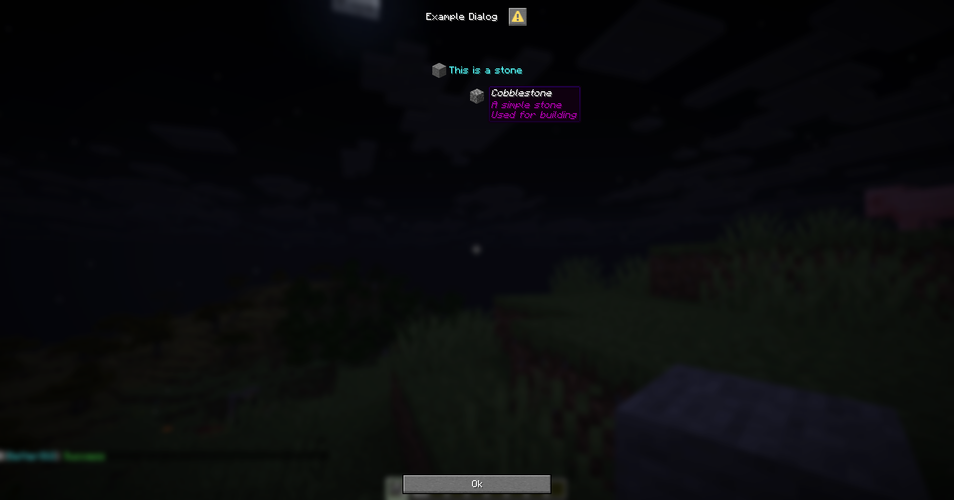
modifier3: value3Example
menu-settings:
  menu-type: notice-dialog
  title: "Example Dialog"
  command: exampledialog

one-item:
  type: item
  description:
    text: "&bThis is a stone"
    width: 500

  id: stone
  name: "Stone"
  lore:
    - "A simple stone"
    - "Used for building"

item-no-description:
  type: item
  id: cobblestone
  name: "Cobblestone"
  lore:
    - "A simple stone"
    - "Used for building"