This is a component for inputs from the player. It allows the player to interact with the dialog and provide user input so that the dialog can send the information to the server.
The next sections will provide more information about each type of input component.
For each input, you can retrieve the value using the {dialog_<name>} variable, where <name> is the name of the input component.
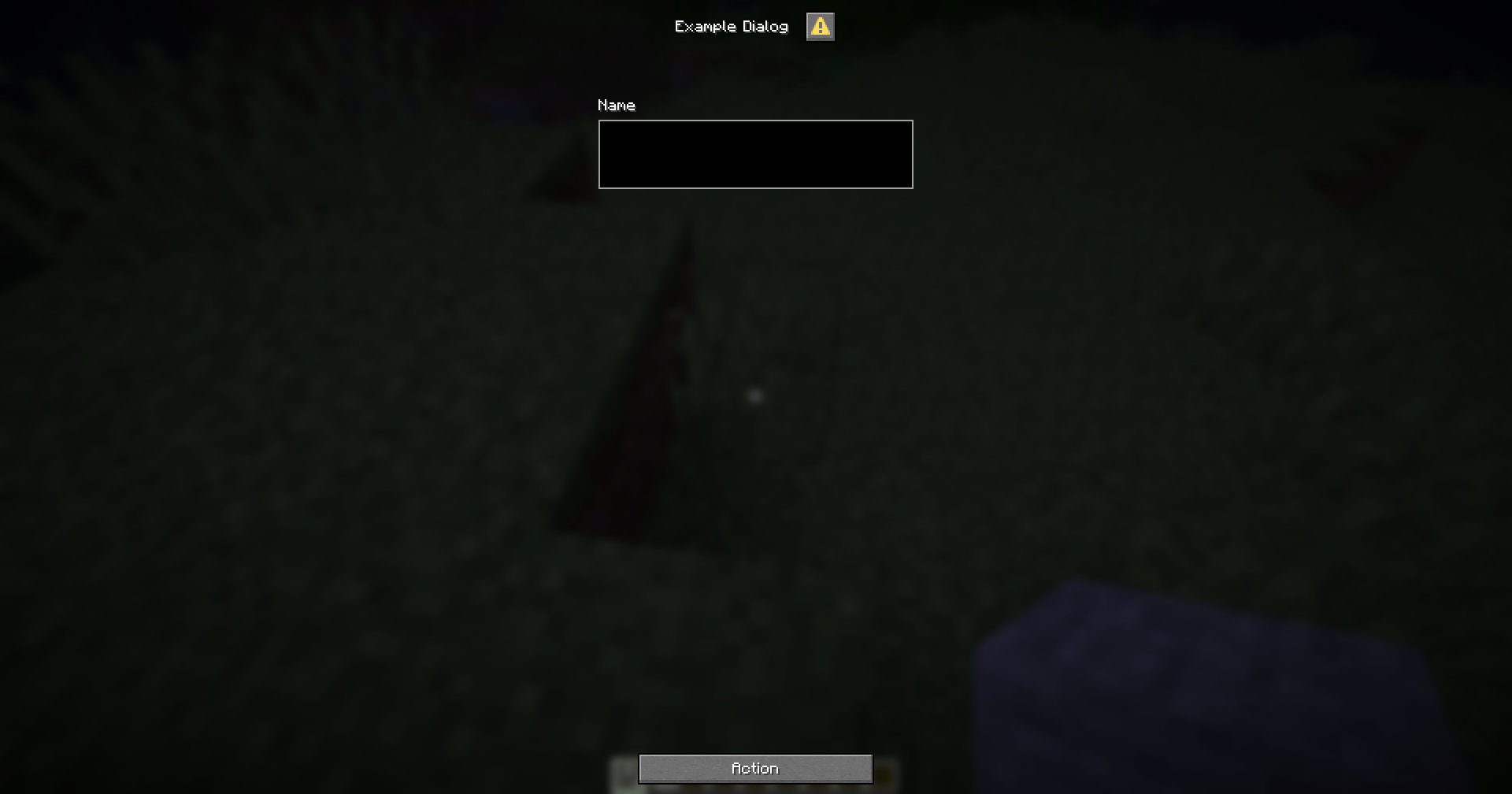
For example, if you have an dialog with an input component like this:
menu-settings:
  menu-type: notice-dialog
  title: "Example Dialog"
  command: exampledialog

name:
  type: input
  label: "Name"

hello:
  type: action
  command: "tell: &b&lHello, &f&l{dialog_name}"
You can retrieve the value of the name component using the {dialog_name} variable, as shown in the hello action.
Subsections of Input
Text
This is an input component that allows players to enter text.
text-input-name:
  # The type of the input component.
  type: input

  # The label of the input component.
  # If not provided, the label will be hidden.
  label: "Text Input"

  # The width of the input component.
  # If not provided, the width will be 200px.
  width: 200

  # The initial value of the input component.
  # If not provided, the initial value will be empty.
  initial: "Hello World"

  # The maximum length of the input component.
  # If not provided, the length will be 32.
  max-length: 32

  # The maximum number of lines the input component can have.
  # Optional.
  max-lines: 5

  # The height of the input component.
  # Optional.
  height: 100
Example
menu-settings:
  menu-type: notice-dialog
  title: "Example Dialog"
  command: exampledialog

name:
  type: input
  label: "Name"

hello:
  type: action
  command: "tell: &b&lHello, &f&l{dialog_name}"
Checkbox
This is an input component that allows players to check a box.
checkbox-input-name:
  # The type of the input component
  type: checkbox

  # The label of the input component
  label: Checkbox Label

  # The initial state of the checkbox
  # If not specified, the checkbox will be unchecked by default
  initial: false

  # The value of the checkbox when checked
  # If not specified, the value will be "true"
  on-true: "Checked"

  # The value of the checkbox when unchecked
  # If not specified, the value will be "false"
  on-false: "Unchecked"
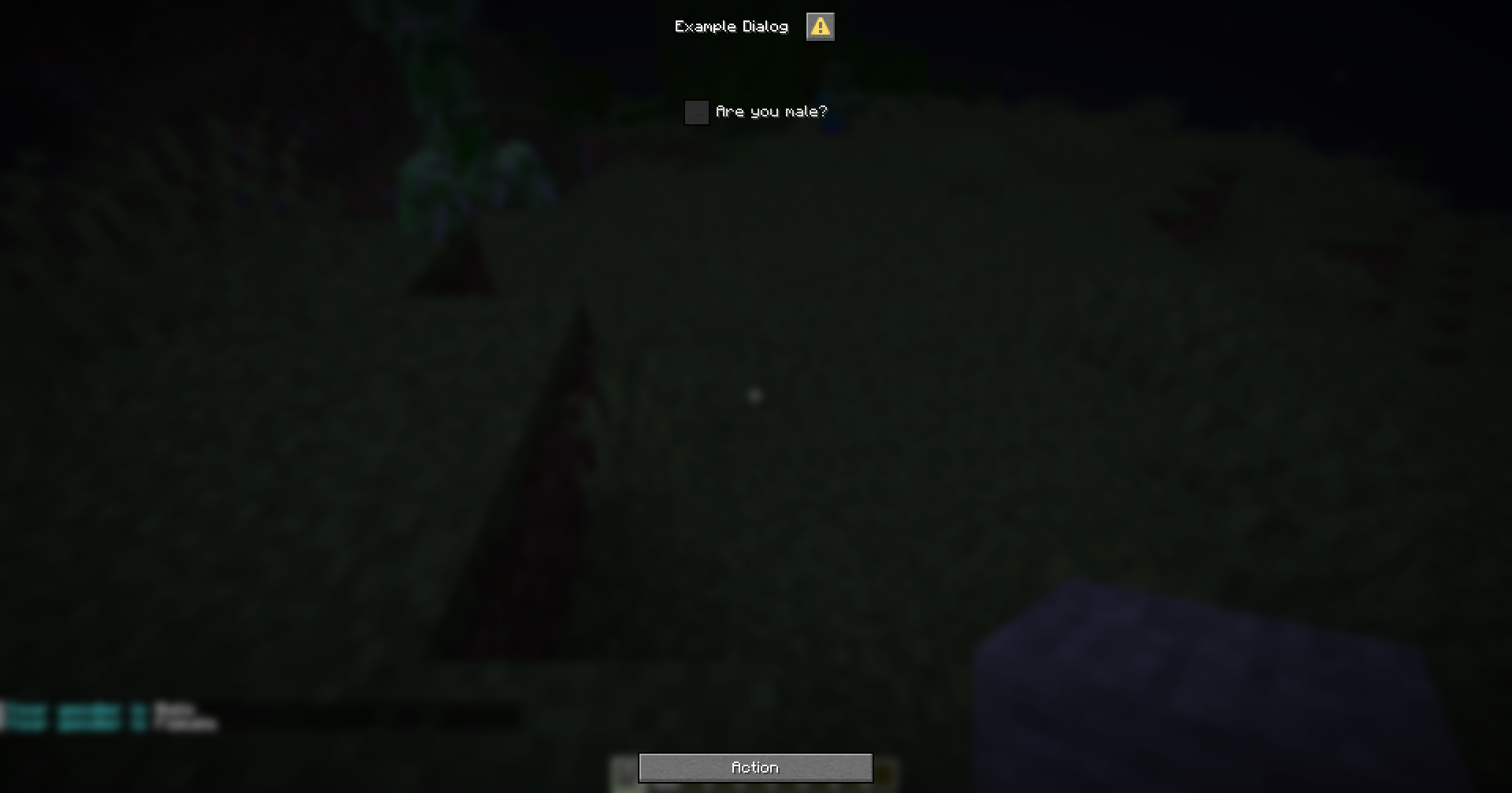
Example
menu-settings:
  menu-type: notice-dialog
  title: "Example Dialog"
  command: exampledialog

gender:
  type: checkbox
  label: "Are you male?"
  on-true: "Male"
  on-false: "Female"

hello:
  type: action
  command: "tell: &b&lYour gender is &f&l{dialog_gender}"
Slider
This is an input component that allows players to select a value within a specified range using a slider.
slider-input-component:
  # The type of the input component.
  type: slider

  # The label for the input component.
  label: "Slider Label"

  # The format for the label.
  # If not specified, the label will be displayed as is.
  label-format: "options.generic_value"

  # The start value of the slider.
  start: 0

  # The end value of the slider.
  end: 100

  # The step value of the slider.
  # If not specified, the step will be calculated automatically based on the range.
  step: 1

  # The initial value of the slider.
  # If not specified, the initial value will be at the start of the range.
  initial: 50
You can define the display format for the slider value when using the variable by following the variable format {dialog_<variable_name>:<format>}
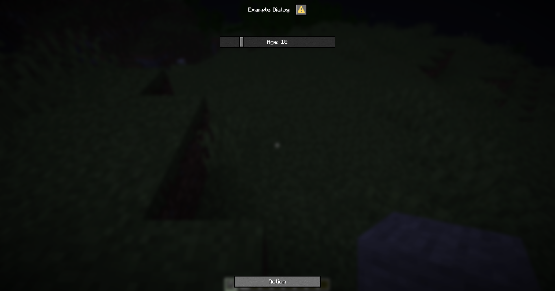
Example
menu-settings:
  menu-type: notice-dialog
  title: "Example Dialog"
  command: exampledialog

age:
  type: slider
  label: "Age"
  start: 0
  end: 100
  step: 1
  initial: 18

hello:
  type: action
  command:
    - "tell: &b&lYour age is &f&l{dialog_age}"
    - "tell: &b&lYour age is &f&l{dialog_age:000}"
Select
This is an input component that allows the player to select an option from a list.
select-input-name:
  # The type of the input component.
  type: select

  # The label of the input component.
  # If not specified, the label will be hidden
  label: "Select an option"

  # The width of the input component.
  # If not specified, the width will be 200 pixels.
  width: 200

  # The available options for the input component.
  # Each option is a key-value pair, where the key is the option's value and the value is the option's label.
  options:
    option1: "Option 1"
    option2: "Option 2"
    option3: "Option 3"

  # The key of the initial option for the input component.
  # If not specified, the first option will be selected by default.
  initial: option1
Variable
When you use the {dialog_<name>} variable, it will return the key of the selected option.
If you want to get the label of the selected option, you can use the {dialog_<name>:display} variable.
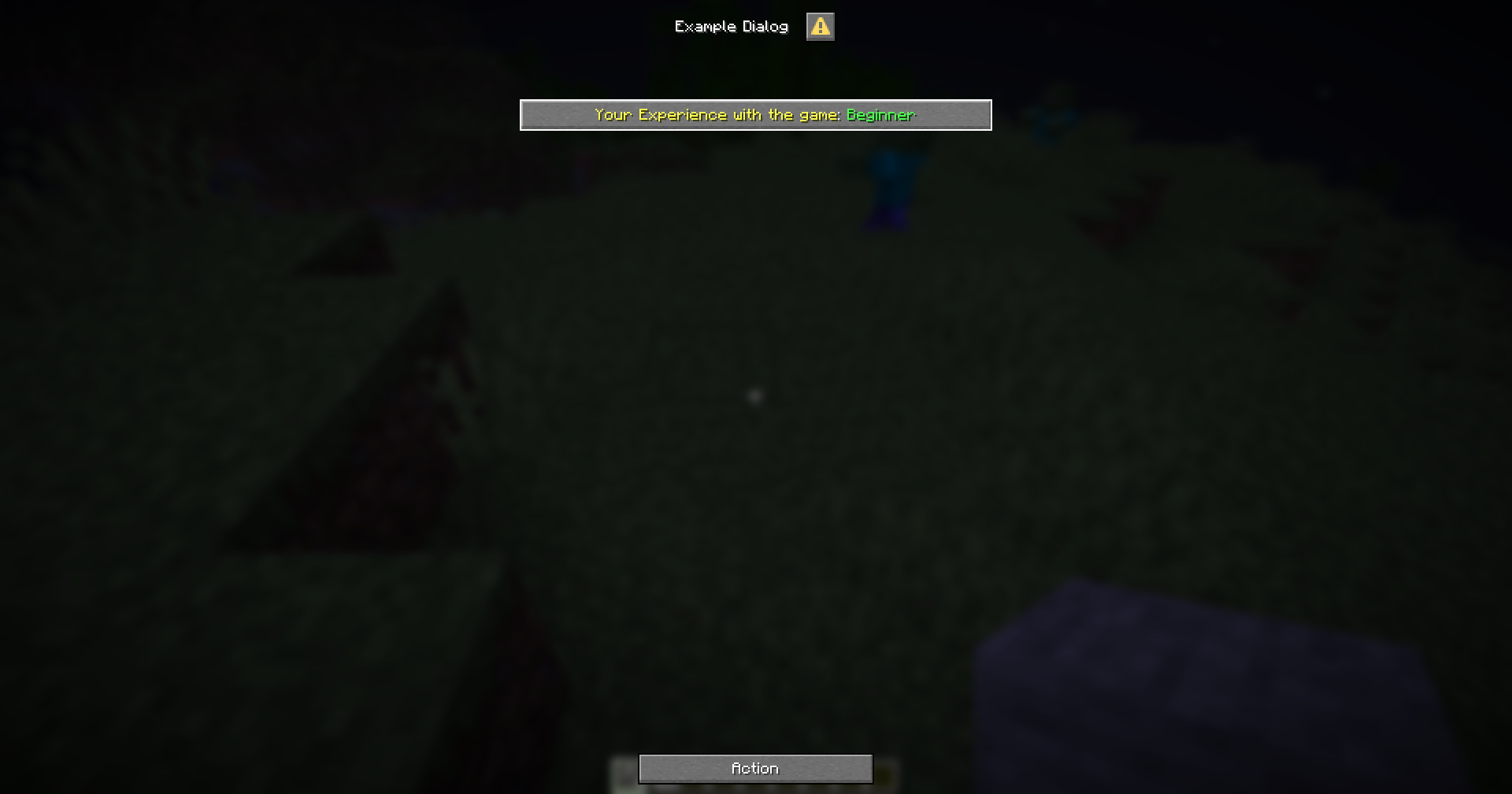
Example
menu-settings:
  menu-type: notice-dialog
  title: "Example Dialog"
  command: exampledialog

experience:
  type: select
  label: "&eYour Experience with the game"
  width: 300
  options:
    beginner: "&aBeginner"
    intermediate: "&eIntermediate"
    advanced: "&6Advanced"
    expert: "&cExpert"
  initial: beginner

hello:
  type: action
  command:
    - "tell: &bYour selected experience is &f{dialog_experience}"
    - "tell: &bYour selected experience is &f{dialog_experience:display}"