BetterGUI

BetterGUI is a Spigot plugin to create inventory menus. It’s known for the modular design so that addons can be made to add more features to the main plugin.

Feature

Supporters

JetBrains

JetBrains Logo (Main) logo.

We joined JetBrains Open Source, who provides licenses for open-source and non-commercial projects.

Subsections of BetterGUI

Chapter 1

Basic

This contains the basic tutorials of the plugin, including the installation, the commands & the FAQs

Subsections of Basic

Install the plugin

  1. Download the plugin
  2. Copy/Cut the plugin and paste it to your plugins folder
  3. Start the server to let it load
  4. Stop the server
  5. Make some configs and menus
  6. Start the server and voila

Add an addon

  1. Download the addon
  2. Go to the plugins/BetterGUI/addon folder
  3. Copy/Cut the downloaded jar file and paste it to the folder
  4. Start/Restart the server
  5. Done

Command & Permission

CommandPermissionDescription
betterguibettergui.helpShow available commands and menu commands
addonsbettergui.addonsGet the loaded addons
openmenu <filename.yml> [player] [args]bettergui.openmenuOpen the specific menu (for a specific player)
reloadmenubettergui.reloadReload all menus
reloadpluginbettergui.reloadReload the plugin
getvariablesbettergui.variableGet the registered variables
getvariables <filename.yml>bettergui.variableGet the registered variables for a menu
gettemplatebuttonsbettergui.templatebuttonsGet the registered template buttons
bettergui.<filename>.ymlThe permission that is required to open the menu
bettergui.openmenu.bypassAllow the player to open all menus

Config

# Use BetterGUI's Click Type with support for number keys
use-modern-click-type: false

# Whether the plugin replaces all similar variables on every check
replace-all-variables-each-check: true

# Use the legacy button that supports the old settings
use-legacy-button: true

# Whether the plugin should use the relative path name instead of the file name when registering menus
relative-menu-name: false

# Whether the plugin should trim the file extension of the menu name
trim-menu-file-extension: false

# Whether the config file name should be included in template name
# If set to true, the template name will be "<config>/<template>" instead of "<template>"
include-menu-in-template: false

Frequently Asked Questions

Why does this plugin exist?

I used Chest Commands GUI to make menus for a long time. Some other GUI plugins (like DeluxeMenus and BossShop) are awesome, but I’m lazy to learn just to create the menu I want. I want a plugin with the same format as Chest Commands GUI and the features I need. Therefore, I created this.

Why does it look like Chest Commands?

Before starting this plugin, I also made a fork for Chest Commands called “Chest Commands GUI - Forked”. Due to some frustrating problems while working with it, I decided to shut it down and make my own. I keep the old style because it’s the simplest one and many people have been using it for years.

Why should I use this plugin?

I don’t know. I’m bad at giving you a motivation to use this. There are even a lot of GUI plugins that are somehow better than this. But this plugin preserves some basic features of a GUI plugin should have (like Chest Commands, one of the famous plugin). You can use this to make some basic or animated menus. The style of the menu settings is fairly simple to learn (but the wiki may not). You can join my Discord to get support, I’m happy to help you_

TL;DR: Basic features, simple style, good support

Why don’t you combine all features from addons into one big plugin?

One of the goals of this plugin is to create a plugin that can be used by any type of servers. Since I don’t know which feature is commonly used, combining all features would be a waste of resources, as some functions are rarely used. So I give the users the choice of choosing which features they want.

Why does X not work?

Join my Discord server. I’m there to help you
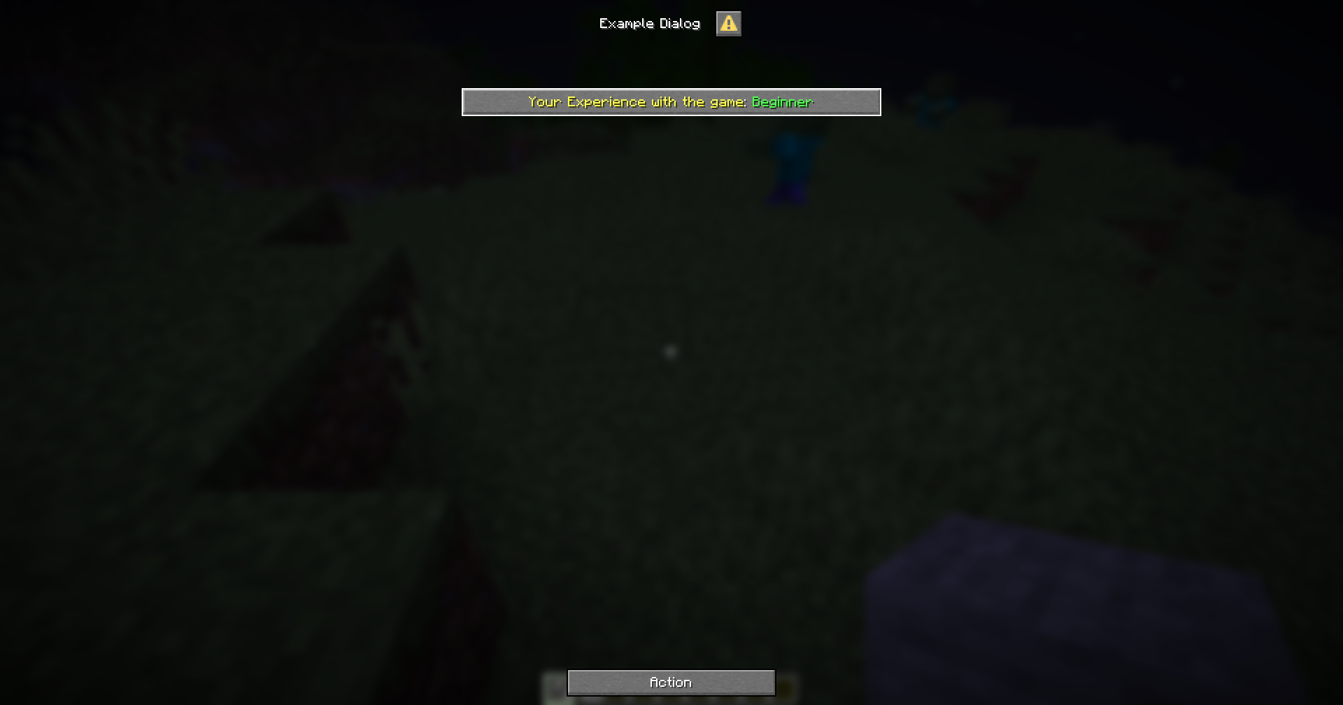
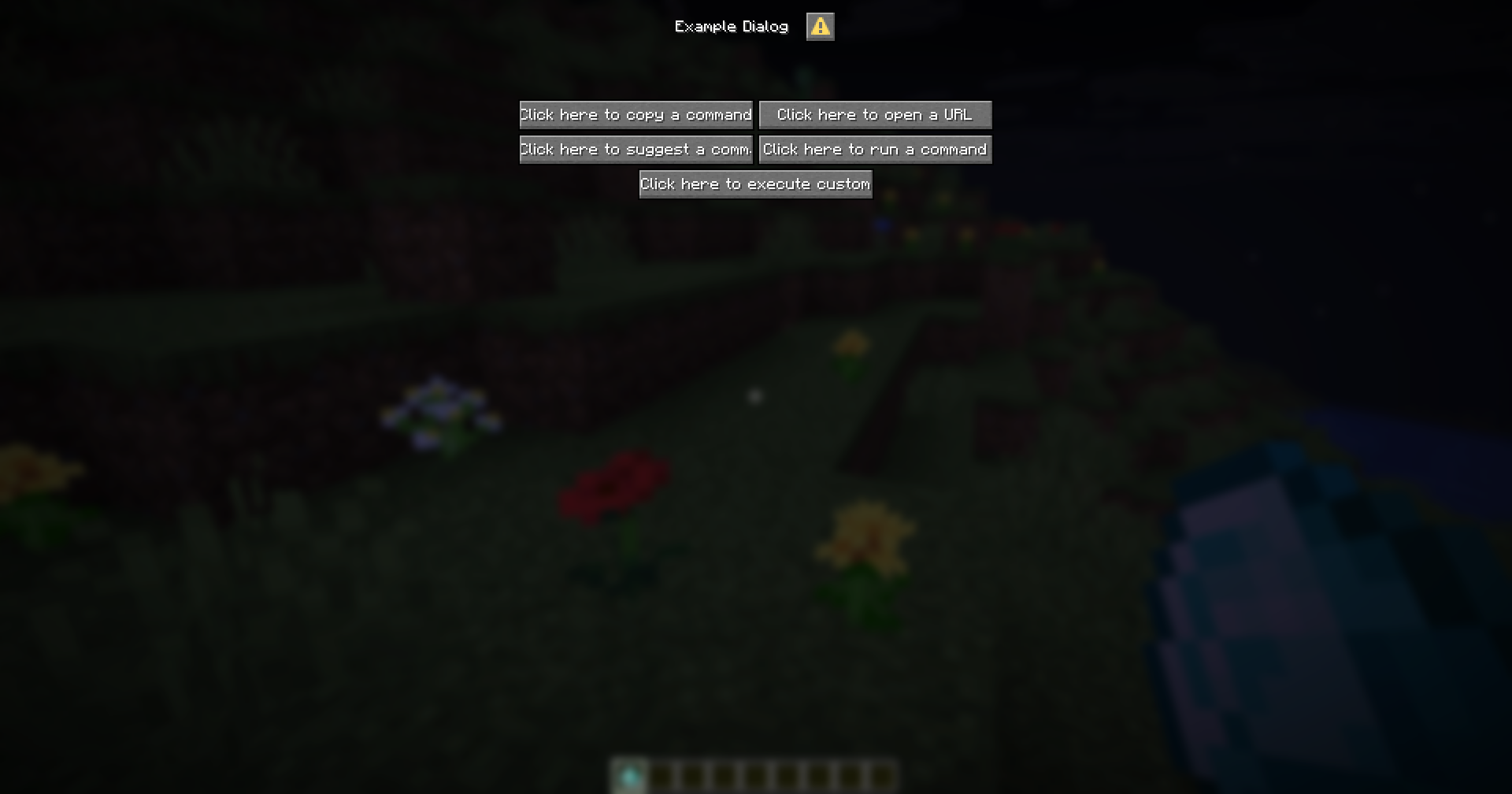
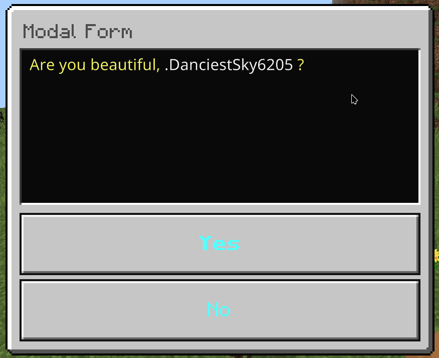
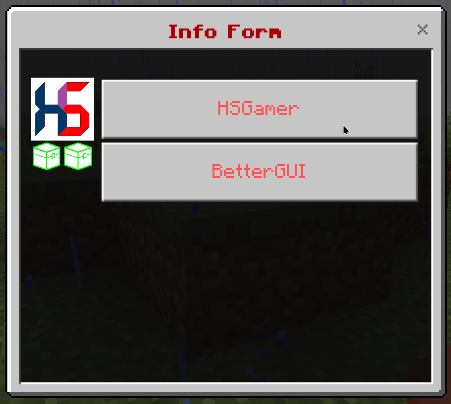
How to use X?

Read the wiki

Why don’t you add a migrator from other GUI plugins? Like Chest Commands GUI, DeluxeMenus, BossShop, TrMenu, etc

Those plugins combine a lot of features into one plugin only. BetterGUI has a different approach, only useful features are in the main plugin, Others are in addons. I won’t support all features of these plugins in BetterGUI, because I don’t have any reason to create and maintain a converter from their plugins. One more thing, These plugins are not abandoned, the authors still support and update them (Maybe not in a frequent time), so why don’t you use them?

Why are you slow in helping us on your plugins?

I’m a human, you know. I have a life, and get busy with it. My plugins are free and I only do these plugins in my free-time, to fulfill my own needs. Therefore, my help support is voluntary, not mandatory, so are my Discord helpers. I may answer your questions when I have time, and I don’t have a responsibility to answer your question instantly. Well, my time is important than yours, don’t expect me to spend my busy time for free, but if it’s in my free time, I can help you.

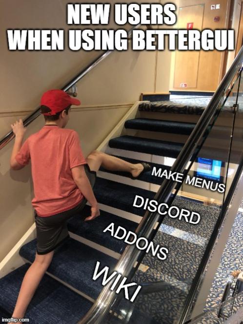
I don’t like the wiki. Don’t waste my time. Make it easy to use already. I don’t understand how to use it. I’ll give you 1 star for this.

So you are not a patient person, and want to do everything fast? Well, then you will not get anything useful from this wiki, or any wiki from any big plugins. It takes time to learn something, I don’t even encourage you to use this plugin. Your choice is yours. Your time is yours. But sometimes a few things in your life cannot be done fast. Even if it can, it may be done poorly, so I want to avoid it and do slowly and steadily. If you are finding a plugin that is easy or fast to create your dream menus, or has an in-game editor, this is not the place, choose another one. But if you choose this plugin, spend some time reading the full wiki, as you may miss features that are useful. Don’t be this meme

Can you add X to your plugin?

Before requesting, you should check if your request already exists on the Addon. If it does not exist, you can either join my Discord server or create an issue.

Chapter 2

Menu

The biggest unit which serves as an interface the user can interact & do actions with.

Subsections of Menu

Overview

  • Menus are what BetterGUI is for. It’s the thing displayed to the player.
  • There are many built-in types of Menu (Check the sidebar). A developer can also make his own menu and register to the plugin.
  • Generally, a menu contains 2 sections: menu-settings and Button
  • You can set the type of menu by setting the menu-type value in the menu-settings section

Example

menu-settings:
  name: '&c&lExample Menu'
  rows: 6
  command: menu
  auto-refresh: 5
  open-action:
    - "tell: &eYou opened the example menu"
  close-action:
    - "tell: &cYou closed the example menu"

# Buttons
spawn-cmd:
  COMMAND: 'spawn'
  NAME: '&u/spawn'
  LORE:
    - 'It just executes /spawn'
    - 'as the player who clicked.'
  ID: ender_pearl
  POSITION-X: 1
  POSITION-Y: 2

Simple Menu

This is the default menu type of BetterGUI, represents a chest-like GUI.

Format

menu-settings:
  menu-type: simple # You don't need to set this type. It's the default value

  # The actions when the player opens the menu
  open-action:
  - action
  - action
  - action
  ...

  # The actions when the player closes the menu
  close-action:
  - action
  - action
  - action
  ...

  # The type of the display inventory
  # https://hub.spigotmc.org/javadocs/spigot/org/bukkit/event/inventory/InventoryType.html
  inventory-type: <inventory-type>
  #inventory: <inventory-type>

  # The rows <1-6> of the inventory if the type is CHEST
  rows: <1-6>

  # How frequently the menu will refresh itself
  auto-refresh: <ticks>
  #ticks: <ticks>

  # The requirement before the player can open the menu
  view-requirement:
    <requirement-set>
    <requirement-set>
    <requirement-set>
    ...

  # The requirement before the player can close the menu
  close-requirement:
    <requirement-set>
    <requirement-set>
    <requirement-set>
    ...

  # The permission required to open the menu
  permission: bettergui.test

  # The command to open the menu
  command:
  - command1
  - command2
  ...

  # The title of the inventory
  title: <name>
  #name: <name>

  # Save the display to the cache for later use
  # This option is mainly used to fix a "self-open" issue when the player open the same menu
  cached: <true/false>

  # The creator to create the inventory. Mainly used to create custom inventories provided by addons.
  creator: default

  # The list of argument processors to process the arguments of the command to open the menu
  argument-processor:
  - <argument-processor>
  - <argument-processor>
 
  # The delay in milliseconds that a player can click the buttons of the menu
  click-delay: <millis>

# This is a special button. It will fill all empty slots of the inventory (You don't need to set this button)
default-button:
  <button-settings>

button1:
  <button-settings>
button2:
  <button-settings>
...

Note

  • open-action: the Action when the menu is opened.
  • close-action: the Action when the menu is closed.
  • view-requirement: the Requirement to check before opening the menu. If it is not met, the menu will not be opened.
  • close-requirement: the Requirement to check before closing the menu. If it is not met, the menu will not be closed.
  • argument-processor: the Argument Processor to handle the arguments of the command to open the menu.

Example

menu-settings:
  name: '&c&lExample Menu'
  rows: 6
  command: menu
  auto-refresh: 5
  open-action:
    - "tell: &eYou opened the example menu"
  close-action:
    - "tell: &cYou closed the example menu"

default-icon:
  type: animated
  child:
    frame1:
      id:
        - RED_STAINED_GLASS_PANE
        - STAINED_GLASS_PANE:14
    frame2:
      id:
        - GREEN_STAINED_GLASS_PANE
        - STAINED_GLASS_PANE:13
    frame3:
      id:
        - BLUE_STAINED_GLASS_PANE
        - STAINED_GLASS_PANE:11

# Buttons
spawn-cmd:
  COMMAND: 'spawn'
  NAME: '&u/spawn'
  LORE:
    - 'It just executes /spawn'
    - 'as the player who clicked.'
  ID: ender_pearl
  POSITION-X: 1
  POSITION-Y: 2

durability-armor:
  NAME: '&aDamaged armor'
  LORE:
    - 'This armor is damaged.'
  ID: diamond helmet
  DAMAGE: 100
  POSITION-X: 2
  POSITION-Y: 2

Addon Downloader

  • This is a special menu that displays the available addons of BetterGUI.
  • You can view the addons and read their wiki
  • You can also download addons and they’ll be installed automatically (Requires restarting the server after downloading to enable the addons)

Format

menu-settings:
  menu-type: addon

  # The name of the menu
  name: '&c&lAddon Downloader'

  # The rows of the menu
  rows: 3

  # The command to open the menu
  command:
    - addondownloader
    - addondl

  # The period in ticks to refresh the menu
  auto-refresh: 5

# The button for each addon
button:
  material:
    - LIGHT_BLUE_STAINED_GLASS_PANE
    - STAINED_GLASS_PANE:3
  name: "&f{name} &c- &4{status}"
  lore:
    - "&f{description}"
    - "&fAuthors: &e{author}"
    - "&fVersion: &e{version}"
    - ""
    - "&bLeft click &fto download"
    - "&bRight click &fto get the source code"
    - "&bMiddle click &fto see the wiki"

Predicate Menu

This is an arbitrary menu that serves as a switch that you can add some Menus and some Requirements for each Menu to check before opening one of them.

Format

menu-settings:
  menu-type: predicate

  permission: bettergui.test

  command:
  - command1
  - command2
  ...

  argument-processor:
  - <argument-processor>
  - <argument-processor>

menu-name1:
  menu: <menu-file>
  argument: <args>
  requirement:
    <requirement-set>
    <requirement-set>
    <requirement-set>
    ...

menu-name2:
  menu: <menu-file>
  argument: <args>
  requirement:
    <requirement-set>
    <requirement-set>
    <requirement-set>
    ...

Note

  • menu-settings

    • permission: the required permission to open the menu.
    • command: the commands to open the menu.
    • argument-processor: the Argument Processor to handle the arguments of the command to open the menu.
  • menu-name1, menu-name2, etc.

    • menu: the file of the menu to open,
    • argument: the argument to pass when opening the menu. It’s optional
    • requirement: the Requirement to check before opening the menu. If it’s not set, the plugin will assume that the menu can always be opened.
  • The plugin will check the requirement of each menus in the top-down order of the config. If it found a menu whose requirements are met, it would open that menu. Otherwise, nothing happened.

Example

# level-predicate.yml
menu-settings:
  menu-type: predicate
  command: level

level-5:
  menu: level-5.yml
  requirement:
    check-level:
      level:
        value: 5
        take: false

level-2:
  menu: level-2.yml
  requirement:
    check-level:
      level:
        value: 2
        take: false

level-0:
  menu: level-0.yml

# level-5.yml
menu-settings:
  title: "&aYou reached level 5!"

# level-2.yml
menu-settings:
  title: "&aYou reached level 2!"

# level-0.yml
menu-settings:
  title: "&cYou don't have enough levels!"
Chapter 3

Button

The visible unit of a Menu that provides a display button the user can interact & do actions when clicked.

Subsections of Button

Overview

  • A button is what is shown in the menu.
  • When the player clicks a button, some actions are executed.
  • A button can also be updated.
  • There are many built-in types of button (Check the sidebar). A developer can make his own button and register to the plugin.
  • You can specify the type of button by setting the type option.

Example

simple-button: #
  slot: 1
  id: cobblestone
  name: "&bThis is a simple button"
  lore:
  - ""
  - "&fThis is a lore"
  action: "tell: &eYou clicked"
  close-on-click: true

animated-icon:
  slot: 2
  type: animated
  update: 5
  child:
    frame_icon1:
      name: "&cFrame 1"
      id: red_wool
      lore:
        - "This is part of an animated icon"
    frame_icon2:
      name: "&aFrame 2"
      id: green_wool
      lore:
        - "This is part of an animated icon"
    frame_icon3:
      name: "&bFrame 3"
      id: light_blue_wool
      lore:
        - "This is part of an animated icon"

Slot

Tip

If you want to use variables in the slot or add Math to the slot, check out MaskedGUI and its Dynamic Slot

Before talking about Button, let’s talk about Slot first.

Slot is a coordinate which is used to determine where the item will be placed in the menu. In BetterGUI, there are 2 ways to specify a slot:

  • position-x and position-y
  • slot

position-x and position-y

If you are comfortable with the grid layout, you can set the slot by specifying the X and Y coordinates.

Here are all coordinates in a 9x6 grid:

Coordinate Table Coordinate Table

Example:

position-x: 1
position-y: 1

slot

This is the easiest way to specify a slot. You can use the slot number directly.

Here are all slots in a 9x6 grid:

Slot Table Slot Table

Example:

slot: 0

Multiple Slots

You can also specify multiple slots for an item. This is useful if you want to create a button that takes up more than one slot.

slot: 0, 1, 2, 3, 4, 5, 6, 7, 8

If you want to specify a range of slots, you can use the range format (<first>-<last>).

slot: 0-8

If you want to go crazy and specify both a range and a list of slots, you can do that too.

slot: 0-8, 9, 17, 18-26

Empty Button

This is the simplest and useless button. This represents nothing.

Format

button-name:
  type: empty

Dummy Button

This is a decorative button. You can only set the display item of the button through Item Modifiers.

Format

button-name:
  type: dummy
  modifier1: <value1>
  modifier2: <value2>
  modifier3: <value3>
  ...

Example

dummy-button:
  type: dummy
  id: STONE
  name: "&eThis is a dummy button"

Air Button

This button represents the Air item, which the player can’t see.

Format

button-name:
  type: air
  # command:
  action:
  - <action>
  - <action>
  - <action>
  ...
  close-on-click: <true/false>

Note

  • action (command): the Action to be executed on clicked.
  • close-on-click: whether to close the menu on clicked.

Example

air-button:
  type: air
  command:
  - "tell: &aOh..."
  - "delay: 30"
  - "tell: &aUhhhh... Hello"
  close-on-click: true

Null Button

This is similar to Air Button, but this button represents nothing.

Format

button-name:
  type: null
  # command:
  action:
  - <action>
  - <action>
  - <action>
  ...
  close-on-click: <true/false>

Note

  • The difference is that, while Air Button overrides the display item and the actions of a slot, this button only overrides the actions of a slot.

Example

null-button:
  type: null
  command:
  - "tell: &aOh..."
  - "delay: 30"
  - "tell: &aUhhhh... Hello"
  close-on-click: true

Simple Button

This is a combination of Dummy Button and Air Button, so you can set both Item Modifiers and action (command) & close-on-click.

Format

button-name:
  type: simple # You don't need to set this value. It's the default value
  modifier1: <value1>
  modifier2: <value2>
  modifier3: <value3>
  ...
  # command:
  action:
  - <action>
  - <action>
  - <action>
  ...
  close-on-click: <true/false>

Example

simple-button:
  id: cobblestone
  name: "&bThis is a simple button"
  lore:
  - ""
  - "&fThis is a lore"
  action: "tell: &eYou clicked"
  close-on-click: true

Animated Button

This is a dynamic button which displays the frame buttons one-by-one.

Format

button-name:
  type: animated
  update: <ticks>
  shift: <number>
  reverse: <true/false>
  child:
    button1:
      <button-settings>
    button2:
      <button-settings>
    button3:
      <button-settings>
    ...

Note

  • child: the list of Button that serves as the frames of the animattion.
  • update: the ticks between two frames.
  • shift: the index of the starting frame.
    • If you set a positive value (n), the n-th frame will be the start frame.
    • If you set a negative value (-n), the n-th frame from the bottom will be the start frame.
  • reverse: whether to flip the frames, so that the frames will go bottom-up.

Example

animated-icon:
  type: animated
  update: 5
  child:
    frame_icon1:
      name: "&cFrame 1"
      id: red_wool
      lore:
        - "This is part of an animated icon"
    frame_icon2:
      name: "&aFrame 2"
      id: green_wool
      lore:
        - "This is part of an animated icon"
    frame_icon3:
      name: "&bFrame 3"
      id: light_blue_wool
      lore:
        - "This is part of an animated icon"

Predicate Button

This is a conditional button which displays the button if the requirements are met, or the fallback button otherwise.

Format

button-name:
  type: predicate
  button:
    <button-settings>
  fallback:
    <button-settings>
  view-requirement:
    <requirement-set>
    <requirement-set>
    <requirement-set>
    ...
  check-only-on-creation: <true/false>
  click-requirement:
    left:
      <requirement-set>
      <requirement-set>
      <requirement-set>
      ...
    right:
      <requirement-set>
      <requirement-set>
      <requirement-set>
      ...
    middle:
      <requirement-set>
      <requirement-set>
      <requirement-set>
      ...
    ...
    default:
      <requirement-set>
      <requirement-set>
      <requirement-set>
      ...

Note

  • view-requirement: the Requirement to check before displaying the Button.
  • button: the Button to show if the view-requirement are met.
  • fallback: the fallback Button to show if the view-requirement are not met.
  • click-requirement: the pairs of Click Type & Requirement to check when the button is clicked.
  • check-only-on-creation: whether to only check view-requirement when the menu is opened.

Example

permission:
  SLOT: 1
  type: predicate
  CLICK-REQUIREMENT:
    default:
      permission:
        PERMISSION: bettergui.test
        fail-command: 'tell: &cYou don''t have the correct permission!'
  button:
    COMMAND: 'tell: &a[v] You have the correct permission!'
    NAME: '&8Permission test'
    LORE:
      - 'To use this item, you need the'
      - 'permission "bettergui.test".'
      - 'Otherwise, a configurable error'
      - 'message will be displayed.'
    ID: iron bars
level-view-requirement:
  type: predicate
  slot: 2
  button:
    id: exp_bottle
    name: "&cA exp bottle"
    lore:
      - "You will see this icon when the level is higher than 5"
  fallback:
    id: stone
    name: "&cA stone"
    lore:
      - "You will see this icon when the level is lower than 5"
  view-requirement:
    level:
      level: 5

List Button

This is a conditional button which loops through the child buttons and check if a button can be displayed.

Format

button-name:
  type: list
  keep-current-index: <true/false>
  child:
    button1:
      <button-settings>
    button2:
      <button-settings>
    button3:
      <button-settings>
    ...

Note

  • child: the list of Button. This button will loop through and display a button if it can be shown.
  • keep-current-index: whether to only check when the player opens the menu.

Example

list-icon:
  type: list
  keep-current-index: false
  child:
    level_5:
      type: predicate
      button:
        id: grass
        name: "&aYou are in Level 5"
      view-requirement:
        level:
          level: 5
    level_3:
      type: predicate
      button:
        id: netherrack
        name: "&cYou are in Level 3"
      view-requirement:
        level:
          level: 3
    low_level:
      id: bedrock
      name: "&cYou are low level"

Template Button

This is an arbitrary button that can be used as a template for various copies of the buttons with slightly different settings and/or values.

Format

button-name:
  type: template
  template: <name> # The name from template folder
  variable:
    <variable1>: <value1>
    <variable2>: <value2>
    ...
  <button-settings>

Note

  • template: the name of the button in the template folder
    • The template folder (located at plugins/BetterGUI/template) is basically a folder containing yml files defining common buttons to use in all menus
    • You can get the registered template buttons by using the command gettemplatebuttons
  • variable: the variables to apply to the template button. This will help you to create many buttons with different attributes from one single template button.

Example

Using Template Button

  • Normal Case
# Not using template
button1:
  id: stone
  name: "&cThis is button"
  lore:
  - "This is a line"
  - "This is a 2 line"
  - "This is a 3 line"
  - "This is a 4 line"
  command: "tell: &cYou clicked"

button2:
  id: stone
  name: "&cThis is button"
  lore:
  - "This is a line"
  - "This is a 2 line"
  - "This is a 3 line"
  - "This is a 4 line"
  command: "tell: &cYou clicked this again"
  • Using Template Button
# Using template
button1:
  type: template
  template: test # The name from template folder
  command: "tell: &cYou clicked"
button2:
  type: template
  template: test # The name from template folder
  command: "tell: &cYou clicked this again"

# Template File
test:
  id: stone
  name: "&cThis is button"
  lore:
  - "This is a line"
  - "This is a 2 line"
  - "This is a 3 line"
  - "This is a 4 line"

Use variable option

# This will create 4 buttons with different XP amount. These buttons give XP to the player
test-xp-100:
  type: template
  template: test-xp
  variable:
    xp: 100

test-xp-200:
  type: template
  slot: 12
  template: test-xp
  variable:
    xp: 200

test-xp-300:
  type: template
  template: test-xp
  variable:
    xp: 300

test-xp-400:
  type: template
  template: test-xp
  variable:
    xp: 400

# Template File
test-xp:
  id: paper
  name: "&eGive &f{xp} XP"
  lore:
  - ""
  - "&fThis is a test template button"
  command: "console: xp {xp} {player}"

# Notice that the template button has {xp} in it. It will be replaced with the value from the variables of the button using this template button
Chapter 4

Action

The operation to be executed

Subsections of Action

Overview

  • Actions are used when you want to execute something on certain events (broadcast everyone when the player clicked the button, etc).
  • There are many built-in types of actions (Check the sidebar). A developer can also create his own action and register to this plugin.

Example

hello:
  COMMAND: # Here are the actions
  - "tell: &eHello There"
  - "delay: 60"
  - "tell: &eHello Again"
  NAME: '&u&lHello Button'
  ID: stone
  POSITION-X: 1
  POSITION-Y: 1

Player Executor

This action will execute the command as a player

Format

  • <command>
  • player: <command>

Note

  • This is the default type of all actions, so you can specific the action without the prefix player:

Example

  • spawn
  • player: warp pvp
  • player: me Hello World!

Console Executor

This action will execute the command as the console (terminal)

Format

  • console: <command>

Example

  • console: say Hello {player}!

OP Executor

This action will execute the command as an operator (/op)

Warning

This action will give the player OP /op, execute the <command> and then de-op the player. Since it uses /op, this action is considered “dangerous”. A hacker can use a Crasher to exploit the action. It’s recommended to use Permission Executor instead.

Format

  • op: <command>

Example

  • op: stop

Permission Executor

This action will give the permissions to the player, execute the command and then retrieve the permissions

Format

  • permission(<permission>): <command>
  • permission(<permission_1>, <permission_2>, <permission_3>): <command>

Example

  • permission(essentials.fly): fly
  • permission(essentials.gamemode, essentials.gamemode.creative): gamemode 1

Open Menu

This action will open the specific menu.

Format

  • open-menu: <menu_name>
  • open: <menu_name>
  • menu: <menu_name>

Example

  • open-menu: example.yml
  • open: pvp.yml
  • menu: test.yml
Note

You can bypass open requirements of the menu by adding bypassChecks to the action. For example: open(bypassChecks): pvp.yml

Update Menu

This action will execute the update task of the current menu.

Format

  • update-menu
  • updatemenu

Back Menu

This action will send the player to his previous menu, or close the current menu if there is no previous menu.

Format

  • back-menu
  • backmenu

Close Menu

This action will close the current menu.

Format

  • close-menu
  • closemenu

Broadcast Message

This action will send the message to every online players

Format

  • broadcast: <message>

Example

  • broadcast: Hello

Tell Message

This action will send the message to the player.

Format

  • tell: <message>

Example

  • tell: You there?

Play Sound

This action will send the sound to the player.

Format

  • sound: <sound>, [volume], [pitch]
  • sound: <sound> [volume] [pitch]
  • raw-sound: <sound>, [volume], [pitch]
  • raw-sound: <sound> [volume] [pitch]

Note

  • <sound> supports Minecraft’s sound name, so it also supports custom sounds from Resource Pack. If the <sound> can not be found, the action is simply ignored.
  • You can specify the [volume] and the [pitch] of the <sound>. Those are optional.

Example

  • sound: BLOCK_NOTE_BLOCK_PLING
  • sound: BLOCK_NOTE_BLOCK_PLING 1 2

Delay

This action will delay the action flow in the specific ticks (20 ticks = 1 second)

Format

  • delay: <ticks>

Example

  • delay: 20
  • delay: 100
Chapter 5

Requirement

The criteria to check before doing actions.

Subsections of Requirement

Overview

  • Requirement is one of the interesting parts of the plugin.
  • It is used when you want to check if the player meets some sort of requirements before doing anything (Check the level before opening the menu, etc).
  • There are many built-in types of requirements (Check the sidebar). A developer can also make his own requirement type and register it to the plugin.
Info

What you see in the examples & set in your Menu is actually Requirement Set.

Make sure to check Requirement Set to understand how to correctly set requirements in your Menu (Particularly, how to set multiple requirements & set Actions when the requirements are met / failed to met).

Example

permission-list:
  slot: 1
  type: predicate
  CLICK-REQUIREMENT: # Click Requirement
    default: # Click type
      we-permission: # The name of the Requirement set
        PERMISSION: # Here we are
        - bettergui.test
        - bettergui.test.1
        fail-command: "tell: &cYou don''t have the correct permission!"
  button:
    COMMAND: "tell: &a[v] You have the correct permission!"
    NAME: '&8Permission test'
    LORE:
      - 'To use this item, you need the'
      - 'required permissions.'
      - 'Otherwise, a configurable error'
      - 'message will be displayed.'
    ID: iron bars

Requirement Set

  • A requirement set is a set of requirements that the player are required to pass before doing actions.
  • It consists of:
    • The Requirements.
    • success-action (success-command): the Action when the player passes all requirements.
    • fail-action (fail-command): the Action when the player doesn’t pass any of the requirements.
  • You can set multiple sets of requirements.
    • The plugin will check for one set that the player meet its requirements. If none of the sets is matched, these are simply passed as failed and the actions will not be executed.

Format

requirement-set-name: # The name of the Requirement Set
  requirement-1: value-1 # The first requirement
  requirement-2: value-2 # The second requirement
  requirement-3: value-3 # The third requirement
  <requirement..>: <value..> # More requirements

  success-action: # The actions when the requirements are met
  - action1
  - action2
  - action3

  fail-action: # The actions when the requirements are not met
  - action1
  - action2
  - action3

Example

check-condition:
  slot: 1
  type: predicate
  CLICK-REQUIREMENT: # Click Requirement
    default: # Click type
      we-permission: # The name of the Requirement Set
        permission: # The permission requirement
        - bettergui.test
        - bettergui.test.1
        level: 10 # The level requirement
        fail-command: "tell: &cYou don''t meet the requirements!"
        success-command: "tell: &a[v] You passed the requirements!"
  button:
    NAME: '&8Requirement Test'
    LORE:
      - 'To use this item, you need to pass all requirements.'
      - 'Otherwise, a configurable error'
      - 'message will be displayed.'
    ID: iron bars

Cooldown Requirement

The requirement to check if the player is not in a cooldown timer (seconds). After checking successfully, the cooldown timer will start for the player.

Format

cooldown: <seconds>

Example

cooldown:
  slot: 1
  type: predicate
  button:
    COMMAND: "tell: &e You will need to wait 10 seconds to click again"
    NAME: '&aCooldown'
    LORE:
      - 'This is a example of icon with cooldown'
    ID: paper
  click-requirement: # Click Requirement
    default: # Click type
      test-cooldown: # Requirement Set name
        cooldown: 10 # Here we are
      fail-command:
        - "tell: &cWait until the cooldown is finished"

Level Requirement

The requirement to check if the level of the player is higher or equal to the specific level

Format

level: <level>
level:
  value: <level>
  take: <true/false>

Note

  • You can specify the take value (true or false) to allow/disallow the plugin to take the level of the player alter checking successfully

Example

test-view-requirement:
  type: predicate
  slot: 1
  button:
    id: exp_bottle
    name: "&cA exp bottle"
    lore:
      - "You will see this icon when the level is higher than 5"
  view-requirement: # View Requirement
    level: # Requirement Set name
      level: 5 # Here we are
test-click-requirement:
  type: predicate
  slot: 1
  button:
    id: exp_bottle
    name: "&cA level checker"
    command: "tell: &aYou reached level 5"
  click-requirement: # Click Requirement
    default: # Click type
      test-level: # Requirement Set name
        level: # Here we are
          value: 5
          take: true # Take the level
      fail-command:
        - "tell: &cTrain more"

Permission Requirement

The requirement to check if the player has the specific permission

Format

permission: <permission>
permission:
- <permission>
- <permission>
- <permission>
...

Note

  • You can add - before <permission> to indicate that the plugin should check if the player doesn’t have the <permission>

Example

permission:
  slot: 1
  type: predicate
  CLICK-REQUIREMENT: # Click Requirement
    default: # Click type
      permission: # Requirement set name
        PERMISSION: bettergui.test # Here we are
        fail-command: "tell: &cYou don''t have the correct permission!"
  button:
    COMMAND: "tell: &a[v] You have the correct permission!"
    NAME: '&8Permission test'
    LORE:
      - 'To use this item, you need the'
      - 'permission "bettergui.test".'
      - 'Otherwise, a configurable error'
      - 'message will be displayed.'
    ID: iron bars
permission-list:
  slot: 2
  type: predicate
  CLICK-REQUIREMENT: # Click Requirement
    default: # Click type
      permission: # Requirement set name
        PERMISSION: # Here we are
        - bettergui.test
        - bettergui.test.1
        fail-command: "tell: &cYou don''t have the correct permission!"
  button:
    COMMAND: "tell: &a[v] You have the correct permission!"
    NAME: '&8Permission test'
    LORE:
      - 'To use this item, you need the'
      - 'required permissions.'
      - 'Otherwise, a configurable error'
      - 'message will be displayed.'
    ID: iron bars

Condition Requirement

The requirement to check on conditions & expressions (Mainly Math extension)

Tip

If you want more advanced expressions, check out Eval Extra

Format

condition: <condition>

Note

  • This requirement will check if <condition> is true, yes, on or 0

Example

test-view-requirement:
  type: predicate
  slot: 1
  button:
    id: exp_bottle
    name: "&cA exp bottle"
    lore:
      - "You will see this icon when the level is 0"
  view-requirement: # View Requirement
    level: # Requirement Set name
      condition: "%math_{level} >= 0%" # Here we are

Version Requirement

The requirement to check if the server is at a specific version or higher.

Format

version: <value>

Note

  • The <value> is the major part of the version of Minecraft.
    • 1.12.2 will be 12
    • 1.18.2 will be 18
    • 1.8.8 will be 8

Example

test-xp:
  slot: 0
  id:
    - EXPERIENCE_BOTTLE
    - EXP_BOTTLE
  name: "&eGive &f10 XP"
  lore:
    - ""
    - "&fThis is a test template button"
    - "&fLevel: {level}"
  click-requirement:
    old-version:
      version: 13 # Check if the server is at 1.13.X
      success-action: "console: xp add {player} 10 points"
      fail-action: "console: xp 10 {player}"
Chapter 6

Item Modifier

The unit that changes the display item.

Subsections of Item Modifier

Overview

  • Item Modifier is the property of an item. It describes what the final item should be.
  • There are a lot of built-in modifiers for items (Check the sidebar). A developer can also make his own modifier and register to the plugin.

Example

stone-button:
  slot: 1
  id: stone
  name: "&cThis is a stone button"
  lore:
  - "This is just a stone button"
  - "&uNothing special"

Material

This modifier will set the material of the item.

Format

material: <material>
id: <material>
mat: <material>

Note

  • List of Materials.
  • You can set multiple materials as a list for the plugin to check for one available material. This helps Setup Makers to support both old and new version of the material.

Example

stone-button:
  slot: 1
  id: stone
player-head:
  slot: 2
  id:
  - player_head
  - skull_item:3

Name

This modifier will set the display name of the item.

Format

name: "<name>"

Example

stone-button:
  slot: 1
  id: stone
  name: "&cThis is a stone button"

Lore

This modifier will set the lore of the item.

Format

lore: <lore>
lore:
- <lore>
- <lore>
- <lore>
...

Example

stone-button:
  slot: 1
  id: stone
  name: "&cThis is a stone button"
  lore:
  - "This is just a stone button"
  - "&uNothing special"

Amount

This modifier will set the amount of the item.

Format

amount: <amount>

Example

stone-button:
  slot: 1
  id: stone
  amount: 10
  name: "&cThis is 10 stone buttons"
  lore:
  - "This is just 10 stone buttons"
  - "&uNothing special"

Durability

This modifier will set the durability of the item.

Format

durability: <durability>
damage: <durability>

Example

durability-armor:
  NAME: '&aDamaged armor'
  LORE:
    - 'This armor is damaged.'
  ID: diamond helmet
  DAMAGE: 100
  POSITION-X: 1
  POSITION-Y: 1

Enchantment

This modifier will add the enchants to the item.

Format

enchantment:
- <enchantment>, [level]
...
enchant:
- <enchantment>, [level]
...
enc:
- <enchantment>, [level]
...

Note

Example

enchanted-sword:
  NAME: '&aEnchanted sword'
  LORE:
    - 'This sword is glowing.'
  ID: diamond_sword
  ENCHANTMENT:
    - "durability, 1"
  POSITION-X: 1
  POSITION-Y: 1

Item Flag

This modifier will add the flags to the item.

Format

flag:
- <flag>
- <flag>
- <flag>
...
item-flags:
- <flag>
- <flag>
- <flag>
...
itemflag:
- <flag>
- <flag>
- <flag>
...
itemflags:
- <flag>
- <flag>
- <flag>
...
item-flag:
- <flag>
- <flag>
- <flag>
...

Note

Example

enchanted-sword-flag:
  NAME: '&aEnchanted sword'
  LORE:
    - 'This sword is glowing. (literally)'
  ID: diamond_sword
  ENCHANTMENT:
    - "durability, 1"
  FLAG:
    - HIDE_ENCHANTS
  POSITION-X: 1
  POSITION-Y: 1

Potion Effect

This modifier will add the potion effects to the item.

Format

potion:
- <potion>, [duration], [amplifier]
...
effect:
- <potion>, [duration], [amplifier]
...

Note

Example

potion:
  position-x: 1
  position-y: 1
  name: "&bPotion"
  id: potion
  potion:
    - "SPEED"
    - "WEAKNESS, 30, 1"

Skull

This modifier will set the skull of the item.

Format

skull: <skull>
head: <skull>
skull-owner: <skull-owner>

Note

  • <skull> accepts a player name, an UUID (unique id), or a texture.minecraft.net URL

Example

skull:
  position-x: 1
  position-y: 1
  name: "&bSkull"
  id: player_head
  skull: "HSGamer"
  #skull: "7acc67dc-8b84-4f8d-b7ad-ec81e758f5a1"
  #skull: "http://textures.minecraft.net/texture/ffcdae586b52403b92b1857ee4331bac636af08bab92ba5750a54a83331a6353"

per-player-skull:
  position-x: 2
  position-y: 1
  name: "&bPer Player Skulls"
  id: player_head
  skull: "{player}"

NBT

This modifier will apply the NBT data to the item.

Warning

This modifier will reset all item settings. Therefore, It’s recommended to order the settings in the following pattern: ID (Material), NBT, other item settings.

Format

nbt: <nbt>
nbt-data: <nbt>

Example

custom-model-chestplate:
  id: leather_chestplate
  nbt:
    CustomModelData: 104230
  #nbt: "{CustomModelData:104230}"
  name: "&aCustom Model Chestplate"
  lore:
    - "This is a custom model chestplate"
  position-x: 1
  position-y: 1

colored-leather-chestplate:
  id: leather_chestplate
  nbt:
    display:
      color: 16175144
  #nbt: "{display:{color:16175144}}"
  name: "&aColored Leather Chestplate"
  lore:
    - "This is a colored leather chestplate"
  position-x: 2
  position-y: 1
Chapter 7

Argument Processor

The unit that handles the arguments of a Menu.

Info

Some menus support multiple argument processors. The argument processors are executed in the order they are specified in the setting.

Subsections of Argument Processor

Overview

  • Argument Processor is a special unit that handles the arguments of a menu, mainly from Open Menu Command and Open Menu Action
  • The arguments are splitted and handled by multiple processors in the configured order.
  • The processors are specified in the argument-processor section of the menu-settings.
  • There are many built-in types of processors (Check the sidebar). A developer can also create his own processor and register to this plugin.

Example

menu-settings:
  command: testargs
  argument-processor:
    hello:
      length: 2
      suggest:
      - Hello you
      - Welcome back
      action: "tell: &cHello is required"
    message:
      take-remaining: true
      suggest:
      - HSGamer
      - Minecraft World
      action: "tell: &cMessage is required"

button:
  slot: 0
  id: stone
  name: "&bTest Arguments"
  lore:
  - "{arg_hello}, {arg_message}"

Variable

  • Each processor provide its own variable to be used in the menu.
  • The format: {arg_<processor_name>}
  • For example: {arg_hello}, {arg_message}

Store Argument

This is a processor to store the arguments and provide them as Variables

Format

menu-settings:
  argument-processor: # Add the processor to the menu
    <name>:
      type: store # Not needed as it's the default type
      action:
      - action
      - action
      - action
      - action
      invalid-action:
      - action
      - action
      - action
      length: <number>
      take-remaining: <true/false>
      suggest:
      - string1
      - string2
      - string3
      check-suggest: <true/false>

Note

  • length: the required length of the argument
  • take-remaining: whether to take all remaining arguments
  • suggest: the list of suggestions when the player uses tab-completion
  • check-suggest: whether to check the argument against the suggest list
  • action: the Action to be called when the argument length is not enough
  • invalid-action: the Action to be called when the argument is invalid

Example

menu-settings:
  command: testargs
  argument-processor:
    hello:
      length: 2
      suggest:
      - Hello you
      - Welcome back
      action: "tell: &cHello is required"
    message:
      take-remaining: true
      suggest:
      - HSGamer
      - Minecraft World
      action: "tell: &cMessage is required"

button:
  slot: 0
  id: stone
  name: "&bTest Arguments"
  lore:
  - "{arg_hello}, {arg_message}"

Player Argument

This is a processor to handle the argument for Player Name

Format

menu-settings:
  argument-processor: # Add the processor to the menu
    <name>:
      type: player
      action:
      - action
      - action
      - action
      - action
      invalid-action:
      - action
      - action
      - action
      online-only: <true/false>

Note

  • online-only: whether to check if the player is online. If true, then only the online players are given to the suggestion list
  • action: the Action to be called when the argument length is not enough
  • invalid-action: the Action to be called when the argument is invalid

Example

menu-settings:
  command: confirmteleport
  argument-processor:
    player:
      type: player
      action: "tell: &cPlayer is required"
    target:
      type: player
      action: "tell: &cTarget is required"

button:
  slot: 0
  id: ender_pearl
  name: "&bTeleport"
  command: "console: tp {arg_player} {arg_target}"

Number Argument

This is a processor to handle the numeric argument

Format

menu-settings:
  argument-processor: # Add the processor to the menu
    <name>:
      type: number
      action:
      - action
      - action
      - action
      - action
      invalid-action:
      - action
      - action
      - action
      suggest:
      - 0
      - 1
      - 2

Note

  • suggest: the list of suggestions when the player uses tab-completion
  • action: the Action to be called when the argument length is not enough
  • invalid-action: the Action to be called when the argument is invalid

Example

menu-settings:
  command: giveapple
  argument-processor:
    amount:
      type: number
      action: "tell: &cAmount is required"

button:
  slot: 0
  id: apple
  name: "&bGive apple"
  command: "console: give {player} apple {arg_amount}"

Decimal Argument

This is a processor to handle the decimal argument

Format

menu-settings:
  argument-processor: # Add the processor to the menu
    <name>:
      type: decimal
      action:
      - action
      - action
      - action
      - action
      invalid-action:
      - action
      - action
      - action
      suggest:
      - 0
      - 1
      - 2

Note

  • suggest: the list of suggestions when the player uses tab-completion
  • action: the Action to be called when the argument length is not enough
  • invalid-action: the Action to be called when the argument is invalid

Example

menu-settings:
  command: teleportcoords
  argument-processor:
    x:
      type: decimal
      action: "tell: &cX is required"
    y:
      type: decimal
      action: "tell: &cY is required"
    z:
      type: decimal
      action: "tell: &cZ is required"

button:
  slot: 0
  id: ender_pearl
  name: "&bTeleport"
  command: "console: tp {player} {arg_x} {arg_y} {arg_z}"

Material Argument

This is a processor to handle the argument of Material

Format

menu-settings:
  argument-processor: # Add the processor to the menu
    <name>:
      type: material
      action:
      - action
      - action
      - action
      - action
      invalid-action:
      - action
      - action
      - action

Note

  • action: the Action to be called when the argument length is not enough
  • invalid-action: the Action to be called when the argument is invalid

Example

menu-settings:
  command: materialview
  argument-processor:
    material:
      type: material
      action: "tell: &cMaterial is required"

button:
  slot: 0
  id: "{arg_material}"
  name: "&bMaterial"

Entity Argument

This is a processor to handle the argument of Entity

Format

menu-settings:
  argument-processor: # Add the processor to the menu
    <name>:
      type: entity
      action:
      - action
      - action
      - action
      - action
      invalid-action:
      - action
      - action
      - action

Note

  • action: the Action to be called when the argument length is not enough
  • invalid-action: the Action to be called when the argument is invalid

Example

menu-settings:
  command: spawnentity
  argument-processor:
    entity:
      type: entity
      action: "tell: &cEntity is required"

button:
  slot: 0
  id: "egg"
  name: "&bSpawn Entity"
  command: "op: spawn {arg_entity}"
Chapter 8

Miscellaneous

Less important but interesting topics.

Subsections of Miscellaneous

Variable

  • Variable (or sometimes Placeholder) is a special string that will be replaced to a value that is relative to the player.
  • Variables can be seen as the string inside curly brackets {}. We will see some of these variables in the next section.
  • You can use /getvariables to get the list of registered variables
  • You can use variables in your text by putting them in curly brackets. For example, Hello {player}! will say hello to the player, with {player} replaced to the player’s name.

Built-ins

  • {player} returns the player’s name
  • {uuid} returns the unique id of the player
  • {online} returns the number of online players
  • {max_players} returns the max capacity of players in the server
  • {world} returns the current world of the player
  • {world_env} returns the environment of the current world of the player
  • {x} returns the current X position of the player
  • {y} returns the current Y position of the player
  • {z} returns the current Z position of the player
  • {bed_world} returns the current world of the player’s bed
  • {bed_world_env} returns the environment of the current world of the player’s bed
  • {bed_x} returns the current X position of the player’s bed
  • {bed_y} returns the current Y position of the player’s bed
  • {bed_z} returns the current Z position of the player’s bed
  • {exp} returns the experiences (XP) of the player
  • {level} returns the level of the player
  • {exp_to_level} returns the required XP to go to the next level
  • {food_level} returns the food level of the player
  • {ip} returns the IP address of the player
  • {biome} returns the current biome in the player’s current location
  • {ping} returns the latency of the player’s connection
  • {random_<i>} or {random_<i1>:<i2>} returns a random number from 0 to <i>, or from <i1> to <i2>
  • There are variables are generated by the menu.
  • To use variables from another menu: {menu_<menu_name>.yml_<variable>
    • Example: If you use Store Argument Processor in a menu called test.yml and want to use {merged_args} in other menus, you can use {menu_test.yml_merged_args}

PlaceholderAPI

  • You can use placeholders from PlaceholderAPI in your text.
  • You can also use variables from BetterGUI to other plugins via PlaceholderAPI
    • The format for this is %bettergui_<variable>% (<variable> is a variable without the curly brackets {})
    • For example, this is the placeholder to use {player} in other plugins: %bettergui_player%

Message Color

Basic Color

  • Some options that accepts a string can also support colors in that string
  • You can use colors to “colorize” the string. If you have been using other plugins that interact with messages and texts, you may be familiar with some color characters (&c, &b, etc) or a combination of color and transformation (&c&l, &b&o&l, etc).
  • Color codes
  • You can use &u to get the random color for the text

HEX Color

  • After the 5.0 update, BetterGUI now supports HEX color (the thing with 3 Red Green Blue values) in texts and messages.
  • You can use it by using the HEX format &#rrggbb (rr, gg and bb are the value of the red, green and blue channel of the color, from 00 to FF)
  • For example, &#FF0000 represents the red color. &#FF0000Hello World! will return the red Hello World!
  • HEX Color

Click Type

  • You may notice, in the example menu, there are some weird values in command (action) and click-requirement.
  • What are those left, right, middle and default?
  • Those are called Click Type. It indicates the different behaviors of the button on different click types (left-click, right-click, middle-click, etc).
  • List of Click Type
  • Along with the click types, you can set a default click type, whose behaviors will be set on all available click types.

In action

COMMAND:
  LEFT: "tell: &cYou left-clicked"
  RIGHT: "tell: &cYou right-clicked"
  MIDDLE: "tell: &cYou middle-clicked"
  # Default for every click types
  DEFAULT:
    - "tell: &cUnknown click type"
    - "tell: Left, Right, Middle only"

In click-requirement

click-requirement:
  left:
    test:
      cooldown: 10
  right:
    test:
      cooldown: 20
  middle:
    test:
      cooldown: 30
  default:
    test:
      cooldown: 40
    fail-command:
      - "tell: &cCalm down"

NUMBER_KEY with number key

  • The format: NUMBER_KEY_<0-8>
  • You can set the NUMBER_KEY click type with a number key (from 0 to 8, specify the 1 to 9 number key)
  • This requires use-modern-click-type to be enabled
Chapter 9

Addon

The extension that adds more features to the main plugin.

Subsections of Addon

Advanced Cooldown

Code Download

Config.yml

# Format:
# <name>: <value>
#
# Example:
# simple-cooldown: 100
simple-cooldown: 100
cooldown-10000: 10000
cooldown-999: 999

Variable

<name> is the cooldown name from the config.yml

  • advanced_cooldown_<name>
  • advanced_cooldown_<name>_s or advanced_cooldown_<name>_seconds
  • advanced_cooldown_<name>_m or advanced_cooldown_<name>_minutes
  • advanced_cooldown_<name>_h or advanced_cooldown_<name>_hours
  • advanced_cooldown_<name>_format_<time-format>
    • Example Format: advanced_cooldown_<name>_format_HH:mm:ss

Requirement

Format

advanced-cooldown: <name>

Description

  • This requirement will check if the player is not in a cooldown timer named <name>.
  • After checking the requirement, the addon will start the cooldown timer for the player.

Example

advanced-cooldown:
  slot: 1
  id: clock
  name: "&cAdvanced Cooldown"
  command:
    - "tell: &aHello"
  click-requirement:
    left:
      test:
        advanced-cooldown: "simple-cooldown" # from config.yml
      fail-command:
        - "tell: &cYou need to wait {advanced_cooldown_simple-cooldown_s} seconds"
    right:
      test:
        advanced-cooldown: "cooldown-10000" # from config.yml
      fail-command:
        - "tell: &cYou need to wait {advanced_cooldown_cooldown-10000_s} seconds"
    middle:
      test:
        advanced-cooldown: "cooldown-999" # from config.yml
      fail-command:
        - "tell: &cYou need to wait {advanced_cooldown_cooldown-999_s} seconds"

Time Format

characterduration element
yyears
Mmonths
ddays
Hhours
mminutes
sseconds
Smilliseconds
  • Example:
    • HH:mm:ss: show hours, minutes and seconds
    • YY:MM:dd HH:mm:ss: show years, months, days, hours, minutes and seconds

Alternative Command Listener

Code Download

This addon adds an alternative feature for menu commands to solve the “duplicated command” issue.

Config.yml

# The list of ignored commands
ignored-commands:
- warp test

# Ignore case-sensitive when checking commands
case-insensitive: true

# Should we ignore the commands in ignored-commands
# If set to false, the plugin will do the opposite (override the commands in ignored-commands)
should-ignore: true

Anvil GUI

Code Download

Format

# Settings
menu-settings:
  menu-type: anvil

  # The title of the menu
  title: <name>

  # The text to show when the player opens the menu
  text: <text>

  # The commands executed when the player clicks the result slot (the last slot)
  complete-action:
  - action
  - action
  ...

  # The commands executed when closing the menu
  close-action:
  - action
  - action
  ...

  # Whether the addon prevents the player from closing the menu
  prevent-close: <true/false>

  # The commands to open the menu
  command:
  - command1
  - command2
  ...

  # Whether the addon will clear the user's input when completed
  clear-input-on-complete: <true/false>

# Left Button
left-button:
  modifier1: <value1>
  modifier2: <value2>
  modifier3: <value3>
  ...

# Right Button
right-button:
  modifier1: <value1>
  modifier2: <value2>
  modifier3: <value3>
  ...

# Left Button (for simplier menu)
button:
  modifier1: <value1>
  modifier2: <value2>
  modifier3: <value3>
  ...

Description

  • This is a special menu type only for getting inputs.
  • In this menu type, the addon only apply ONE icon.

Note

  • The complete-action and close-action use the Action value.
  • The left-button, right-button and button use the Button value.
  • The menu will register a Menu Variable named {anvil_input} to get the player’s input.

Example

menu-settings:
  menu-type: anvil
  command: testanvil
  title: "&cTest Anvil"
  text: "What is your name?"
  clear-input-on-complete: true
  complete-action:
  - "tell: &aHello, {anvil_input}"
  prevent-close: true
  close-action:
  - "tell: &cYou closed the menu"

button:
  id: paper

ASCII-Placeholders

Code Download

Config.yml

# This is the config for all static variables
# Format: {ascii_<name_of_variable>}
# Example: {ascii_<3}, {ascii_*}, {ascii_cross}, e.g.
#
# List of unicode symbols: http://www.fileformat.info/info/unicode/index.htm
<3: \u2764
"*": \u2605
"**": \u2739
"p": \u2022
"v": \u2714
"+": \u25C6
"++": \u2726
"x": \u2588
"/": \u258C
"cross": \u2720
"arrow_right": \u27A1
"arrow_left": \u2B05
"arrow_up": \u2B06
"arrow_down": \u2B07

Variable

  • {ascii_<name>} gets the value (symbol) from the config.yml at the key <name>

Bungee Link

Code Download

Warning

Depend: BungeeCord or its forks

Action

Send To Server

Format

  • server: <server-name>

Description

This action will send the player to the server <server-name>

Example

send-to-pvp:
  slot: 1
  id: diamond sword
  name: "&c&lPVP"
  lore:
  - "&fGo to PVP Server"
  command: "server: pvp"

Alert

Format

  • alert: <message>

Description

This action will send <message> to all servers in the network

Example

ping-everyone:
  slot: 1
  id: paper
  name: "&ePing @everyone"
  command: "alert: &b&l@everyone"

Converter

Code Download

Note

This is a work-in-progress. More features will be added soon.

Warning

This addon does not guarantee to convert 100% of your menus, because the structure is usually different between menu plugins.

BetterGUI does not have conflict with other menus. Therefore, it’s recommended to do a fresh start by making your next menu entirely in BetterGUI, then rework your old menus one-by-one in BetterGUI.

Supported plugins

How to use

  1. Don’t delete your old plugin
  2. Download & Install the addon
  3. Start & Join your server
  4. Type /convertmenu <plugin> [menu]
  • If you don’t set the [menu], the addon will convert all menus from your old menu plugin.
  1. The converted files will be in plugins/BetterGUI/addon/Converter/<plugin>

Dynamic Title

Code Download

Description

This is an addon for your existing menus. This enables updating inventory titles.

How to use

Set the creator option of the menu-settings to be dynamic-title

menu-settings:
  name: '&u&lExample Menu'

  creator: "dynamic-title"
  # ...

More settings

menu-settings:
  name: '&u&lExample Menu'

  # The creator to enable Dynamic Title
  creator: "dynamic-title"

  # How often the title should update in ticks (20 ticks = 1 second)
  title-period: 5

  # The title template
  # The list of title "frames" that will be displayed in order (when the title refreshes)
  title-template:
  - "&u-"
  - "&u--"
  - "&u---"
  - "&u----"
  - "&u-----"
  - "%original%"
  - "&u-----"
  - "&u----"
  - "&u---"
  - "&u--"
  - "&u-"
  - ""
Warning

Sometimes when you close the menu, the menu will not be closed. It’s a known (and wont-fix) bug because of how the packet is sent. You may have to set the title-period higher to reduce the chance the bug occurs.

Enchant Keyring

Code Download

This addon adds an Item Modifier similar to Enchantment but it uses Minecraft’s keys instead of Bukkit’s ones. It is useful for those who use custom enchantment plugins and want to add these enchantments to the menu.

Format

enchant-key:
- <enchantment>, [level]

Note

  • The <enchantment> use Minecraft’s key in the format of <name>:<key> (Similar to the enchantment key you use in the /enchant command in Vanilla).
  • You can set the [level] of the <enchantment>. It’s optional.

Example

enchanted-sword:
  NAME: '&aEnchanted sword'
  LORE:
    - 'This sword is glowing.'
  ID: diamond_sword
  enchant-key:
    - "minecraft:unbreaking, 1"
  POSITION-X: 1
  POSITION-Y: 1

Eval Extra

Code Download

Description

  • This is an addon to apply math expressions in some settings of the menu
  • With this, you can write advanced math in menu. Especially, this addon is useful to write advanced conditions in Condition Requirement

Example

stone:
  id: stone
  amount: "25 + 3"
stone:
  id: stone
  amount: "FLOOR(SQRT(18))" # The amount will be the floor value of the square root of 18, which is 4
test-view-requirement:
  type: predicate
  slot: 1
  button:
    id: exp_bottle
    name: "&cA exp bottle"
    lore:
      - "You will see this icon when the level is higher than 5"
  view-requirement:
    level:
      condition: "{level} > 5" # This will check if the player's level is higher than 5

Operator

  • The basic is the use of math operators in the expressions (+, -, *, /, etc)
  • Examples:
amount: "5 + 7" # The amount will be 11
amount: "{level} % 64 + 1" # The amount will be from 1 to 64, based on the level
  • Along with math operators, you can also use Boolean operators (>, <, =, >=, <=, etc) to compare values.
  • Example:
condition: "{level} > 5" # This will check if the player's level is higher than 5

Function

  • Functions are the process of “input to output”, take the input and returns the corresponding output.
  • Functions
  • Example:
amount: "FLOOR(SQRT(18))" # The amount will be the floor value of the square root of 18, which is 4

String Functions

  • This addon also accepts comparing strings with String Functions
  • It includes:
    • STRCT("this", "is") check if is is in this (this contains is)
    • STREDW("String", "ing") check if String ends with ing
    • STREQ("str1", "str1") check if str1 equals str1
    • STREQIC("str1", "str1") check if str1 equals str1 (case-insensitive)
    • STRLEN("Hello World") get the length of Hello World
    • STRMP("String", "String-?") check if String matches the RegExr pattern String-?
    • STRSTW("String", "Str") check if String starts with Str

Skip the Evaluation

  • If you want to skip your string from evaluation for some reason, put [skip-eval] before your string
    • Example: If you want to skip 1 + 1, put [skip-eval] like this [skip-eval] 1 + 1

ExterHeads

Code Download

This addon adds Item Modifiers to get heads from popular head plugins.

Head Database

Format

head-database: <head-id>
head-db: <head-id>
hdb: <head-id>

Example

head-item:
  hdb: 1
  name: "&cHead Database"
  lore:
  - ""
  - "&7This is a head item from Head Database"

TheSilentPro’s HeadDB

Format

tsp-head: <head-id>
tsp-head-name: <head-name>

Example

head-item:
  tsp-head: 1
  name: "&cHeadDB"
  lore:
  - ""
  - "&7This is a head item from HeadDB"

Item Gotcha

Code Download

Config.yml

stone:
  id: STONE
  amount: 32

advanced_stone:
  id: STONE
  amount: "32"
  name: "&c{player}'s Stone"
  lore:
    - "A dummy Stone"
    - ''
    - "&kYes, it's very dummy and stupid"

Create an item

  • The config should be easy if you are familiar with Button and, particularly, Dummy Button
  • Yes, you can think of the config.yml as a Menu setup, but with dummy buttons
  • Therefore, if you want to make an item, you can set it up in the config.yml as how you did in your menu (Name, Material, Lore, etc)

Command

CommandPermissionDescription
giveitem <item_name>bettergui.itemsGive <item_name> to the player

Action

Format

  • give: <item>
  • give: <item>, <amount>
  • give: <material>, <amount>

Description

This action will give the player the <item> (specified in the config.yml) or the <material> with the <amount>

Example

give-stone:
  slot: 1
  id: stone
  name: "&cGive me stone"
  command: "give: stone"

give-advanced-stone:
  slot: 2
  id: stone
  name: "&cGive me advanced stone"
  command: "give: advanced_stone"

give-kits:
  slot: 3
  id: diamond sword
  name: "&cGive kits"
  command:
  - "give: DIAMOND_SWORD"
  - "give: STONE, 10"

Requirement

Format

item: <item>
item:
  value: <item>
  take: <true/false>
item: <item>, [amount]
item:
  value: <item>, [amount]
  take: <true/false>

Description

  • This requirement will check if the player has the <item> (specified in the config.yml) in his inventory
  • You can set the amount value to specify the amount of <item> the requirement should check
  • You can set the take value (true or false) to allow/disallow the plugin to take the items of the player alter checking successfully

Example

take-stone:
  slot: 1
  type: predicate
  button:
    id: stone
    name: "&cTake Stone"
  click-requirement:
    left:
      take-one: # Take one stone
        item: "stone"
    right:
      take-ten: # Take ten stone
        item: "stone, 10"
    middle:
      take-multi: # Take 10 stone and 1 cobblestone
        item:
          value:
            - "stone, 10"
            - "cobblestone"
          take: true
    default:
      check-stone: # Check (not take) if the player has 20 stone
        item:
          value:
            - "stone, 20"
          take: false

ItemBridge Hook

Code Download

Warning

Depend: ItemBridge

Format

itembridge: <id>
item-bridge: <id>

Description

This item modifier allows you to use the item with the <id> from ItemBridge in your menus.

Note

This item modifier is order-sensitive. You have to set it before other modifiers.

Example

test-itembridge:
  slot: 0
  itembridge: "minecraft:stone"
  name: "&bItemBridge"

Meta Play

Code Download

Description

This addon adds a new variable to get and set metadata of players. This can be used to store data for the player.

Variable

  • {meta_<key>} gets the value from the metadata of the player at the key <key>
  • {meta_number_<key>} gets the value from the metadata of the player at the key <key> and converts it to a number

Action

  • mete(<key>): <value> sets the value of the metadata of the player at the key <key> to <value>
  • meta(<key>, number): <value> sets the value of the metadata of the player at the key <key> to <value> as a number
  • meta(<key>) removes the value of the metadata of the player at the key <key>

Note: In <value> you can use the variable {value} to get the previous value of the metadata.

Example

T:
  id: diamond
  name: "&b&lMeta: &f{meta_number_diamond_count}"
  command:
    left: "meta(diamond_count, number): {value} + 1" # Requires EvalExtra to use expressions
    right: "meta(diamond_count): 0"

PaperSpec

Code Download

Description

This addon add functions that only work on PaperMC and its forks.

Warning

Requirement: Paper 1.19.4 or newer is required for this addon to work.

Set the creator option of the menu-settings to be mini-title.

Then you can use MiniMessage formatting for the inventory title.

menu-settings:
  name: '<red><b>A inventory title generated by MiniMessage'

  creator: "mini-title"
  # ...

Item Modifiers

Skull Modifier

Format

paper-skull: <skull>
paper-head: <skull>
skull$: <skull>
head$: <skull>

Description

  • This modifier will set the <skull> of the item
  • <skull> accepts a player name or an UUID (unique id)

Example

skull:
  position-x: 1
  position-y: 1
  name: "&bSkull"
  id: player_head
  paper-skull: "HSGamer"
  # paper-skull: "7acc67dc-8b84-4f8d-b7ad-ec81e758f5a1"

per-player-skull:
  position-x: 2
  position-y: 1
  name: "&bPer Player Skulls"
  id: player_head
  paper-skull: "{player}"

DisplayName & Lore Modifiers

Format

mini-name: <minimessage formatting text>
mini-lore:
- <minimessage formatting text>
- ...

Description

You can use MiniMessage formatting for the name and lore of your menu items. Just make sure you use the new format above instead of the original name and lore modifiers.

There are aliases for the modifiers. You can also use:

  1. name$ for the mini-name modifier
  2. lore$ for the mini-lore modifier

Note that the legacy color codes (&c, &3) does not work in the new format.

Example

minimessage:
  position-x: 1
  position-y: 1
  mini-name: "<rainbow>Rainbow Name"
  mini-lore:
    - "<b>Bold text"
    - "<aqua>Simple color!"
    - "<#00ff00>R G B color!"
    - "<gradient:green:blue>Gradient color!"
    - "<transition:#00ff00:#ff0000:0>Transition color!"
    - "<font:myfont:custom_font>Uses a custom font from a resource pack"
    - "<lang:block.minecraft.diamond_block> <- this is a translatable text"

Action

<type>: The type of the component (json, minimessage, legacy)

  • paper-tell(<type>): <text>: send the component text to the player
  • paper-broadcast(<type>): <text>: send the component text to all players
  • paper-tell(<type>, bar): <text>: send the component text as an action bar to the player
  • paper-broadcast(<type>, bar): <text>: send the component text as an action bar to all players

MiniPlaceholders support

MiniPlaceholders is supported in all settings that involve MiniMessage formatting

Example

mini-tps:
  position-x: 1
  position-y: 1
  mini-name: "<rainbow>TPS"
  mini-lore:
    - "<white><b>1m: <green><server_tps_1>" # <server_tps_1> is a MiniPlaceholders placeholder
    - "<white><b>5m: <green><server_tps_5>" # <server_tps_5> is a MiniPlaceholders placeholder

PlayerPoints Bridge

Code Download

Warning

Depend: PlayerPoints

Variable

  • {points} gets the points the player having

Action

Format

  • give-point: <point>

Description

This action gives <point> to the player

Example

give-point:
  slot: 1
  id: emerald
  name: "&cGive points"
  command: "give-point: 10"

Requirement

Format

point: <value>
point:
  value: <value>
  take: <true/false>

Description

  • This requirement checks if the player has at least <value> points
  • You can set the take value (true or false) to allow/disallow the plugin to take the points of the player alter checking successfully

Example

check-points:
  slot: 1
  id: emerald
  name: "&cTake Points"
  click-requirement:
    left:
      take-point: # Take 10 points
        point: 10
    right:
      check-point: # Check if the players has 10 points
        point:
          value: 10
          take: false
        success-action: "tell: &a You have enough points"
        fail-action: "tell: &a You don't have enough points"

Switch Icon

Code Download

Format

button-name:
  type: switch
  child:
    button1:
      <button-settings>
    button2:
      <button-settings>
    button3:
      <button-settings>
    ...

Description

This is a button that changes everytime the user clicks

Example

switch-icon:
  type: switch
  child:
    frame_icon1:
      name: "&cFrame 1"
      id: red_wool
    frame_icon2:
      name: "&aFrame 2"
      id: green_wool
    frame_icon3:
      name: "&bFrame 3"
      id: light_blue_wool

TokenManager Bridge

Code Download

Warning

Depend: TokenManager

Variable

  • {tokens} gets the tokens the player having

Action

Format

  • give-token: <token>

Description

This action gives <token> to the player

Example

give-token:
  slot: 1
  id: emerald
  name: "&cGive tokens"
  command: "give-token: 10"

Requirement

Format

token: <value>
token:
  value: <value>
  take: <true/false>

Description

  • This requirement checks if the player has at least <value> tokens
  • You can set the take value (true or false) to allow/disallow the plugin to take the tokens of the player alter checking successfully

Example

check-tokens:
  slot: 1
  id: emerald
  name: "&cTake tokens"
  click-requirement:
    left:
      take-token: # Take 10 tokens
        token: 10
    right:
      check-token: # Check if the players has 10 tokens
        token:
          value: 10
          take: false
        success-action: "tell: &a You have enough tokens"
        fail-action: "tell: &a You don't have enough tokens"

Vault Bridge

Code Download

Warning

Depend: Vault

Variable

  • {money} gets the money the player having
  • {money_formatted} gets the money the player having (formatted)
  • {group} gets the group the player is currently in

Action

Format

  • give-money: <money>

Description

This action gives <money> to the player

Example

give-money:
  slot: 1
  id: emerald
  name: "&cGive money"
  command: "give-money: 10"

Requirement

Money

Format

money: <value>
money:
  value: <value>
  take: <true/false>

Description

  • This requirement checks if the money the player having is at least <value>
  • You can set the take value (true or false) to allow/disallow the plugin to take the money of the player alter checking successfully

Example

check-money:
  slot: 1
  id: emerald
  name: "&cTake money"
  click-requirement:
    left:
      take-money: # Take 10 money
        money: 10
    right:
      check-money: # Check if the players has 10 money
        money:
          value: 10
          take: false
        success-action: "tell: &a You have enough money"
        fail-action: "tell: &a You don't have enough money"

Group

Format

group: <name>

Decription

This requirement checks if the player is in the group <name>

Example

check-group:
  slot: 1
  id: stone
  name: "&cStone Group"
  click-requirement:
    default:
      stone-group: # Check if the player is in the "stone" group
        group: stone
        success-action: "tell: &aYou are welcome"
        fail-action: "tell: &cGet out of here"

World and Region

Code Download

Warning

Depend: WorldGuard (for Region & Flag)

Variable

  • {region} gets the name of the region the user standing on
  • {flag_<flag_name>} gets the status of the flag <flag_name> at the region the user standing on

Requirement

World

Format

world: <world_name>
world:
- <world_name>
- <world_name>

Description

This requirement checks if the player is at the world <world_name>

Region

Format

region: <region_name>
region:
- <region_name>
- <region_name>

Description

This requirement checks if the player is at the region <region_name>

Region Owner

Format

region-owner: <region_name>
region-owner:
- <region_name>
- <region_name>

Description

This requirement checks if the player is the owner of the region <region_name>

Region User

Format

region-user: <region_name>
region-user:
- <region_name>
- <region_name>

Description

This requirement checks if the player is the user of the region <region_name>

Flag

Format

flag:
  flag1: <value1>
  flag2: <value2>
  flag3: <value3>
  ...

Description

This requirement checks if the status of the flag at the region the player standing on matches the value

XCross

Code Download

Description

This addon integrates XSeries so that you can use version-independent values in some item modifiers & actions.

Item Modifier

Material Modifier

Format

xmaterial: <material>
xid: <material>
xmat: <material>

Description

  • This modifier will set the <material> of the item

Example

stone-button:
  slot: 1
  xid: stone
player-head:
  slot: 2
  xid: player_head

Enchantment Modifier

Format

xenchantment:
- <enchantment>, [level]
...
xenchant:
- <enchantment>, [level]
...
xenc:
- <enchantment>, [level]
...

Description

  • This modifier will add the <enchantment>s to the item
  • You can set the [level] of the <enchantment>. It’s optional.

Example

enchanted-sword:
  NAME: '&aEnchanted sword'
  LORE:
    - 'This sword is glowing.'
  ID: diamond_sword
  XENCHANTMENT:
    - "durability, 1"
  POSITION-X: 1
  POSITION-Y: 1

Potion Effect Modifier

Format

xpotion:
- <potion>, [duration], [amplifier]
...
xeffect:
- <potion>, [duration], [amplifier]
...

Description

  • This modifier will add the <potion> effect to the item.
  • You can set the [duration] and [amplifier] of the <potion> effect. These are optional.

Example

potion:
  position-x: 1
  position-y: 1
  name: "&bPotion"
  id: potion
  xpotion:
    - "SPEED"
    - "WEAKNESS, 30, 1"

Skull Modifier

Format

xskull: <skull>
xhead: <skull>

Description

  • This modifier will set the <skull> of the item
  • <skull> accepts a player name, an UUID (unique id), an Base64 value, or a texture.minecraft.net URL

Example

skull:
  position-x: 1
  position-y: 1
  name: "&bSkull"
  id: player_head
  xskull: "HSGamer"
  #xskull: "7acc67dc-8b84-4f8d-b7ad-ec81e758f5a1"
  #xskull: "http://textures.minecraft.net/texture/ffcdae586b52403b92b1857ee4331bac636af08bab92ba5750a54a83331a6353"
  #xskull: "eyJ0ZXh0dXJlcyI6eyJTS0lOIjp7InVybCI6Imh0dHA6Ly90ZXh0dXJlcy5taW5lY3JhZnQubmV0L3RleHR1cmUvZmZjZGFlNTg2YjUyNDAzYjkyYjE4NTdlZTQzMzFiYWM2MzZhZjA4YmFiOTJiYTU3NTBhNTRhODMzMzFhNjM1MyJ9fX0="

per-player-skull:
  position-x: 2
  position-y: 1
  name: "&bPer Player Skulls"
  id: player_head
  xskull: "{player}"

Action

Play Sound

Format

  • xsound: <sound>, [volume], [pitch]
  • xsound: <sound> [volume] [pitch]

Description

  • This action will send the <sound> to the player
  • You can specify the [volume] and the [pitch] of the <sound>. Those are optional

Example

  • xsound: BLOCK_NOTE_BLOCK_PLING
  • xsound: BLOCK_NOTE_BLOCK_PLING 1 2
Chapter 10

Premium

Documentation for premium / paid features.

Subsections of Premium

BetterForms

Code
Warning

Depend: Geyser or Floodgate

This is an addon for those who want to work with Bedrock Forms, in BetterGUI’s style.

Get Started

After downloading, follow this guide to install the addon.

Subsections of BetterForms

Modal Form

This is a simple form with 2 buttons.

Format

menu-settings:
  menu-type: modal-form

  # The title of the form
  title: <name>

  # The content of the form
  content: <content>

  # The actions when the player opens the form
  open-action:
  - action
  - action
  - action
  ...

  # The actions when the player closes the form
  close-action:
  - action
  - action
  - action
  ...

  # The actions when the player does something invalid in the form
  invalid-action:
  - action
  - action
  - action
  ...

  # The actions when the player is not a Bedrock player
  java-action:
  - action
  - action
  - action
  ...

  # The requirement before the player can open the form
  view-requirement:
    <requirement-set>
    <requirement-set>
    <requirement-set>
    ...

  # The permission required to open the form
  permission: bettergui.test

  # The command to open the form
  command:
  - command1
  - command2
  ...

  # The list of argument processors to process the arguments of the command to open the form
  argument-processor:
    <argument-processor>
    <argument-processor>

# The first button
button1:
  # The text of the button
  text: <text>

  # The actions when clicking the button
  action:
  - action
  - action
  - action
  ...

  # The requirement to check when clicking the button
  click-requirement:
    <requirement-set>
    <requirement-set>
    <requirement-set>
    ...

# The second button
button2:
  # The text of the button
  text: <text>

  # The actions when clicking the button
  action:
  - action
  - action
  - action
  ...

  # The requirement to check when clicking the button
  click-requirement:
    <requirement-set>
    <requirement-set>
    <requirement-set>
    ...

Note

  • open-action: the Action when the menu is opened.
  • close-action: the Action when the menu is closed.
  • invalid-action: the Action when the player does something invalid.
  • java-action: the Action when the player is not a Bedrock player.
  • view-requirement: the Requirement to check before opening the menu. If it is not met, the menu will not be opened.
  • argument-processor: the Argument Processor to handle the arguments of the command to open the menu.

Button

  • action: the Action when the button is clicked.
  • click-requirement: the Requirement to check when the button is clicked. If it is not met, the action will not be executed.

Example

menu-settings:
  menu-type: modal-form
  command: modalform
  title: "Modal Form"
  content: "&eAre you beautiful, &f{player} &e?"

  open-action: "tell: &eYou opened the form"
  close-action: "tell: &cYou closed the form"
  java-action: "tell: &cYou can't open this form because you're not a Bedrock player"

yes:
  text: "&b&lYes"
  click-requirement:
    check-level:
      level:
        value: 10
        take: false
      success-action: "tell: &eThanks for paticipating the form"
      fail-action: "tell: &eImprove yourself..."

no:
  text: "&bNo"
  action: "tell: &aIt's fine, you're beautiful as always"

Example 1 Example 1

Simple Form

This is a form with a list of buttons.

Format

menu-settings:
  menu-type: simple-form

  # The title of the form
  title: <name>

  # The actions when the player opens the form
  open-action:
  - action
  - action
  - action
  ...

  # The actions when the player closes the form
  close-action:
  - action
  - action
  - action
  ...

  # The actions when the player does something invalid in the form
  invalid-action:
  - action
  - action
  - action
  ...

  # The actions when the player is not a Bedrock player
  java-action:
  - action
  - action
  - action
  ...

  # The requirement before the player can open the form
  view-requirement:
    <requirement-set>
    <requirement-set>
    <requirement-set>
    ...

  # The permission required to open the form
  permission: bettergui.test

  # The command to open the form
  command:
  - command1
  - command2
  ...

  # The list of argument processors to process the arguments of the command to open the form
  argument-processor:
    <argument-processor>
    <argument-processor>

# The button
button1:
  # The text of the button
  text: <text>

  # The actions when clicking the button
  action:
  - action
  - action
  - action
  ...

  # The requirement to check when clicking the button
  click-requirement:
    <requirement-set>
    <requirement-set>
    <requirement-set>
    ...

  # The path to the image
  path: <path>

  # The URL to the image
  url: <url>

button2:
  ...

button3:
  ...

Note

  • open-action: the Action when the menu is opened.
  • close-action: the Action when the menu is closed.
  • invalid-action: the Action when the player does something invalid.
  • java-action: the Action when the player is not a Bedrock player.
  • view-requirement: the Requirement to check before opening the menu. If it is not met, the menu will not be opened.
  • argument-processor: the Argument Processor to handle the arguments of the command to open the menu.

Button

  • action: the Action when the button is clicked.
  • click-requirement: the Requirement to check when the button is clicked. If it is not met, the action will not be executed.
  • path: the path to the image displayed in the button. The path is mostly for texture packs
  • url: the URL to the image displayed in the button.

Example

menu-settings:
  menu-type: simple-form
  command: simpleform
  title: "&4&lInfo Form"

profile:
  text: "&cHSGamer"
  url: "https://raw.githubusercontent.com/HSGamer/hsgamer.github.io/main/static/android-chrome-256x256.png"
  command: "tell: &eLink: &fhttps://hsgamer.me/"

bettergui:
  text: "&cBetterGUI"
  url: "https://raw.githubusercontent.com/BetterGUI-MC/.github/main/images/logo.png"
  command: "tell: &eLink: &fhttps://bettergui-mc.github.io/Docs/"

Example 1 Example 1

Custom Form

This is a complex form with a list of input components.

Format

menu-settings:
  menu-type: custom-form

  # The title of the form
  title: <name>

  # The actions when the player opens the form
  open-action:
  - action
  - action
  - action
  ...

  # The actions when the player closes the form
  close-action:
  - action
  - action
  - action
  ...

  # The actions when the player does something invalid in the form
  invalid-action:
  - action
  - action
  - action
  ...

  # The actions when the player is not a Bedrock player
  java-action:
  - action
  - action
  - action
  ...

  # The requirement before the player can open the form
  view-requirement:
    <requirement-set>
    <requirement-set>
    <requirement-set>
    ...

  # The permission required to open the form
  permission: bettergui.test

  # The command to open the form
  command:
  - command1
  - command2
  ...

  # The list of argument processors to process the arguments of the command to open the form
  argument-processor:
    <argument-processor>
    <argument-processor>

# The components
component1:
  <setting>

component2:
  <setting>

component3:
  <setting>

Component

Label

component:
  type: label

  # The component text
  text: <text>

Input

component:
  type: input

  # The component text
  text: <text>

  # The placeholder when there is no value in the input
  placeholder: <placeholder>

  # The default text
  default: <text>
component:
  type: dropdown

  # The component text
  text: <text>

  # The options
  option: <placeholder>

  # The index of the option to choose as the default option
  default: <index>

Slider

component:
  type: slider

  # The component text
  text: <text>

  # The minimum value
  min: <value>

  # The maximum value
  maximum: <value>

  # The step
  step: <value

  # The default value
  default: <value>

Step Slider

component:
  type: step

  # The component text
  text: <text>

  # The options
  option: <placeholder>

  # The index of the option to choose as the default option
  default: <index>

Switch

component:
  type: switch

  # The component text
  text: <text>

  # The default value
  default: <true/false>

Submit Button

button1:
  type: submit

  # The component text
  text: <text>

  # The actions when clicking the button
  action:
  - action
  - action
  - action
  ...

  # The requirement to check when clicking the button
  click-requirement:
    <requirement-set>
    <requirement-set>
    <requirement-set>
    ...

Note

  • open-action: the Action when the menu is opened.
  • close-action: the Action when the menu is closed.
  • invalid-action: the Action when the player does something invalid.
  • java-action: the Action when the player is not a Bedrock player.
  • view-requirement: the Requirement to check before opening the menu. If it is not met, the menu will not be opened.
  • argument-processor: the Argument Processor to handle the arguments of the command to open the menu.

Component

  • action: the Action when the button is clicked.
  • click-requirement: the Requirement to check when the button is clicked. If it is not met, the action will not be executed.

Variable

You can get the value of the component by using the format {form_<component>}, where <component> is the name of the component in the config. For example, use {form_username} to get the value of the component named username.

Example

menu-settings:
  menu-type: custom-form
  command: customform
  title: "&4&lRegister Form"

username:
  type: input
  text: "Username"
  placeholder: "Your username here..."
  default: "{player}"

password:
  type: input
  text: "Password"
  placeholder: "Yout password here..."

remember:
  type: toggle
  text: "Remember"

submit:
  type: submit
  action:
  - "tell: &eYour username is &f{form_username}"
  - "tell: &eYour password is &f{form_password}"
  click-requirement:
    remember-check:
      condition: "{form_remember}"
      fail-action: "tell: &cYour form is lost..."

Example 1 Example 1

MaskedGUI

Code Download

This is an addon for your existing menus. It introduces new advanced features to make more complex menus and allows for more possibilities, while keeping the same level of simplicity if you are familiar with BetterGUI.

Some possible menus you can make with this addon are:

Get Started

After downloading, follow this guide to install the addon.

To start using the addon in your menu, simply set menu-type of menu-settings to masked.

menu-settings:
  menu-type: masked
  name: '&c&lExample Menu'
  rows: 6
  ...

Subsections of MaskedGUI

Slot Grid

Let’s extend the concept of Slot to add more features to it.

Start with this simple menu

menu-settings:
  menu-type: masked
  command: demo
  title: "&c&lDemo"
  rows: 6

demo-slot:
  slot: 0-53
  id: emerald

Slot Demo 1 Slot Demo 1

You can see that I have set the slot to 0-53 which means that the demo-slot will be applied to all slots in the menu.

What if I want to use slot to specify a grid of slots, like a 3x3 grid in the middle of the menu?

Here is where I’ll introduce a new format for slot called Slot Grid.

slot: <x1>-<y1>-<x2>-<y2>

<x1> and <y1> are the coordinates of the top-left corner of the grid.

<x2> and <y2> are the coordinates of the bottom-right corner of the grid.

For example, I can replicate the previous menu by using slot: 1-1-9-6.

demo-slot:
  slot: 1-1-9-6
  id: emerald

Or I can make a 3x3 grid in the middle of the menu by using slot: 4-2-6-4.

demo-slot:
  slot: 4-2-6-4
  id: emerald

Slot Demo 2 Slot Demo 2

Cool, right? But what if I want only the outer border of the grid?

You can put -o at the end of the slot to specify that you want the outer border of the grid.

demo-slot:
  slot: 1-1-9-6-o
  id: emerald

Slot Demo 3 Slot Demo 3

Dynamic Slot

If you want to control the Slot interactively (i.e. use variables in the slot, add Math to the slot), you can use dynamic-slot instead of the traditional slot

Example

level-slot:
  dynamic-slot: "{level} % 9" # Slot depends on the level of the player
  id: red_stained_glass_pane
  name: "&cDynamic Button"
  lore:
    - "&fLevel: {level}"

# Button to give XP
give-xp:
  slot: 9-17
  id:
    - EXPERIENCE_BOTTLE
    - EXP_BOTTLE
  name: "&eGive &f10 XP"
  lore:
    - "&fLevel: {level}"
  click-requirement:
    old-version:
      version: 13 # Check if the server is at 1.13.X
      success-action: "console: xp add {player} 10 points"
      fail-action: "console: xp 10 {player}"

Dynamic Slot Demo 1 Dynamic Slot Demo 1

Mask

This is a new component in which you can specify the logic on how the Buttons are displayed. This creates new possibilities to make more creative menus from your crazy ideas.

You can use this to make a simple menu

… or a more complex menu

Built-in

Subsections of Mask

Simple Mask

This is the default mask if you don’t specify any mask. That means that all Buttons are Simple Mask by default.

multi-slot:
  mask: simple # You can omit this line. It's the default mask.
  slot: 0-8,45,46,47-52
  type: animated
  update: 10
  child:
    frame1:
      name: ' '
      id:
        - black stained glass pane
        - STAINED_GLASS_PANE:15
    frame2:
      name: ' '
      id:
        - gray stained glass pane
        - STAINED_GLASS_PANE:7
    frame3:
      name: ' '
      id:
        - white stained glass pane
        - STAINED_GLASS_PANE

Multi-Slot Mask

It’s the same as the Simple Mask but there is a special feature when you add multiple Buttons.

Format

mask-name:
  mask: multislot
  slot: <slot>
  child:
    button-name-1:
      <button-settings>
    button-name-2:
      <button-settings>
    ...

Example

demo-slot:
  mask: multislot
  slot: 1-1-9-6
  child:
    emerald-button:
      id: emerald
      name: "&a&lEmerald"

MultiSlot 1 MultiSlot 1

demo-slot:
  mask: multislot
  slot: 1-1-9-6
  child:
    emerald-button:
      id: emerald
      name: "&a&lEmerald"
    diamond-button:
      id: diamond
      name: "&b&lDiamond"

MultiSlot 2 MultiSlot 2

demo-slot:
  mask: multislot
  slot: 1-1-9-6
  child:
    emerald-button:
      id: emerald
      name: "&a&lEmerald"
    diamond-button:
      id: diamond
      name: "&b&lDiamond"
    redstone-button:
      id: redstone
      name: "&c&lRedstone"

MultiSlot 3 MultiSlot 3

You may now understand what is the special feature of this mask. This mask will loop through the child buttons and display them for each slot in the slot section.

Pattern Mask

It is a mask that allows you to create a pattern of buttons. The Buttons are elements that can be used to draw on a grid-like pattern.

Format

mask-name:
  mask: pattern
  pattern:
    - "xxxxxxxxx"
    - "x       x"
    - "x       x"
    - "x       x"
    - "xxxxxxxxx"
  child:
    button-name-1:
      <button-settings>
    button-name-2:
      <button-settings>
    ...

Note

  • pattern: The pattern that will be drawn. The pattern is a list of strings. Each string represents a row of the pattern. The length of each string must be the same. The character in the string represents the button that will be drawn on that position. The character must be unique.
  • The name of each button in the child section is the character that is used to draw on the pattern. The character must be unique.

Example

demo-slot:
  mask: pattern
  pattern:
    - "xxxxxxxxx"
    - "x       x"
    - "x       x"
    - "x       x"
    - "x       x"
    - "xxxxxxxxx"
  child:
    x:
      id: emerald
      name: "&a&lEmerald"

Pattern 1 Pattern 1

demo-slot:
  mask: pattern
  pattern:
    - "xxxxxxxxx"
    - "x       x"
    - "x 1 1 1 x"
    - "x  2 2  x"
    - "x       x"
    - "xxxxxxxxx"
  child:
    x:
      id: black_stained_glass_pane
      name: "&r"
    ' ':
      id: gray_stained_glass_pane
      name: "&r"
    1:
      id: emerald
      name: "&a&lEmerald"
    2:
      id: diamond
      name: "&b&lDiamond"

Pattern 2 Pattern 2

Progress Mask

It is a mask that shows the progress of the player. It is useful for showing the progress of the player in a quest or a game.

Format

mask-name:
  mask: progress
  slot: <slot>
  current: <current-value>
  max: <max-value>
  current-button:
    <button-settings>
  max-button:
    <button-settings>

Note

  • current: The current value of the progress. It can be a number or a placeholder.
  • max: The max value of the progress. It can be a number or a placeholder.
  • current-button: The Button that represents the filled part of the progress.
  • max-button: The Button that represents the empty part of the progress.

Example

demo-slot:
  mask: progress
  current: "{level}"
  max: 45
  slot: 1-1-9-5
  current-button:
    id: green_stained_glass_pane
    name: "&a&lCurrent: &e{level}"
  max-button:
    id: red_stained_glass_pane
    name: "&c&lMax: &e45"

Progress 1 Progress 1

Don’t worry about the weird last row. I’ll explain it later.

Hybrid Mask

This mask is a combination of multiple masks. It is useful for grouping masks for better organization.

Format

mask-name:
  mask: hybrid
  child:
    mask-1:
      <mask-settings>
    mask-2:
      <mask-settings>
    ...

Example

demo-slot:
  mask: hybrid
  child:
    mask-1:
      slot: 1-1-9-5
      id: green_stained_glass_pane
      name: "&a&lMask 1"
    mask-2:
      slot: 1-6-9-6
      id: red_stained_glass_pane
      name: "&c&lMask 2"

Hybrid 1 Hybrid 1

demo-slot:
  mask: hybrid
  child:
    progress-level:
      mask: progress
      current: "{level}"
      max: 45
      slot: 1-1-9-5
      current-button:
        id: green_stained_glass_pane
        name: "&a&lCurrent: &e{level}"
      max-button:
        id: red_stained_glass_pane
        name: "&c&lMax: &e45"
    give-xp:
      slot: "1-6-9-6"
      id:
        - EXPERIENCE_BOTTLE
        - EXP_BOTTLE
      name: "&eGive &f10 XP"
      lore:
        - ""
        - "&fLevel: {level}"
      click-requirement:
        old-version:
          version: 13
          success-action: "console: xp add {player} 10 points"
          fail-action: "console: xp 10 {player}"

Hybrid 2 Hybrid 2

To explain what was missed in the example of Progress Mask, the last row is the Simple Mask that gives the player 10 XP. I used the Hybrid Mask to group the Progress Mask and the Simple Mask together.

Animated Mask

Similar to Animated Button, this mask iterates through a list of masks and displays them in a sequence to create an animation.

Format

mask-name:
  mask: animated
  update: <ticks>
  child:
    mask-1:
      <mask-settings>
    mask-2:
      <mask-settings>
    ...

Note

  • update: The number of ticks between each frame.

Example

demo-slot:
  mask: animated
  update: 5
  child:
    frame1:
      slot: 0-53
      id: red_stained_glass_pane
      name: "&c&lFrame 1"
    frame2:
      slot: 0-53
      id: green_stained_glass_pane
      name: "&a&lFrame 2"
    frame3:
      slot: 0-53
      id: blue_stained_glass_pane
      name: "&9&lFrame 3"

Animated 1 Animated 1

demo-slot:
  mask: animated
  update: 5
  child:
    frame1:
      slot: 0-8
      id: black_stained_glass_pane
      name: "&c&lFrame 1"
    frame2:
      slot: 9-17
      id: black_stained_glass_pane
      name: "&c&lFrame 2"
    frame3:
      slot: 18-26
      id: black_stained_glass_pane
      name: "&c&lFrame 3"
    frame4:
      slot: 27-35
      id: black_stained_glass_pane
      name: "&c&lFrame 4"
    frame5:
      slot: 36-44
      id: black_stained_glass_pane
      name: "&c&lFrame 5"
    frame6:
      slot: 45-53
      id: black_stained_glass_pane
      name: "&c&lFrame 6"

Animated 2 Animated 2

demo-slot:
  mask: animated
  update: 5
  child:
    frame1:
      slot: 1-1-9-6
      mask: multislot
      child:
        button1:
          id: red_stained_glass_pane
          name: "&r"
        button2:
          id: black_stained_glass_pane
          name: "&r"
    frame2:
      slot: 1-1-9-6
      mask: multislot
      child:
        button1:
          id: black_stained_glass_pane
          name: "&r"
        button2:
          id: red_stained_glass_pane
          name: "&r"

Animated 3 Animated 3

One-Time Animated Mask

This is a special type of Animated Mask that only plays once. It will not loop back to the first frame after it reaches the last frame.

Format

mask-name:
  mask: animated
  update: <ticks>
  async: <true/false>
  keep-last: <true/false>
  child:
    mask-1:
      <mask-settings>
    mask-2:
      <mask-settings>
    ...

Note

  • keep-last: Whether the last frame will be kept after the animation is finished. The default value is false.

Example

demo-slot:
  mask: one-time-animated
  update: 5
  child:
    frame1:
      slot: 0-8
      id: black_stained_glass_pane
      name: "&c&lFrame 1"
    frame2:
      slot: 9-17
      id: black_stained_glass_pane
      name: "&c&lFrame 2"
    frame3:
      slot: 18-26
      id: black_stained_glass_pane
      name: "&c&lFrame 3"
    frame4:
      slot: 27-35
      id: black_stained_glass_pane
      name: "&c&lFrame 4"
    frame5:
      slot: 36-44
      id: black_stained_glass_pane
      name: "&c&lFrame 5"
    frame6:
      slot: 45-53
      id: black_stained_glass_pane
      name: "&c&lFrame 6"

One-Time Animated 1 One-Time Animated 1

Predicate Mask

This is a conditional mask. It will show the mask if the requirement is met. If not, it will show the fallback mask.

Format

mask-name:
  mask: predicate
  view-requirement:
    <requirement-set>
    <requirement-set>
    <requirement-set>
    ...
  check-only-on-creation: <true/false>
  success:
    <mask-settings>
  fallback:
    <mask-settings>

Note

  • success: The Mask that will be shown if the view-requirement is met. If you don’t set it, the mask will be empty.
  • fallback: The Mask that will be shown if the view-requirement is not met. If you don’t set it, the mask will be empty.
  • view-requirement: The Requirement that must be met for the success mask to be shown.
  • check-only-on-creation: If this value is set to true, the plugin will only check the view-requirement when the player opens the menu.

Example

demo-slot:
  mask: predicate
  view-requirement:
    test-level:
      level:
        value: 10
        take: false
  success:
    mask: pattern
    pattern:
      - "...xxx..."
      - "..x...x.."
      - "..x...x.."
      - "..x...x.."
      - "...xxx..."
    child:
      x:
        id: green_stained_glass_pane
        name: "&a&lSuccess"
  fallback:
    mask: pattern
    pattern:
      - "..x...x.."
      - "...x.x..."
      - "....x...."
      - "...x.x..."
      - "..x...x.."
    child:
      x:
        id: red_stained_glass_pane
        name: "&c&lFail"

Predicate 1 Predicate 1

List Mask

This is a conditional mask that loops through a list of masks and display a mask if it can be shown.

It can be used with Predicate Mask to make more complex checks.

Format

mask-name:
  mask: list
  child:
    mask1:
      <mask-settings>
    mask2:
      <mask-settings>
    ...

Example

demo-slot:
  mask: list
  child:
    level-10:
      mask: predicate
      view-requirement:
        test-level:
          level:
            value: 10
            take: false
      success:
        mask: pattern
        pattern:
          - "..x..xxx."
          - ".xx..x.x."
          - "..x..x.x."
          - "..x..x.x."
          - ".xxx.xxx."
        child:
          x:
            id: green_stained_glass_pane
            name: "&a&lYou have reached level 10!"
    level-5:
      mask: predicate
      view-requirement:
        test-level:
          level:
            value: 5
            take: false
      success:
        mask: pattern
        pattern:
          - "...xxx..."
          - "...x....."
          - "...xxx..."
          - ".....x..."
          - "...xxx..."
        child:
          x:
            id: green_stained_glass_pane
            name: "&a&lYou have reached level 5!"
    level-0:
      mask: pattern
      pattern:
        - "...xxx..."
        - "...x.x..."
        - "...x.x..."
        - "...x.x..."
        - "...xxx..."
      child:
        x:
          id: red_stained_glass_pane
          name: "&c&lFail"

List 1 List 1

Button Paginated Mask

This is a mask that allows you to paginate Buttons. This is useful when you have a lot of buttons and you want to split them into multiple pages.

Format

mask-name:
  mask: button-paginated
  slot: <slot>
  cycle: <true/false>
  signal: <signal>
  child:
    button-1:
      <button-settings>
    button-2:
      <button-settings>
    ...

Note

  • cycle: Whether the buttons should cycle when you reach the end of the page. If this is set to true, then when you reach the end of the page, it will go back to the first page. If this is set to false, then when you reach the end of the page, it will stop at the last page.
  • signal: The signal name used by actions to change the page.

Action

  • next-page: <signal>: Changes the page to the next page.
  • previous-page: <signal>: Changes the page to the previous page.
  • set-mask(<signal>): <page>: Changes the page to <page>.

Example

# The paginated mask
demo-slot:
  mask: button-paginated
  slot: 1-7
  cycle: false
  signal: demo-page-signal # This is the signal name used by actions to change the page.
  child:
    button1:
      id: red_stained_glass_pane
      name: "&c&lButton 1"
    button2:
      id: green_stained_glass_pane
      name: "&a&lButton 2"
    button3:
      id: blue_stained_glass_pane
      name: "&9&lButton 3"
    button4:
      id: yellow_stained_glass_pane
      name: "&e&lButton 4"
    button5:
      id: purple_stained_glass_pane
      name: "&5&lButton 5"
    button6:
      id: orange_stained_glass_pane
      name: "&6&lButton 6"
    button7:
      id: pink_stained_glass_pane
      name: "&d&lButton 7"
    button8:
      id: black_stained_glass_pane
      name: "&0&lButton 8"
    button9:
      id: white_stained_glass_pane
      name: "&f&lButton 9"
    button10:
      id: gray_stained_glass_pane
      name: "&7&lButton 10"
    button11:
      id: light_gray_stained_glass_pane
      name: "&8&lButton 11"

# The button to go to the previous page
previous-button:
  slot: 0
  id: arrow
  name: "&c&lPrevious"
  command: "previous-page: demo-page-signal" # The action to change the page

# The button to go to the next page
next-button:
  slot: 8
  id: arrow
  name: "&a&lNext"
  command: "next-page: demo-page-signal" # The action to change the page

Button Paginated 1 Button Paginated 1

Sequence Paginated Mask

This is the same as the Button Paginated Mask. The only difference is that this mask assumes each button as a page, so it will “shift” the buttons to the left or right depending on the page.

Format

mask-name:
  mask: sequence-paginated
  slot: <slot>
  cycle: <true/false>
  signal: <signal>
  child:
    button-1:
      <button-settings>
    button-2:
      <button-settings>
    ...

Note

  • cycle: Whether the buttons should cycle when you reach the end of the page. If this is set to true, then when you reach the end of the page, it will go back to the first page. If this is set to false, then when you reach the end of the page, it will stop at the last page.
  • signal: The signal name used by actions to change the page.

Action

  • next-page: <signal>: Changes the page to the next page.
  • previous-page: <signal>: Changes the page to the previous page.
  • set-mask(<signal>): <page>: Changes the page to <page>.

Example

# The paginated mask
demo-slot:
  mask: sequence-paginated
  slot: 1-7
  cycle: false
  signal: demo-page-signal # This is the signal name used by actions to change the page.
  child:
    button1:
      id: red_stained_glass_pane
      name: "&c&lButton 1"
    button2:
      id: green_stained_glass_pane
      name: "&a&lButton 2"
    button3:
      id: blue_stained_glass_pane
      name: "&9&lButton 3"
    button4:
      id: yellow_stained_glass_pane
      name: "&e&lButton 4"
    button5:
      id: purple_stained_glass_pane
      name: "&5&lButton 5"
    button6:
      id: orange_stained_glass_pane
      name: "&6&lButton 6"
    button7:
      id: pink_stained_glass_pane
      name: "&d&lButton 7"
    button8:
      id: black_stained_glass_pane
      name: "&0&lButton 8"
    button9:
      id: white_stained_glass_pane
      name: "&f&lButton 9"
    button10:
      id: gray_stained_glass_pane
      name: "&7&lButton 10"
    button11:
      id: light_gray_stained_glass_pane
      name: "&8&lButton 11"

# The button to go to the previous page
previous-button:
  slot: 0
  id: arrow
  name: "&c&lPrevious"
  command: "previous-page: demo-page-signal" # The action to change the page

# The button to go to the next page
next-button:
  slot: 8
  id: arrow
  name: "&a&lNext"
  command: "next-page: demo-page-signal" # The action to change the page

Sequence Paginated 1 Sequence Paginated 1

Mask Paginated Mask

Unlike Button Paginated Mask, this mask paginates Masks instead of Buttons.

Format

mask-name:
  mask: mask-paginated
  cycle: <true/false>
  signal: <signal>
  child:
    mask-1:
      <mask-settings>
    mask-2:
      <mask-settings>
    ...

Note

  • cycle: Whether the buttons should cycle when you reach the end of the page. If this is set to true, then when you reach the end of the page, it will go back to the first page. If this is set to false, then when you reach the end of the page, it will stop at the last page.
  • signal: The signal name used by actions to change the page.

Action

  • next-page: <signal>: Changes the page to the next page.
  • previous-page: <signal>: Changes the page to the previous page.
  • set-mask(<signal>): <page>: Changes the page to <page>.

Example

# The paginated mask
demo-slot:
  mask: mask-paginated
  cycle: false
  signal: demo-page-signal # This is the signal name used by actions to change the page.
  child:
    0:
      mask: pattern
      pattern:
        - "...xxx..."
        - "...x.x..."
        - "...x.x..."
        - "...x.x..."
        - "...xxx..."
      child:
        x:
          id: red_stained_glass_pane
          name: "&c&l0"
    1:
      mask: pattern
      pattern:
        - "....x...."
        - "...xx...."
        - "....x...."
        - "....x...."
        - "...xxx..."
      child:
        x:
          id: red_stained_glass_pane
          name: "&a&l1"
    2:
      mask: pattern
      pattern:
        - "...xxx..."
        - ".....x..."
        - "...xxx..."
        - "...x....."
        - "...xxx..."
      child:
        x:
          id: red_stained_glass_pane
          name: "&b&l2"
    3:
      mask: pattern
      pattern:
        - "...xxx..."
        - ".....x..."
        - "...xxx..."
        - ".....x..."
        - "...xxx..."
      child:
        x:
          id: red_stained_glass_pane
          name: "&d&l3"
    4:
      mask: pattern
      pattern:
        - "...x.x..."
        - "...x.x..."
        - "...xxx..."
        - ".....x..."
        - ".....x..."
      child:
        x:
          id: red_stained_glass_pane
          name: "&e&l4"
    5:
      mask: pattern
      pattern:
        - "...xxx..."
        - "...x....."
        - "...xxx..."
        - ".....x..."
        - "...xxx..."
      child:
        x:
          id: red_stained_glass_pane
          name: "&f&l5"

# The button to go to the previous page
previous-button:
  slot: 18
  id: arrow
  name: "&c&lPrevious"
  command: "previous-page: demo-page-signal" # The action to change the page

# The button to go to the next page
next-button:
  slot: 26
  id: arrow
  name: "&a&lNext"
  command: "next-page: demo-page-signal" # The action to change the page

Mask Paginated Mask Paginated

Template Mask

While you are creating menus with masks, you may find yourself repeating the same mask settings over and over again. This is where the template mask comes in handy. It allows you to create a template mask and use it in other masks.

Format

mask-name:
  mask: template
  template: <name> # The name from template folder
  variable:
    <variable1>: <value1>
    <variable2>: <value2>
    ...
  <mask-settings>

Template Folder

The template folder (located at plugins/BetterGUI/addon/MaskedGUI/template) is a folder containing yml files defining common masks to use in all menus. That means you can create a template mask by simply creating a yml file in the template folder, add the common mask settings, and use it in other masks.

Note

  • variable: The variable is a way to pass values to the template mask. Check out Use variable option for more information.

Example

# Template File
test-pattern:
  mask: pattern
  button:
    "*":
      id: purple_stained_glass_pane
      name: "&b&lBody"
    "x":
      id: red_stained_glass_pane
      name: "&c&lTarget"
    "#":
      id: pink_stained_glass_pane
      name: "&a&lHead"
demo-slot:
  mask: animated
  update: 3
  child:
    1:
      mask: template
      template: test-pattern
      pattern:
      - "......x.."
      - "........."
      - "........."
    2:
      mask: template
      template: test-pattern
      pattern:
      - "......x.."
      - "........."
      - "#........"
    3:
      mask: template
      template: test-pattern
      pattern:
      - "......x.."
      - "........."
      - "*#......."
    4:
      mask: template
      template: test-pattern
      pattern:
      - "......x.."
      - "........."
      - "**#......"
    5:
      mask: template
      template: test-pattern
      pattern:
      - "......x.."
      - "..#......"
      - "***......"
    6:
      mask: template
      template: test-pattern
      pattern:
      - "..#...x.."
      - "..*......"
      - ".**......"
    7:
      mask: template
      template: test-pattern
      pattern:
      - "..*#..x.."
      - "..*......"
      - "..*......"
    8:
      mask: template
      template: test-pattern
      pattern:
      - "..**#.x.."
      - "..*......"
      - "........."
    9:
      mask: template
      template: test-pattern
      pattern:
      - "..***#x.."
      - "........."
      - "........."
    10:
      mask: template
      template: test-pattern
      pattern:
      - "..****#.."
      - "........."
      - "........."
    11:
      mask: template
      template: test-pattern
      pattern:
      - "...****.."
      - "......#.."
      - "........."
    12:
      mask: template
      template: test-pattern
      pattern:
      - "....***.."
      - "......*.."
      - "......#.."
    13:
      mask: template
      template: test-pattern
      pattern:
      - ".....**.."
      - "......*.."
      - "......*#."
    14:
      mask: template
      template: test-pattern
      pattern:
      - "......*.."
      - "......*.."
      - "......**#"
    15:
      mask: template
      template: test-pattern
      pattern:
      - "........."
      - "......*.."
      - "......***"
    16:
      mask: template
      template: test-pattern
      pattern:
      - "........."
      - "........."
      - "......***"
    17:
      mask: template
      template: test-pattern
      pattern:
      - "........."
      - "........."
      - ".......**"
    18:
      mask: template
      template: test-pattern
      pattern:
      - "........."
      - "........."
      - "........*"
    19:
      mask: template
      template: test-pattern
      pattern:
      - "........."
      - "........."
      - "........."

Template 1 Template 1

Switch Mask

This mask allows you to store a list of masks. Then you can make it switch to a specific mask from that list.

Format

mask-name:
  mask: hybrid
  signal: <signal>
  default: <mask-name>
  child:
    mask-1:
      <mask-settings>
    mask-2:
      <mask-settings>
    ...

Note

  • signal: The signal name used by actions to switch the mask.
  • default: The name of the mask from the child section used as a default mask. If it’s not set, the default mask will be empty.

Action

  • set-mask(<signal>): <mask>: Switch the mask to <mask>

Example

demo-slot:
  mask: switch
  signal: demo-page-signal # This is the signal name used by actions to switch the mask.
  default: 0 # The default mask name
  child:
    0:
      mask: pattern
      pattern:
        - "...xxx..."
        - "...x.x..."
        - "...x.x..."
        - "...x.x..."
        - "...xxx..."
      child:
        x:
          id: red_stained_glass_pane
          name: "&c&l0"
    1:
      mask: pattern
      pattern:
        - "....x...."
        - "...xx...."
        - "....x...."
        - "....x...."
        - "...xxx..."
      child:
        x:
          id: red_stained_glass_pane
          name: "&a&l1"
    2:
      mask: pattern
      pattern:
        - "...xxx..."
        - ".....x..."
        - "...xxx..."
        - "...x....."
        - "...xxx..."
      child:
        x:
          id: red_stained_glass_pane
          name: "&b&l2"
    3:
      mask: pattern
      pattern:
        - "...xxx..."
        - ".....x..."
        - "...xxx..."
        - ".....x..."
        - "...xxx..."
      child:
        x:
          id: red_stained_glass_pane
          name: "&d&l3"
    4:
      mask: pattern
      pattern:
        - "...x.x..."
        - "...x.x..."
        - "...xxx..."
        - ".....x..."
        - ".....x..."
      child:
        x:
          id: red_stained_glass_pane
          name: "&e&l4"
    5:
      mask: pattern
      pattern:
        - "...xxx..."
        - "...x....."
        - "...xxx..."
        - ".....x..."
        - "...xxx..."
      child:
        x:
          id: red_stained_glass_pane
          name: "&f&l5"

button-1:
  slot: 47
  name: "&e&l1"
  id: arrow
  command: "set-mask(demo-page-signal): 1"

button-2:
  slot: 48
  name: "&e&l2"
  id: arrow
  command: "set-mask(demo-page-signal): 2"

button-3:
  slot: 49
  name: "&e&l3"
  id: arrow
  command: "set-mask(demo-page-signal): 3"

button-4:
  slot: 50
  name: "&e&l4"
  id: arrow
  command: "set-mask(demo-page-signal): 4"

button-5:
  slot: 51
  name: "&e&l5"
  id: arrow
  command: "set-mask(demo-page-signal): 5"

Switch 1 Switch 1

Player List Mask

This mask is similar to Button Paginated Mask. The only difference is that this mask will fetch all online players and display each of them as a Button.

Format

mask-name:
  mask: player-list
  slot: <slot>
  cycle: <true/false>
  signal: <signal>
  view-self: <true/false>
  view-offline: <true/false>
  player-update: 20
  viewer-update: 0
  player-condition:
  - condition1
  - condition2
  - condition3
  viewer-condition:
  - condition1
  - condition2
  - condition3
  button:
    <button-settings>

Note

  • cycle: Whether the buttons should cycle when you reach the end of the page. If this is set to true, then when you reach the end of the page, it will go back to the first page. If this is set to false, then when you reach the end of the page, it will stop at the last page.
  • signal: The signal name used by actions to change the page.
  • view-self: Whether the mask will display the player that opens then menu.
  • view-offline: Whether the mask will display all offline players instead of just online ones.
  • player-condition: The list of Condition Requirement that the player must meet to appear in the list.
  • viewer-condition: The list of Condition Requirement that the viewer must meet to see the player’s button.
  • The difference between player-condition and viewer-condition is that the player-condition will be checked for each online players to gather the list of “passed” players to display in the menu, while viewer-condition will be checked between the viewer (who opens the menu) and the player in the “passed” players to determine if the viewer can see the player in the menu.
  • button: The Button to be displayed for each players.
  • player-update: The ticks to wait before the player list is refreshed.
  • viewer-update: The ticks to wait before the “passed” player list from the viewer view is refreshed.

Action

  • next-page: <signal>: Changes the page to the next page.
  • previous-page: <signal>: Changes the page to the previous page.
  • set-mask(<signal>): <page>: Changes the page to <page>.

Player Variable

  • It’s possible to define variables for each players in the list in player-condition and button
  • To do that, the mask introduces 2 new variables:
    • {current_player_<variable_name>} to fetch the variable <variable_name> of the target player
      • Example:
        • {player} -> {current_player}
        • {ping} -> {current_player_ping}
        • {exp_to_level} -> {current_player_exp_to_level}
    • {current_player_papi_<placeholder_name>} to fetch the PlaceholderAPI’s placeholder <placeholder_name> of the target player

Example

demo-slot:
  mask: player-list
  signal: demo-page-signal # This is the signal name used by actions to change the page.
  slot: 2-1-8-1
  view-self: true
  button:
    id: player_head
    skull: "{current_player}"
    name: "&c{current_player}"
    lore:
    - "&eX: &f{current_player_x}"
    - "&eY: &f{current_player_y}"
    - "&eZ: &f{current_player_z}"
    command: "console: tp {player} {current_player}"
    close-on-click: true

# The button to go to the previous page
previous-button:
  slot: 0
  id: arrow
  name: "&c&lPrevious"
  command: "previous-page: demo-page-signal" # The action to change the page

# The button to go to the next page
next-button:
  slot: 8
  id: arrow
  name: "&a&lNext"
  command: "next-page: demo-page-signal" # The action to change the page

Player List 1 Player List 1

Value List Mask

This mask is similar to Button Paginated Mask, but you can specify a list of values and display each of them as a Button.

Format

mask-name:
  mask: value-list
  slot: <slot>
  cycle: <true/false>
  signal: <signal>
  value-update: 20
  viewer-update: 0
  viewer-condition:
  - condition1
  - condition2
  - condition3
  value:
  - value1
  - value2
  - value3
  button:
    <button-settings>

Note

  • cycle: Whether the buttons should cycle when you reach the end of the page. If this is set to true, then when you reach the end of the page, it will go back to the first page. If this is set to false, then when you reach the end of the page, it will stop at the last page.
  • signal: The signal name used by actions to change the page.
  • viewer-condition: The list of Condition Requirement that the viewer must meet to see the button.
  • value: The list of values
  • button: The Button to be displayed for each values.
  • value-update: The ticks to wait before the value list is refreshed.
  • viewer-update: The ticks to wait before the “passed” value list from the viewer view is refreshed.

Action

  • next-page: <signal>: Changes the page to the next page.
  • previous-page: <signal>: Changes the page to the previous page.
  • set-mask(<signal>): <page>: Changes the page to <page>.

Variable

  • On button, you can get the current value from the value list by using the variable {current_value}

Example

# The paginated mask
demo-slot:
  mask: value-list
  slot: 1-7
  cycle: false
  signal: demo-page-signal # This is the signal name used by actions to change the page.
  value:
  - red_stained_glass_pane
  - green_stained_glass_pane
  - blue_stained_glass_pane
  - yellow_stained_glass_pane
  - purple_stained_glass_pane
  - orange_stained_glass_pane
  - pink_stained_glass_pane
  - black_stained_glass_pane
  - white_stained_glass_pane
  - gray_stained_glass_pane
  - light_gray_stained_glass_pane
  button:
    id: "{current_value}"
    name: "&c&lButton"

# The button to go to the previous page
previous-button:
  slot: 0
  id: arrow
  name: "&c&lPrevious"
  command: "previous-page: demo-page-signal" # The action to change the page

# The button to go to the next page
next-button:
  slot: 8
  id: arrow
  name: "&a&lNext"
  command: "next-page: demo-page-signal" # The action to change the page

Value List 1 Value List 1

Key-Value List Mask

This mask is similar to Button Paginated Mask, but you can specify a list of map-like values and display each of them as a Button.

Format

mask-name:
  mask: key-value-list
  slot: <slot>
  cycle: <true/false>
  signal: <signal>
  value-update: 20
  viewer-update: 0
  viewer-condition:
  - condition1
  - condition2
  - condition3
  value:
  - key1: value1
    key2: value2
    key3: value3
  - key1: value11
    key2: value12
    key3: value13
  - key1: value21
    key2: value22
    key3: value23
  button:
    <button-settings>

Note

  • cycle: Whether the buttons should cycle when you reach the end of the page. If this is set to true, then when you reach the end of the page, it will go back to the first page. If this is set to false, then when you reach the end of the page, it will stop at the last page.
  • signal: The signal name used by actions to change the page.
  • viewer-condition: The list of Condition Requirement that the viewer must meet to see the button.
  • value: The list of map-like values
  • button: The Button to be displayed for each values.
  • value-update: The ticks to wait before the value list is refreshed.
  • viewer-update: The ticks to wait before the “passed” value list from the viewer view is refreshed.

Action

  • next-page: <signal>: Changes the page to the next page.
  • previous-page: <signal>: Changes the page to the previous page.
  • set-mask(<signal>): <page>: Changes the page to <page>.

Variable

  • On button, you can use a key to get the value from the value list by using the variable {key_<name>}
  • For examples: With this value list
value:
- material: red_stained_glass_pane
  name: "Button 1"
- material: green_stained_glass_pane
  name: "Button 2"
  • You can use {key_material} to get the material part of the value
  • You can use {key_name} to get the name part of the value

Example

# The paginated mask
demo-slot:
  mask: key-value-list
  slot: 1-7
  cycle: false
  signal: demo-page-signal # This is the signal name used by actions to change the page.
  value:
  - material: red_stained_glass_pane
    name: Button 1
  - material: green_stained_glass_pane
    name: Button 2
  - material: blue_stained_glass_pane
    name: Button 3
  - material: yellow_stained_glass_pane
    name: Button 4
  - material: purple_stained_glass_pane
    name: Button 5
  - material: orange_stained_glass_pane
    name: Button 6
  - material: pink_stained_glass_pane
    name: Button 7
  - material: black_stained_glass_pane
    name: Button 8
  - material: white_stained_glass_pane
    name: Button 9
  - material: gray_stained_glass_pane
    name: Button 10
  - material: light_gray_stained_glass_pane
    name: Button 11
  button:
    id: "{key_material}"
    name: "&c&l{key_name}"

# The button to go to the previous page
previous-button:
  slot: 0
  id: arrow
  name: "&c&lPrevious"
  command: "previous-page: demo-page-signal" # The action to change the page

# The button to go to the next page
next-button:
  slot: 8
  id: arrow
  name: "&a&lNext"
  command: "next-page: demo-page-signal" # The action to change the page

Key Value List 1 Key Value List 1

Filtered Button Paginated Mask

This mask is similar to Button Paginated Mask, but you can filter out the buttons with specific requirements.

Format

mask-name:
  mask: filtered-button-paginated
  slot: <slot>
  cycle: <true/false>
  signal: <signal>
  update: 20
  child:
    button-1:
      <button-settings>
      filter-requirement:
        <requirement-set>
        <requirement-set>
        <requirement-set>
        ...

    button-2:
      <button-settings>
      filter-requirement:
        <requirement-set>
        <requirement-set>
        <requirement-set>
        ...

    button-3:
      <button-settings>
      filter-requirement:
        <requirement-set>
        <requirement-set>
        <requirement-set>
        ...
    ...

Note

  • cycle: Whether the buttons should cycle when you reach the end of the page. If this is set to true, then when you reach the end of the page, it will go back to the first page. If this is set to false, then when you reach the end of the page, it will stop at the last page.
  • signal: The signal name used by actions to change the page.
  • update: The ticks to wait before the mask is refreshed.
  • You can use filter-requirement on the button to remove it from the list if the player doesn’t meet the requirements.
    • It’s similar to view-requirement, but the difference is that, while buttons with view-requirement will leave an empty button on the list, those with filter-requirement will be removed from the list if the player doesn’t meet the requirements.

Action

  • next-page: <signal>: Changes the page to the next page.
  • previous-page: <signal>: Changes the page to the previous page.
  • set-mask(<signal>): <page>: Changes the page to <page>.

Example

# The paginated mask
demo-slot:
  mask: filtered-button-paginated
  slot: 1-7
  cycle: false
  signal: demo-page-signal # This is the signal name used by actions to change the page.
  child:
    button1:
      id: red_stained_glass_pane
      name: "&c&lButton 1"
      filter-requirement:
        test-level:
          level:
            value: 1
            take: false
    button2:
      id: green_stained_glass_pane
      name: "&a&lButton 2"
      filter-requirement:
        test-level:
          level:
            value: 2
            take: false
    button3:
      id: blue_stained_glass_pane
      name: "&9&lButton 3"
      filter-requirement:
        test-level:
          level:
            value: 4
            take: false
    button4:
      id: yellow_stained_glass_pane
      name: "&e&lButton 4"
      filter-requirement:
        test-level:
          level:
            value: 5
            take: false
    button5:
      id: purple_stained_glass_pane
      name: "&5&lButton 5"
      filter-requirement:
        test-level:
          level:
            value: 6
            take: false
    button6:
      id: orange_stained_glass_pane
      name: "&6&lButton 6"
      filter-requirement:
        test-level:
          level:
            value: 10
            take: false
    button7:
      id: pink_stained_glass_pane
      name: "&d&lButton 7"
      filter-requirement:
        test-level:
          level:
            value: 11
            take: false
    button8:
      id: black_stained_glass_pane
      name: "&0&lButton 8"
      filter-requirement:
        test-level:
          level:
            value: 11
            take: false
    button9:
      id: white_stained_glass_pane
      name: "&f&lButton 9"
      filter-requirement:
        test-level:
          level:
            value: 11
            take: false
    button10:
      id: gray_stained_glass_pane
      name: "&7&lButton 10"
      filter-requirement:
        test-level:
          level:
            value: 12
            take: false
    button11:
      id: light_gray_stained_glass_pane
      name: "&8&lButton 11"
      filter-requirement:
        test-level:
          level:
            value: 12
            take: false

# The button to go to the previous page
previous-button:
  slot: 0
  id: arrow
  name: "&c&lPrevious"
  command: "previous-page: demo-page-signal" # The action to change the page

# The button to go to the next page
next-button:
  slot: 8
  id: arrow
  name: "&a&lNext"
  command: "next-page: demo-page-signal" # The action to change the page

# Button to give XP
give-xp:
  slot: 9-17
  id:
    - EXPERIENCE_BOTTLE
    - EXP_BOTTLE
  name: "&eGive &f10 XP"
  lore:
    - ""
    - "&fLevel: {level}"
  click-requirement:
    old-version:
      version: 13 # Check if the server is at 1.13.X
      success-action: "console: xp add {player} 10 points"
      fail-action: "console: xp 10 {player}"

Filtered Button Paginated 1 Filtered Button Paginated 1

Chapter 11

Contribute

Tutorials on how to contribute to the project.