Button
The visible unit of a Menu that provides a display button the user can interact & do actions when clicked.
The visible unit of a Menu that provides a display button the user can interact & do actions when clicked.
type option.simple-button: #
slot: 1
id: cobblestone
name: "&bThis is a simple button"
lore:
- ""
- "&fThis is a lore"
action: "tell: &eYou clicked"
close-on-click: true
animated-icon:
slot: 2
type: animated
update: 5
child:
frame_icon1:
name: "&cFrame 1"
id: red_wool
lore:
- "This is part of an animated icon"
frame_icon2:
name: "&aFrame 2"
id: green_wool
lore:
- "This is part of an animated icon"
frame_icon3:
name: "&bFrame 3"
id: light_blue_wool
lore:
- "This is part of an animated icon"If you want to use variables in the slot or add Math to the slot, check out MaskedGUI and its Dynamic Slot
Before talking about Button, let’s talk about Slot first.
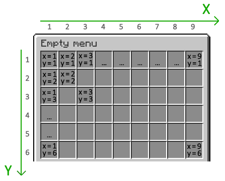
Slot is a coordinate which is used to determine where the item will be placed in the menu. In BetterGUI, there are 2 ways to specify a slot:
position-x and position-yslotposition-x and position-yIf you are comfortable with the grid layout, you can set the slot by specifying the X and Y coordinates.
Here are all coordinates in a 9x6 grid:
Example:
position-x: 1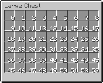
position-y: 1slotThis is the easiest way to specify a slot. You can use the slot number directly.
Here are all slots in a 9x6 grid:
Example:
slot: 0You can also specify multiple slots for an item. This is useful if you want to create a button that takes up more than one slot.
slot: 0, 1, 2, 3, 4, 5, 6, 7, 8If you want to specify a range of slots, you can use the range format (<first>-<last>).
slot: 0-8If you want to go crazy and specify both a range and a list of slots, you can do that too.
slot: 0-8, 9, 17, 18-26This is the simplest and useless button. This represents nothing.
button-name:
type: emptyThis is a decorative button. You can only set the display item of the button through Item Modifiers.
button-name:
  type: dummy
  modifier1: <value1>
  modifier2: <value2>
  modifier3: <value3>
...dummy-button:
type: dummy
id: STONE
name: "&eThis is a dummy button"This button represents the Air item, which the player can’t see.
button-name:
  type: air
  # command:
  action:
  - <action>
  - <action>
  - <action>
  ...
close-on-click: <true/false>action (command): the Action to be executed on clicked.close-on-click: whether to close the menu on clicked.air-button:
type: air
command:
- "tell: &aOh..."
- "delay: 30"
- "tell: &aUhhhh... Hello"
close-on-click: trueThis is similar to Air Button, but this button represents nothing.
button-name:
  type: null
  # command:
  action:
  - <action>
  - <action>
  - <action>
  ...
close-on-click: <true/false>null-button:
type: null
command:
- "tell: &aOh..."
- "delay: 30"
- "tell: &aUhhhh... Hello"
close-on-click: trueThis is a combination of Dummy Button and Air Button, so you can set both Item Modifiers and action (command) & close-on-click.
button-name:
  type: simple # You don't need to set this value. It's the default value
  modifier1: <value1>
  modifier2: <value2>
  modifier3: <value3>
  ...
  # command:
  action:
  - <action>
  - <action>
  - <action>
  ...
close-on-click: <true/false>simple-button:
id: cobblestone
name: "&bThis is a simple button"
lore:
- ""
- "&fThis is a lore"
action: "tell: &eYou clicked"
close-on-click: trueThis is a dynamic button which displays the frame buttons one-by-one.
button-name:
  type: animated
  update: <ticks>
  shift: <number>
  reverse: <true/false>
  child:
    button1:
      <button-settings>
    button2:
      <button-settings>
    button3:
      <button-settings>
...child: the list of Button that serves as the frames of the animattion.update: the ticks between two frames.shift: the index of the starting frame.n), the n-th frame will be the start frame.-n), the n-th frame from the bottom will be the start frame.reverse: whether to flip the frames, so that the frames will go bottom-up.animated-icon:
type: animated
update: 5
child:
frame_icon1:
name: "&cFrame 1"
id: red_wool
lore:
- "This is part of an animated icon"
frame_icon2:
name: "&aFrame 2"
id: green_wool
lore:
- "This is part of an animated icon"
frame_icon3:
name: "&bFrame 3"
id: light_blue_wool
lore:
- "This is part of an animated icon"This is a conditional button which displays the button if the requirements are met, or the fallback button otherwise.
button-name:
  type: predicate
  button:
    <button-settings>
  fallback:
    <button-settings>
  view-requirement:
    <requirement-set>
    <requirement-set>
    <requirement-set>
    ...
  check-only-on-creation: <true/false>
  click-requirement:
    left:
      <requirement-set>
      <requirement-set>
      <requirement-set>
      ...
    right:
      <requirement-set>
      <requirement-set>
      <requirement-set>
      ...
    middle:
      <requirement-set>
      <requirement-set>
      <requirement-set>
      ...
    ...
    default:
      <requirement-set>
      <requirement-set>
      <requirement-set>
...view-requirement: the Requirement to check before displaying the Button.button: the Button to show if the view-requirement are met.fallback: the fallback Button to show if the view-requirement are not met.click-requirement: the pairs of Click Type & Requirement to check when the button is clicked.check-only-on-creation: whether to only check view-requirement when the menu is opened.permission:
SLOT: 1
type: predicate
CLICK-REQUIREMENT:
default:
permission:
PERMISSION: bettergui.test
fail-command: 'tell: &cYou don''t have the correct permission!'
button:
COMMAND: 'tell: &a[v] You have the correct permission!'
NAME: '&8Permission test'
LORE:
- 'To use this item, you need the'
- 'permission "bettergui.test".'
- 'Otherwise, a configurable error'
- 'message will be displayed.'
ID: iron barslevel-view-requirement:
type: predicate
slot: 2
button:
id: exp_bottle
name: "&cA exp bottle"
lore:
- "You will see this icon when the level is higher than 5"
fallback:
id: stone
name: "&cA stone"
lore:
- "You will see this icon when the level is lower than 5"
view-requirement:
level:
level: 5This is a conditional button which loops through the child buttons and check if a button can be displayed.
button-name:
  type: list
  keep-current-index: <true/false>
  child:
    button1:
      <button-settings>
    button2:
      <button-settings>
    button3:
      <button-settings>
...child: the list of Button. This button will loop through and display a button if it can be shown.keep-current-index: whether to only check when the player opens the menu.list-icon:
type: list
keep-current-index: false
child:
level_5:
type: predicate
button:
id: grass
name: "&aYou are in Level 5"
view-requirement:
level:
level: 5
level_3:
type: predicate
button:
id: netherrack
name: "&cYou are in Level 3"
view-requirement:
level:
level: 3
low_level:
id: bedrock
name: "&cYou are low level"This is an arbitrary button that can be used as a template for various copies of the buttons with slightly different settings and/or values.
button-name:
  type: template
  template: <name> # The name from template folder
  variable:
    <variable1>: <value1>
    <variable2>: <value2>
    ...
<button-settings>template: the name of the button in the template folderplugins/BetterGUI/template) is basically a folder containing yml files defining common buttons to use in all menusgettemplatebuttonsvariable: the variables to apply to the template button. This will help you to create many buttons with different attributes from one single template button.# Not using template
button1:
id: stone
name: "&cThis is button"
lore:
- "This is a line"
- "This is a 2 line"
- "This is a 3 line"
- "This is a 4 line"
command: "tell: &cYou clicked"
button2:
id: stone
name: "&cThis is button"
lore:
- "This is a line"
- "This is a 2 line"
- "This is a 3 line"
- "This is a 4 line"
command: "tell: &cYou clicked this again"# Using template
button1:
type: template
template: test # The name from template folder
command: "tell: &cYou clicked"
button2:
type: template
template: test # The name from template folder
command: "tell: &cYou clicked this again"
# Template File
test:
id: stone
name: "&cThis is button"
lore:
- "This is a line"
- "This is a 2 line"
- "This is a 3 line"
- "This is a 4 line"variable option# This will create 4 buttons with different XP amount. These buttons give XP to the player
test-xp-100:
type: template
template: test-xp
variable:
xp: 100
test-xp-200:
type: template
slot: 12
template: test-xp
variable:
xp: 200
test-xp-300:
type: template
template: test-xp
variable:
xp: 300
test-xp-400:
type: template
template: test-xp
variable:
xp: 400
# Template File
test-xp:
id: paper
name: "&eGive &f{xp} XP"
lore:
- ""
- "&fThis is a test template button"
command: "console: xp {xp} {player}"
# Notice that the template button has {xp} in it. It will be replaced with the value from the variables of the button using this template button