Addon
The extension that adds more features to the main plugin.
The extension that adds more features to the main plugin.
# Format:
# <name>: <value>
#
# Example:
# simple-cooldown: 100
simple-cooldown: 100
cooldown-10000: 10000
cooldown-999: 999
<name>is the cooldown name from theconfig.yml
advanced_cooldown_<name>advanced_cooldown_<name>_s or advanced_cooldown_<name>_secondsadvanced_cooldown_<name>_m or advanced_cooldown_<name>_minutesadvanced_cooldown_<name>_h or advanced_cooldown_<name>_hoursadvanced_cooldown_<name>_format_<time-format>advanced_cooldown_<name>_format_HH:mm:ssadvanced-cooldown: <name><name>.advanced-cooldown:
slot: 1
id: clock
name: "&cAdvanced Cooldown"
command:
- "tell: &aHello"
click-requirement:
left:
test:
advanced-cooldown: "simple-cooldown" # from config.yml
fail-command:
- "tell: &cYou need to wait {advanced_cooldown_simple-cooldown_s} seconds"
right:
test:
advanced-cooldown: "cooldown-10000" # from config.yml
fail-command:
- "tell: &cYou need to wait {advanced_cooldown_cooldown-10000_s} seconds"
middle:
test:
advanced-cooldown: "cooldown-999" # from config.yml
fail-command:
- "tell: &cYou need to wait {advanced_cooldown_cooldown-999_s} seconds"| character | duration element |
|---|---|
| y | years |
| M | months |
| d | days |
| H | hours |
| m | minutes |
| s | seconds |
| S | milliseconds |
HH:mm:ss: show hours, minutes and secondsYY:MM:dd HH:mm:ss: show years, months, days, hours, minutes and secondsThis addon adds an alternative feature for menu commands to solve the “duplicated command” issue.
# The list of ignored commands
ignored-commands:
- warp test

# Ignore case-sensitive when checking commands
case-insensitive: true

# Should we ignore the commands in ignored-commands
# If set to false, the plugin will do the opposite (override the commands in ignored-commands)
should-ignore: true# Settings
menu-settings:
menu-type: anvil
# The title of the menu
title: <name>
# The text to show when the player opens the menu
text: <text>
# The commands executed when the player clicks the result slot (the last slot)
complete-action:
- action
- action
...
# The commands executed when closing the menu
close-action:
- action
- action
...
# Whether the addon prevents the player from closing the menu
prevent-close: <true/false>
# The commands to open the menu
command:
- command1
- command2
...
# Whether the addon will clear the user's input when completed
clear-input-on-complete: <true/false>
# Left Button
left-button:
modifier1: <value1>
modifier2: <value2>
modifier3: <value3>
...
# Right Button
right-button:
modifier1: <value1>
modifier2: <value2>
modifier3: <value3>
...
# Left Button (for simplier menu)
button:
modifier1: <value1>
modifier2: <value2>
modifier3: <value3>
...complete-action and close-action use the Action value.left-button, right-button and button use the Button value.{anvil_input} to get the player’s input.menu-settings:
menu-type: anvil
command: testanvil
title: "&cTest Anvil"
text: "What is your name?"
clear-input-on-complete: true
complete-action:
- "tell: &aHello, {anvil_input}"
prevent-close: true
close-action:
- "tell: &cYou closed the menu"
button:
id: paper# This is the config for all static variables
# Format: {ascii_<name_of_variable>}
# Example: {ascii_<3}, {ascii_*}, {ascii_cross}, e.g.
#
# List of unicode symbols: http://www.fileformat.info/info/unicode/index.htm
<3: \u2764
"*": \u2605
"**": \u2739
"p": \u2022
"v": \u2714
"+": \u25C6
"++": \u2726
"x": \u2588
"/": \u258C
"cross": \u2720
"arrow_right": \u27A1
"arrow_left": \u2B05
"arrow_up": \u2B06
"arrow_down": \u2B07{ascii_<name>} gets the value (symbol) from the config.yml at the key <name>This is an addon for those who want to work with the new Dialog System, in BetterGUI’s style.
Your server must meet one of the following requirements:
menu-settings:
  # The menu type of the dialog
  menu-type: action-dialog

  # The title of the dialog
  title: "Dialog Title"

  # Whether the menu will be closed when the player clicks a button
  can-close-with-action: true

  # The action to perform after the player clicks a button
  after-action: CLOSE

  # The actions when the player opens the dialog
  open-action:
  - action
  - action
  - action

  # The requirement before the player can open the dialog
  view-requirement:
    <requirement-set>
    <requirement-set>
    <requirement-set>
    ...

  # The permission required to open the dialog
  permission: bettergui.test

  # The command to open the dialog
  command:
  - command1
  - command2
  ...

  # The list of argument processors to process the arguments of the command to open the dialog
  argument-processor:
    <argument-processor>
<argument-processor>menu-typeThe type of the dialog
Available values:
confirmation-dialog: A confirmation dialog with 2 buttonsaction-dialog: A dialog with multiple buttonsnotice-dialog: A notice dialog with a single buttonserver-links-dialog: A dialog used to display server linkmenu-settings:
menu-type: server-links-dialogmenu-settings:
menu-type: confirmation-dialogcan-close-with-actionWhether the menu will be closed when the player clicks a button
Available values:
true: The menu will be closed when the player clicks a buttonfalse: The menu will not be closed when the player clicks a buttonmenu-settings:
menu-type: confirmation-dialog
can-close-with-action: trueafter-actionThe action to perform after the player clicks a button
Available values:
CLOSE: Close the menuNONE: Do nothingWAIT_FOR_RESPONSE: Wait for the server’s responsemenu-settings:
menu-type: confirmation-dialog
after-action: CLOSEmenu-settings:
menu-type: confirmation-dialog
after-action: NONEcolumnsThe number of columns in the dialog
Only works when the menu-type is action-dialog or server-links-dialog
menu-settings:
menu-type: action-dialog
columns: 3button-widthThe width of the buttons in the dialog
Only works when the menu-type is server-links-dialog
menu-settings:
  menu-type: server-links-dialog
button-width: 10menu-settings:
menu-type: confirmation-dialog
title: "&c&lTest Dialog for &e&lBetterDialogs"
command: testconfirmdialog
welcome:
text: "&7Hello, &e{player}"
width: 100
text-body:
text: "&fThis is a demo for for &e&lBetterDialogs"
item:
type: item
material: DIAMOND_SWORD
name: "&e&lDiamond Sword"
lore:
- "&7This is a diamond sword."
- "&7It's very sharp."
- "&b&lClick to open the dialog."
enchant:
- "durability, 1"
description:
text: "&7This is a diamond sword. It's very sharp."
name:
type: input
label: "&aEnter your name"
initial: "{player}"
male:
type: "boolean"
label: "&6Are you male?"
on-true: "Male"
on-false: "Female"
number:
type: number
label: "&bChoose a number"
start: 0
end: 100
step: 1
initial: 50
select:
type: select
label: "&cWhat do you prefer?"
options:
tea: "&eTea"
coffee: "&eCoffee"
water: "&eWater"
initial: "tea"
yes:
type: action
label: "&e&lYes"
command:
- "tell: &eName: &f{dialog_name}"
- "tell: &eGender: &f{dialog_male}"
- "tell: &eNumber: &f{dialog_number}"
- "tell: &eSelection: &f{dialog_select:display} &7({dialog_select})"
no:
type: action
label: "&c&lNo"
command: "tell: &cNevermind"
The lines below menu-settings are called Component. Those are the pieces of the body of the dialog.
Continue to the next section for more information about the dialog components.
Documentation of the various components of a dialog
This is a component to display text content.
text-component-name:
  # The type of the component.
  type: text
  # The text to display.
  text: "Hello, world!"
  # The width of the component in pixels.
  # Optional and defaults to 150.
width: 150menu-settings:
menu-type: notice-dialog
title: "Example Dialog"
command: exampledialog
show-name:
type: text
text: "&e&lHello, &b{player}&r!"
show-info:
type: text
text: "&e&lWelcome to our server!"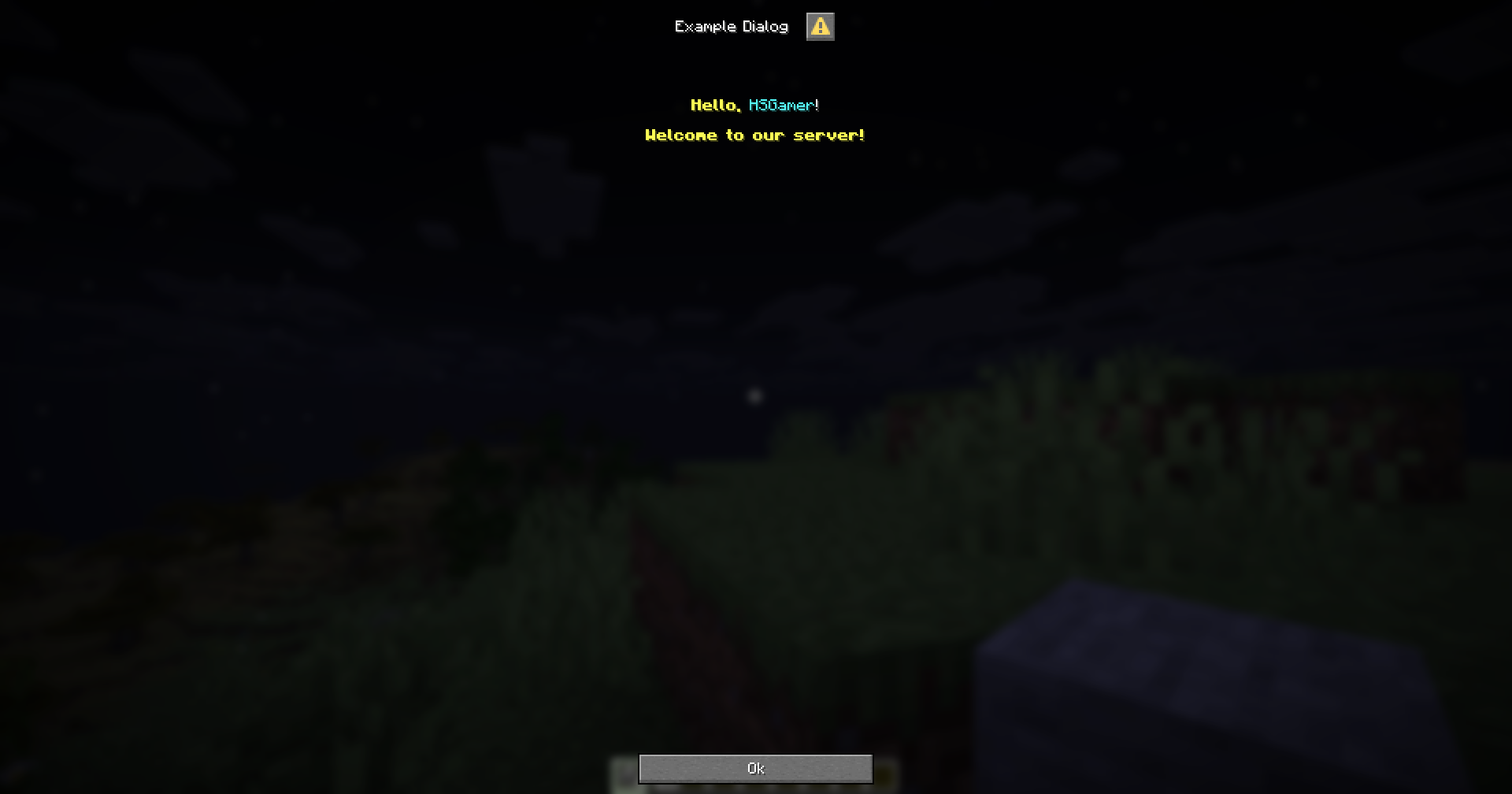
This is a component to display an item in a dialog, with an optional text description.
item-component-name:
  type: item

  # The description of the item
  # Optional. If not provided, the item will not have a description.
  description:
    # The text to display as the description of the item.
    text: "Item description"
    # The width of the description text in pixels.
    width: 150

  # Whether to show decorations
  show-decorations: true

  # Whether to show tooltip when hovering over the item.
  show-tooltip: true

  # The width of the item in pixels.
  width: 150

  # The height of the item in pixels.
  height: 150

  # The Item modifiers
  modifier1: value1
  modifier2: value2
modifier3: value3menu-settings:
menu-type: notice-dialog
title: "Example Dialog"
command: exampledialog
one-item:
type: item
description:
text: "&bThis is a stone"
width: 500
id: stone
name: "Stone"
lore:
- "A simple stone"
- "Used for building"
item-no-description:
type: item
id: cobblestone
name: "Cobblestone"
lore:
- "A simple stone"
- "Used for building"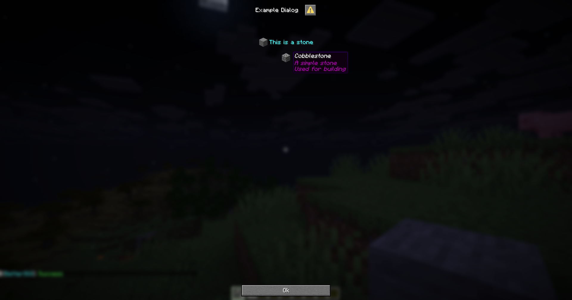
This is a component for inputs from the player. It allows the player to interact with the dialog and provide user input so that the dialog can send the information to the server.
The next sections will provide more information about each type of input component.
For each input, you can retrieve the value using the {dialog_<name>} variable, where <name> is the name of the input component.
For example, if you have an dialog with an input component like this:
menu-settings:
  menu-type: notice-dialog
  title: "Example Dialog"
  command: exampledialog

name:
  type: input
  label: "Name"

hello:
  type: action
  command: "tell: &b&lHello, &f&l{dialog_name}"
You can retrieve the value of the name component using the {dialog_name} variable, as shown in the hello action.
This is an input component that allows players to enter text.
text-input-name:
  # The type of the input component.
  type: input

  # The label of the input component.
  # If not provided, the label will be hidden.
  label: "Text Input"

  # The width of the input component.
  # If not provided, the width will be 200px.
  width: 200

  # The initial value of the input component.
  # If not provided, the initial value will be empty.
  initial: "Hello World"

  # The maximum length of the input component.
  # If not provided, the length will be 32.
  max-length: 32

  # The maximum number of lines the input component can have.
  # Optional.
  max-lines: 5

  # The height of the input component.
  # Optional.
height: 100menu-settings:
menu-type: notice-dialog
title: "Example Dialog"
command: exampledialog
name:
type: input
label: "Name"
hello:
type: action
command: "tell: &b&lHello, &f&l{dialog_name}"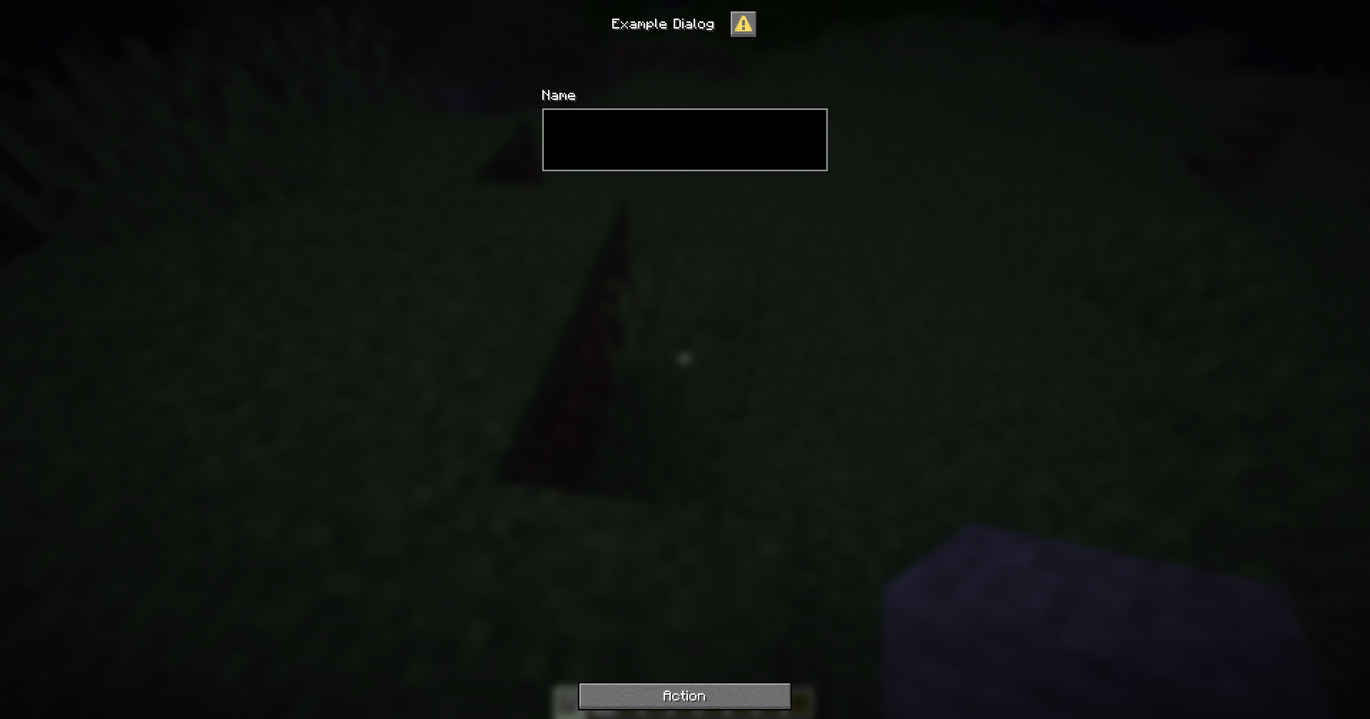
This is an input component that allows players to check a box.
checkbox-input-name:
  # The type of the input component
  type: checkbox

  # The label of the input component
  label: Checkbox Label

  # The initial state of the checkbox
  # If not specified, the checkbox will be unchecked by default
  initial: false

  # The value of the checkbox when checked
  # If not specified, the value will be "true"
  on-true: "Checked"

  # The value of the checkbox when unchecked
  # If not specified, the value will be "false"
on-false: "Unchecked"menu-settings:
menu-type: notice-dialog
title: "Example Dialog"
command: exampledialog
gender:
type: checkbox
label: "Are you male?"
on-true: "Male"
on-false: "Female"
hello:
type: action
command: "tell: &b&lYour gender is &f&l{dialog_gender}"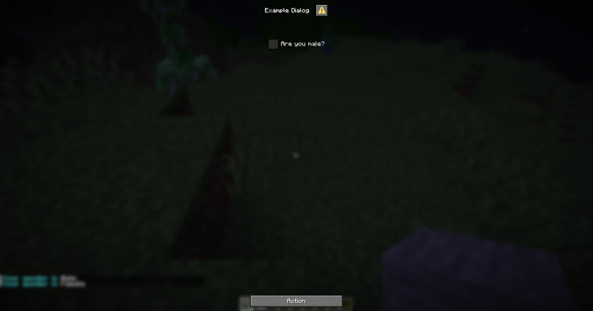
This is an input component that allows players to select a value within a specified range using a slider.
slider-input-component:
  # The type of the input component.
  type: slider

  # The label for the input component.
  label: "Slider Label"

  # The format for the label.
  # If not specified, the label will be displayed as is.
  label-format: "options.generic_value"

  # The start value of the slider.
  start: 0

  # The end value of the slider.
  end: 100

  # The step value of the slider.
  # If not specified, the step will be calculated automatically based on the range.
  step: 1

  # The initial value of the slider.
  # If not specified, the initial value will be at the start of the range.
initial: 50You can define the display format for the slider value when using the variable by following the variable format {dialog_<variable_name>:<format>}
menu-settings:
  menu-type: notice-dialog
  title: "Example Dialog"
  command: exampledialog

age:
  type: slider
  label: "Age"
  start: 0
  end: 100
  step: 1
  initial: 18

hello:
  type: action
  command:
    - "tell: &b&lYour age is &f&l{dialog_age}"
    - "tell: &b&lYour age is &f&l{dialog_age:000}"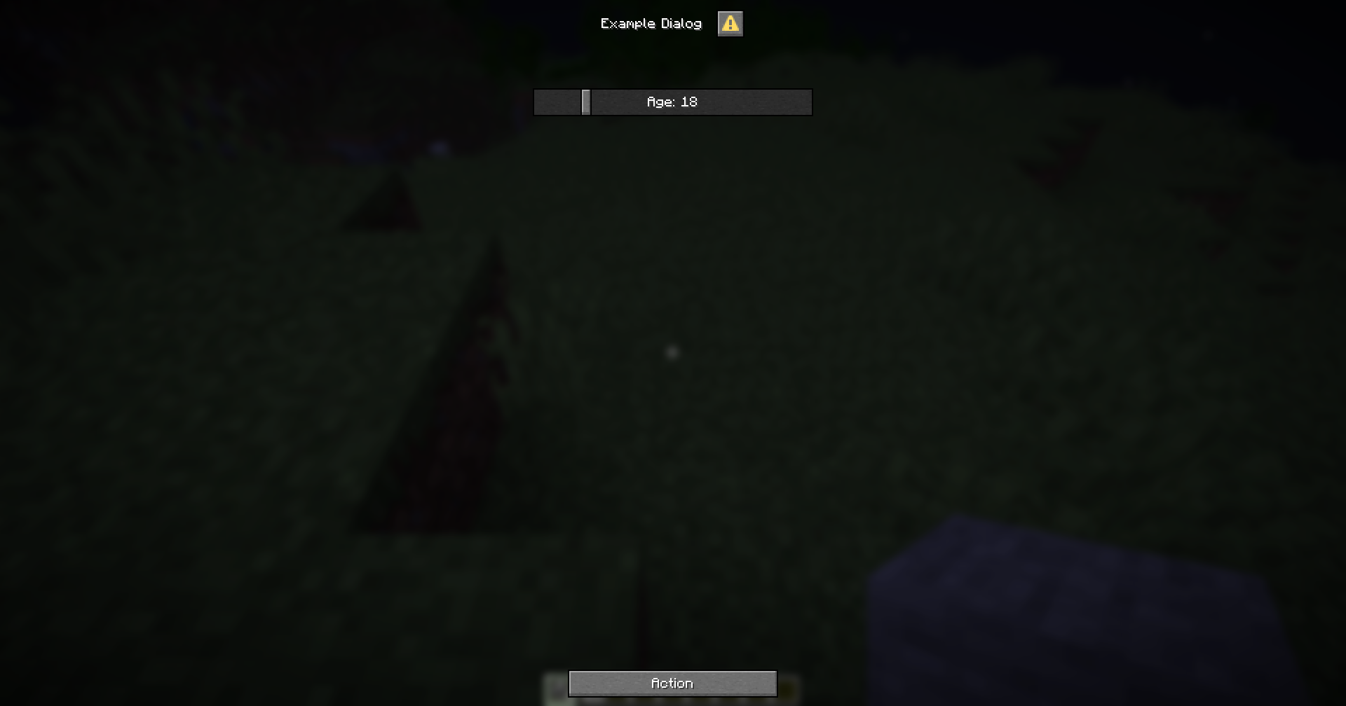
This is an input component that allows the player to select an option from a list.
select-input-name:
  # The type of the input component.
  type: select

  # The label of the input component.
  # If not specified, the label will be hidden
  label: "Select an option"

  # The width of the input component.
  # If not specified, the width will be 200 pixels.
  width: 200

  # The available options for the input component.
  # Each option is a key-value pair, where the key is the option's value and the value is the option's label.
  options:
    option1: "Option 1"
    option2: "Option 2"
    option3: "Option 3"

  # The key of the initial option for the input component.
  # If not specified, the first option will be selected by default.
initial: option1When you use the {dialog_<name>} variable, it will return the key of the selected option.
If you want to get the label of the selected option, you can use the {dialog_<name>:display} variable.
menu-settings:
  menu-type: notice-dialog
  title: "Example Dialog"
  command: exampledialog

experience:
  type: select
  label: "&eYour Experience with the game"
  width: 300
  options:
    beginner: "&aBeginner"
    intermediate: "&eIntermediate"
    advanced: "&6Advanced"
    expert: "&cExpert"
  initial: beginner

hello:
  type: action
  command:
    - "tell: &bYour selected experience is &f{dialog_experience}"
    - "tell: &bYour selected experience is &f{dialog_experience:display}"
This is a button component, one that can be used to perform an action when clicked.
action-name:
  # The label of the button
  label: "Click me!"

  # The tooltip of the button
  # If the tooltip is not provided, there will be no tooltip
  tooltip: "This is a tooltip"

  # The width of the button
  # If the width is not provided, it will default to 150
width: 150This button copies the specified text to the clipboard.
action-name:
  # The type of the button
  type: copy

  # The text to copy to the clipboard
text: "Hello, world!"copy-command:
type: copy
label: "Click here to copy a command"
tooltip: "Copy the command to your clipboard"
text: "/kill {player}"This button will prompt the player to open a URL.
action-name:
  # The type of the button
  type: url

  # The URL to open
url: "https://example.com"open-url:
type: url
label: "Click here to open a URL"
tooltip: "Open a URL in your browser"
url: "https://bettergui-mc.github.io/Docs/"This button will suggest a command to the player.
action-name:
# The type of the button
type: suggest
# The command to suggest
command: "/kill {player}"suggest-command:
type: suggest
label: "Click here to suggest a command"
tooltip: "Suggest a command to your player"
command: "/kill {player}"This button will control the player to execute a command.
action-name:
# The type of the button
type: run
# The command to execute
command: "/kill {player}"run-command:
type: run
label: "Click here to run a command"
tooltip: "Run a command on your player"
command: "/kill {player}"This button will execute custom actions on the server.
action-name:
# The type of the button
type: action
# The list of actions to execute
command:
- action1
- action2
# The requirement to check when clicking the button
click-requirement:
<requirement-set>
<requirement-set>
<requirement-set>Check Action for more information about the available actions in command.
Check Requirement for more information about the available requirements in click-requirement.
action-custom:
type: action
label: "Click here to execute custom actions"
tooltip: "Execute custom actions on your player"
command:
- "tell: &aYou met the requirement"
- "tell: &aHere is your reward"
- "console: give {player} diamond 64"
click-requirement:
check-level:
level:
value: 10
take: false
fail-action: "tell: &cYou don't have enough level"menu-settings:
menu-type: action-dialog
title: "Example Dialog"
command: exampledialog
copy-command:
type: copy
label: "Click here to copy a command"
text: "/kill {player}"
open-url:
  type: url
  label: "Click here to open a URL"
  tooltip: "Open a URL in your browser"
  url: "https://bettergui-mc.github.io/Docs/"
suggest-command:
  type: suggest
  label: "Click here to suggest a command"
  tooltip: "Suggest a command to your player"
  command: "/kill {player}"
run-command:
  type: run
  label: "Click here to run a command"
  tooltip: "Run a command on your player"
  command: "/kill {player}"
action-custom:
  type: action
  label: "Click here to execute custom actions"
  tooltip: "Execute custom actions on your player"
  command:
  - "tell: &aYou met the requirement"
  - "tell: &aHere is your reward"
  - "console: give {player} diamond 64"
  click-requirement:
    check-level:
      level:
        value: 10
        take: false
      fail-action: "tell: &cYou don't have enough level"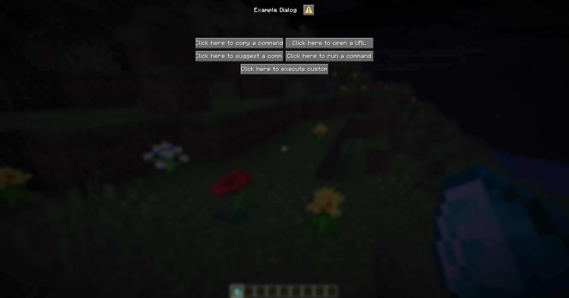
For some components that display Text (label, title, etc.), there are variants that can be used for advanced purposes.
This page will provide the possible ways to use the Adventure Component.
Support: PaperMC
You can use MiniMessage to format text in your components by wrapping the key option in either the prefix mini- or the postfix $. For example:
title will be mini-title or title$label will be mini-label or label$name:
type: text
text$: "Hello <rainbow>world</rainbow>, isn't <blue><u><click:open_url:'https://docs.advntr.dev/minimessage'>MiniMessage</click></u></blue> fun?"You can use the placeholders provided by MiniPlaceholders to display dynamic information in your components.
ping:
type: text
text$: "<player_name>: <player_ping>"Support: PaperMC, PacketEvents
You can use JSON to format text in your components by wrapping the key option in either the prefix json-. For example:
title will be json-titlelabel will be json-labeljson:
type: text
json-text: '["",{"text":"Welcome "},{"text":"to","italic":true},{"text":" BetterDialogs","bold":true,"color":"yellow"}]'menu-settings:
menu-type: notice-dialog
title: "Example Dialog"
command: exampledialog
name:
  type: text
  text$: "Hello <rainbow>world</rainbow>, isn't <blue><u><click:open_url:'https://docs.advntr.dev/minimessage'>MiniMessage</click></u></blue> fun?"
ping:
  type: text
  text$: "<player_name>: <player_ping>"
json:
  type: text
  json-text: '["",{"text":"Welcome "},{"text":"to","italic":true},{"text":" BetterDialogs","bold":true,"color":"yellow"}]'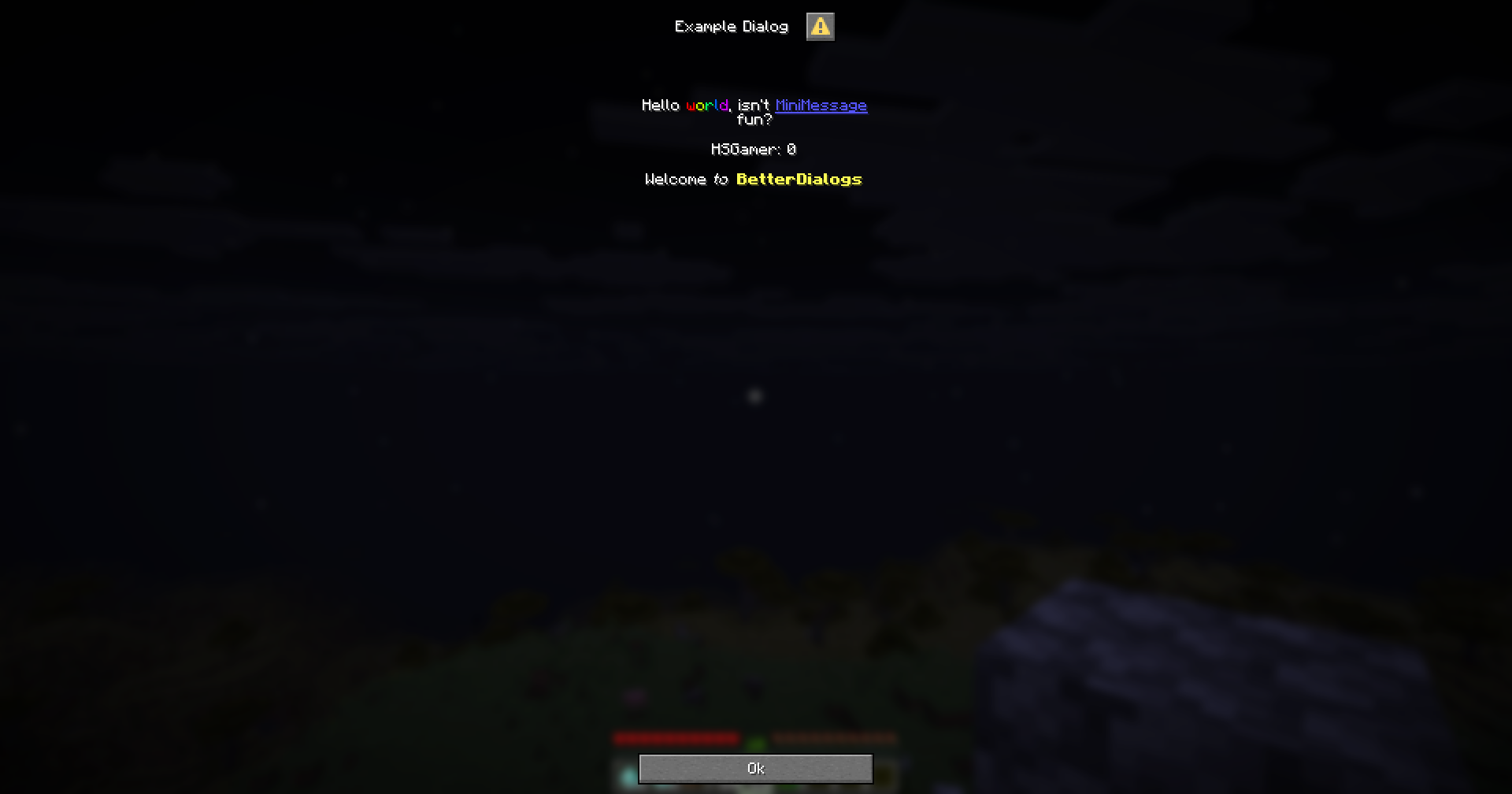
This is an addon for those who want to work with Bedrock Forms, in BetterGUI’s style.
After downloading the addon and the required plugins, follow this guide to install the addon.
This is a simple form with 2 buttons.
menu-settings:
  menu-type: modal-form

  # The title of the form
  title: <name>

  # The content of the form
  content: <content>

  # The actions when the player opens the form
  open-action:
  - action
  - action
  - action
  ...

  # The actions when the player closes the form
  close-action:
  - action
  - action
  - action
  ...

  # The actions when the player does something invalid in the form
  invalid-action:
  - action
  - action
  - action
  ...

  # The actions when the player is not a Bedrock player
  java-action:
  - action
  - action
  - action
  ...

  # The requirement before the player can open the form
  view-requirement:
    <requirement-set>
    <requirement-set>
    <requirement-set>
    ...

  # The permission required to open the form
  permission: bettergui.test

  # The command to open the form
  command:
  - command1
  - command2
  ...

  # The list of argument processors to process the arguments of the command to open the form
  argument-processor:
    <argument-processor>
    <argument-processor>

# The first button
button1:
  # The text of the button
  text: <text>

  # The actions when clicking the button
  action:
  - action
  - action
  - action
  ...

  # The requirement to check when clicking the button
  click-requirement:
    <requirement-set>
    <requirement-set>
    <requirement-set>
    ...

# The second button
button2:
  # The text of the button
  text: <text>

  # The actions when clicking the button
  action:
  - action
  - action
  - action
  ...

  # The requirement to check when clicking the button
  click-requirement:
    <requirement-set>
    <requirement-set>
    <requirement-set>
...open-action: the Action when the menu is opened.close-action: the Action when the menu is closed.invalid-action: the Action when the player does something invalid.java-action: the Action when the player is not a Bedrock player.view-requirement: the Requirement to check before opening the menu. If it is not met, the menu will not be opened.argument-processor: the Argument Processor to handle the arguments of the command to open the menu.action: the Action when the button is clicked.click-requirement: the Requirement to check when the button is clicked. If it is not met, the action will not be executed.menu-settings:
menu-type: modal-form
command: modalform
title: "Modal Form"
content: "&eAre you beautiful, &f{player} &e?"
open-action: "tell: &eYou opened the form"
close-action: "tell: &cYou closed the form"
java-action: "tell: &cYou can't open this form because you're not a Bedrock player"
yes:
text: "&b&lYes"
click-requirement:
check-level:
level:
value: 10
take: false
success-action: "tell: &eThanks for paticipating the form"
fail-action: "tell: &eImprove yourself..."
no:
text: "&bNo"
action: "tell: &aIt's fine, you're beautiful as always"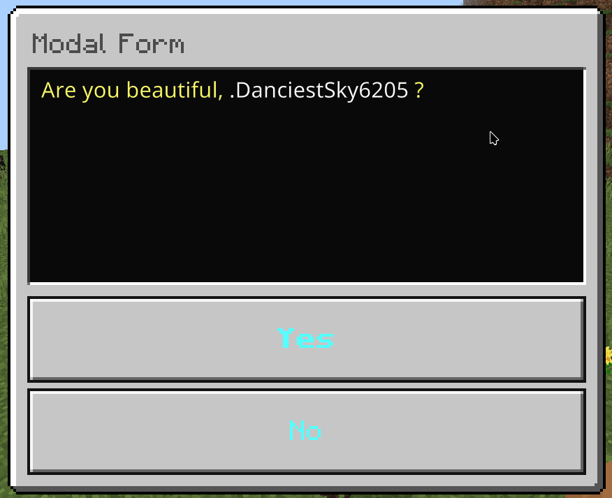
This is a form with a list of buttons.
menu-settings:
menu-type: simple-form
# The title of the form
title: <name>
# The actions when the player opens the form
open-action:
- action
- action
- action
...
# The actions when the player closes the form
close-action:
- action
- action
- action
...
# The actions when the player does something invalid in the form
invalid-action:
- action
- action
- action
...
# The actions when the player is not a Bedrock player
java-action:
- action
- action
- action
...
# The requirement before the player can open the form
view-requirement:
<requirement-set>
<requirement-set>
<requirement-set>
...
# The permission required to open the form
permission: bettergui.test
# The command to open the form
command:
- command1
- command2
...
# The list of argument processors to process the arguments of the command to open the form
argument-processor:
<argument-processor>
<argument-processor>
# The button
button1:
# The text of the button
text: <text>
# The actions when clicking the button
action:
- action
- action
- action
...
# The requirement to check when clicking the button
click-requirement:
<requirement-set>
<requirement-set>
<requirement-set>
...
# The path to the image
path: <path>
# The URL to the image
url: <url>
button2:
...
button3:
...open-action: the Action when the menu is opened.close-action: the Action when the menu is closed.invalid-action: the Action when the player does something invalid.java-action: the Action when the player is not a Bedrock player.view-requirement: the Requirement to check before opening the menu. If it is not met, the menu will not be opened.argument-processor: the Argument Processor to handle the arguments of the command to open the menu.action: the Action when the button is clicked.click-requirement: the Requirement to check when the button is clicked. If it is not met, the action will not be executed.path: the path to the image displayed in the button. The path is mostly for texture packsurl: the URL to the image displayed in the button.menu-settings:
menu-type: simple-form
command: simpleform
title: "&4&lInfo Form"
profile:
text: "&cHSGamer"
url: "https://raw.githubusercontent.com/HSGamer/hsgamer.github.io/main/static/android-chrome-256x256.png"
command: "tell: &eLink: &fhttps://hsgamer.me/"
bettergui:
text: "&cBetterGUI"
url: "https://raw.githubusercontent.com/BetterGUI-MC/.github/main/images/logo.png"
command: "tell: &eLink: &fhttps://bettergui-mc.github.io/Docs/"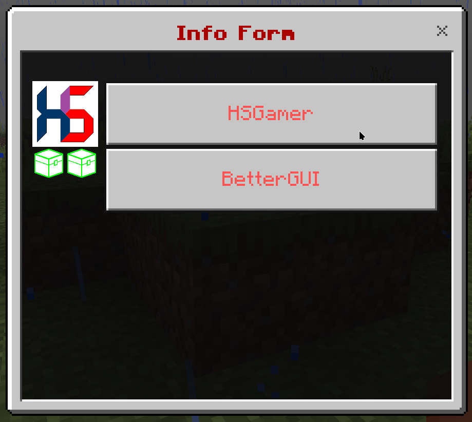
This is a complex form with a list of input components.
menu-settings:
menu-type: custom-form
# The title of the form
title: <name>
# The actions when the player opens the form
open-action:
- action
- action
- action
...
# The actions when the player closes the form
close-action:
- action
- action
- action
...
# The actions when the player does something invalid in the form
invalid-action:
- action
- action
- action
...
# The actions when the player is not a Bedrock player
java-action:
- action
- action
- action
...
# The requirement before the player can open the form
view-requirement:
<requirement-set>
<requirement-set>
<requirement-set>
...
# The permission required to open the form
permission: bettergui.test
# The command to open the form
command:
- command1
- command2
...
# The list of argument processors to process the arguments of the command to open the form
argument-processor:
<argument-processor>
<argument-processor>
# The components
component1:
<setting>
component2:
<setting>
component3:
<setting>component:
type: label
# The component text
text: <text>component:
type: input
# The component text
text: <text>
# The placeholder when there is no value in the input
placeholder: <placeholder>
# The default text
default: <text>component:
type: dropdown
# The component text
text: <text>
# The options
option:
- text1
- text2
- text3
...
# The index of the option to choose as the default option
default: <index>component:
type: slider
# The component text
text: <text>
# The minimum value
min: <value>
# The maximum value
max: <value>
# The step
step: <value>
# The default value
default: <value>component:
type: step
# The component text
text: <text>
# The options
option:
- text1
- text2
- text3
...
# The index of the option to choose as the default option
default: <index>component:
type: switch
# The component text
text: <text>
# The default value
default: <true/false>button1:
type: submit
# The component text
text: <text>
# The actions when clicking the button
action:
- action
- action
- action
...
# The requirement to check when clicking the button
click-requirement:
<requirement-set>
<requirement-set>
<requirement-set>
...open-action: the Action when the menu is opened.close-action: the Action when the menu is closed.invalid-action: the Action when the player does something invalid.java-action: the Action when the player is not a Bedrock player.view-requirement: the Requirement to check before opening the menu. If it is not met, the menu will not be opened.argument-processor: the Argument Processor to handle the arguments of the command to open the menu.action: the Action when the button is clicked.click-requirement: the Requirement to check when the button is clicked. If it is not met, the action will not be executed.You can get the value of the component by using the format {form_<component>}, where <component> is the name of the component in the config. For example, use {form_username} to get the value of the component named username.
menu-settings:
menu-type: custom-form
command: customform
title: "&4&lRegister Form"
user-label:
type: label
text: User Details
username:
type: input
text: "Username"
placeholder: "Your username here..."
default: "{player}"
password:
type: input
text: "Password"
placeholder: "Yout password here..."
remember:
type: switch
text: "Remember"
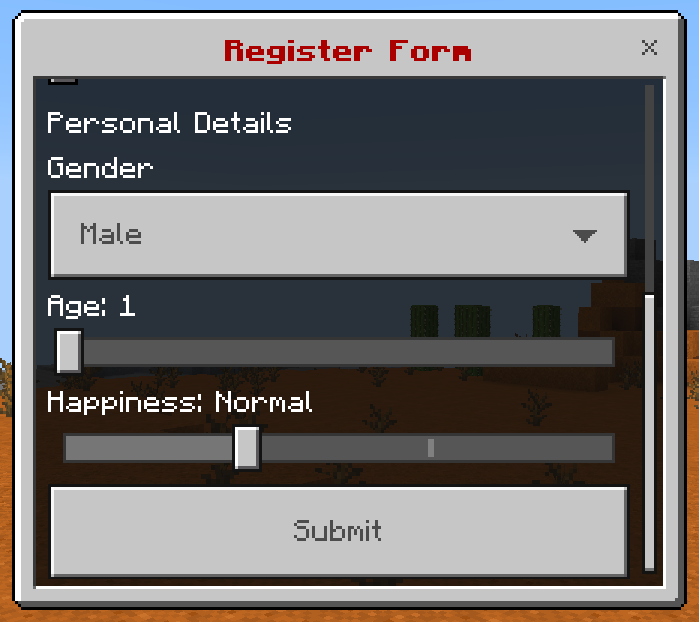
personal-label:
type: label
text: Personal Details
gender:
type: dropdown
text: Gender
option:
- "Male"
- "Female"
- "Other..."
default: 0
age:
type: slider
text: Age
min: 0
max: 100
step: 1
default: 1
happiness:
type: step
text: Happiness
option:
- Sad
- Normal
- Happy
- Feeling Lucky
default: 1
submit:
type: submit
action:
- "tell: &eUsername: &f{form_username}"
- "tell: &ePassword: &f{form_password}"
- "tell: &eGender: &f{form_gender}"
- "tell: &eAge: &f{form_age}"
- "tell: &eHappiness: &f{form_happiness}"
click-requirement:
remember-check:
condition: "{form_remember}"
fail-action: "tell: &cYour form is lost..."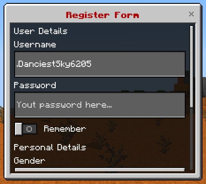
You can use view-requirement to any component so that it will only be shown in the form if the player meets the Requirement.
menu-settings:
  menu-type: modal-form
  command: modalform
  title: "Modal Form"
  content: "&eAre you beautiful, &f{player} &e?"

  open-action: "tell: &eYou opened the form"
  close-action: "tell: &cYou closed the form"
  java-action: "tell: &cYou can't open this form because you're not a Bedrock player"

yes:
  text: "&b&lYes"
  click-requirement:
    check-level:
      level:
        value: 10
        take: false
      success-action: "tell: &eThanks for paticipating the form"
      fail-action: "tell: &eImprove yourself..."

no:
  text: "&bNo"
  action: "tell: &aIt's fine, you're beautiful as always"
view-requirement: # Only show this component if the player meets the following requirement
check-level: # Check if the level of the player is higher than or equal to 10
level:
value: 10
take: falseDepend: BungeeCord, Velocity or their forks
For Velocity and its fork, make sure to set bungee-plugin-message-channel = true in your velocity.toml
server: <server-name>This action will send the player to the server <server-name>
send-to-pvp:
  slot: 1
  id: diamond sword
  name: "&c&lPVP"
  lore:
  - "&fGo to PVP Server"
command: "server: pvp"alert: <message>This action will send <message> to all servers in the network
ping-everyone:
  slot: 1
  id: paper
  name: "&ePing @everyone"
command: "alert: &b&l@everyone"This is a work-in-progress. More features will be added soon.
This addon does not guarantee to convert 100% of your menus, because the structure is usually different between menu plugins.
BetterGUI does not have conflict with other menus. Therefore, it’s recommended to do a fresh start by making your next menu entirely in BetterGUI, then rework your old menus one-by-one in BetterGUI.
/convertmenu <plugin> [menu][menu], the addon will convert all menus from your old menu plugin.plugins/BetterGUI/addon/Converter/<plugin>This is an addon for your existing menus. This enables updating inventory titles.
Set the creator option of the menu-settings to be dynamic-title
menu-settings:
  name: '&u&lExample Menu'

  creator: "dynamic-title"
# ...menu-settings:
name: '&u&lExample Menu'
# The creator to enable Dynamic Title
creator: "dynamic-title"
# How often the title should update in ticks (20 ticks = 1 second)
title-period: 5
# The title template
# The list of title "frames" that will be displayed in order (when the title refreshes)
title-template:
- "&u-"
- "&u--"
- "&u---"
- "&u----"
- "&u-----"
- "%original%"
- "&u-----"
- "&u----"
- "&u---"
- "&u--"
- "&u-"
- ""Sometimes when you close the menu, the menu will not be closed. It’s a known (and wont-fix) bug because of how the packet is sent. You may have to set the title-period higher to reduce the chance the bug occurs.
This addon adds an Item Modifier similar to Enchantment but it uses Minecraft’s keys instead of Bukkit’s ones. It is useful for those who use custom enchantment plugins and want to add these enchantments to the menu.
enchant-key:
- <enchantment>, [level]
- <enchantment>, [level]
- <enchantment>, [level]<enchantment> use Minecraft’s key in the format of <name>:<key> (Similar to the enchantment key you use in the /enchant command in Vanilla).[level] of the <enchantment>. It’s optional.enchanted-sword:
NAME: '&aEnchanted sword'
LORE:
- 'This sword is glowing.'
ID: diamond_sword
enchant-key:
- "minecraft:unbreaking, 1"
POSITION-X: 1
POSITION-Y: 1stone:
id: stone
amount: "25 + 3"stone:
id: stone
amount: "FLOOR(SQRT(18))" # The amount will be the floor value of the square root of 18, which is 4test-view-requirement:
type: predicate
slot: 1
button:
id: exp_bottle
name: "&cA exp bottle"
lore:
- "You will see this icon when the level is higher than 5"
view-requirement:
level:
condition: "{level} > 5" # This will check if the player's level is higher than 5+, -, *, /, etc)amount: "5 + 7" # The amount will be 11amount: "{level} % 64 + 1" # The amount will be from 1 to 64, based on the level>, <, =, >=, <=, etc) to compare values.condition: "{level} > 5" # This will check if the player's level is higher than 5amount: "FLOOR(SQRT(18))" # The amount will be the floor value of the square root of 18, which is 4STRCT("this", "is") check if is is in this (this contains is)STREDW("String", "ing") check if String ends with ingSTREQ("str1", "str1") check if str1 equals str1STREQIC("str1", "str1") check if str1 equals str1 (case-insensitive)STRLEN("Hello World") get the length of Hello WorldSTRMP("String", "String-?") check if String matches the RegExr pattern String-?STRSTW("String", "Str") check if String starts with Str[skip-eval] before your string1 + 1, put [skip-eval] like this [skip-eval] 1 + 1You can evaluate an expression as a variable by using the variable {eval_<expression>}
For example:
{eval_1 + 2}{eval_{level} * 100}{eval_FLOOR(SQRT(18))}This addon adds Item Modifiers to get heads from popular head plugins.
head-database: <head-id>
head-db: <head-id>
hdb: <head-id>head-item:
hdb: 1
name: "&cHead Database"
lore:
- ""
- "&7This is a head item from Head Database"tsp-head: <head-id>
tsp-head-name: <head-name>head-item:
tsp-head: 1
name: "&cHeadDB"
lore:
- ""
- "&7This is a head item from HeadDB"zhead: <head-id>head-item:
zhead: 1
name: "&czHead"
lore:
- ""
- "&7This is a head item from zHead"skulls: <head-id>head-item:
skulls: 1
name: "&cSkulls"
lore:
- ""
- "&7This is a head item from Skulls"stone:
id: STONE
amount: 32
advanced_stone:
id: STONE
amount: "32"
name: "&c{player}'s Stone"
lore:
- "A dummy Stone"
- ''
- "&kYes, it's very dummy and stupid"config.yml as a Menu setup, but with dummy buttonsconfig.yml as how you did in your menu (Name,
Material, Lore, etc)| Command | Permission | Description |
|---|---|---|
giveitem <item_name> | bettergui.items | Give <item_name> to the player |
give: <item>give: <item>, <amount>give: <material>, <amount>This action will give the player the <item> (specified in the config.yml) or
the <material> with the <amount>
give-stone:
  slot: 1
  id: stone
  name: "&cGive me stone"
  command: "give: stone"

give-advanced-stone:
  slot: 2
  id: stone
  name: "&cGive me advanced stone"
  command: "give: advanced_stone"

give-kits:
  slot: 3
  id: diamond sword
  name: "&cGive kits"
  command:
  - "give: DIAMOND_SWORD"
- "give: STONE, 10"item: <item>item:
value: <item>
take: <true/false>item: <item>, [amount]item:
value: <item>, [amount]
take: <true/false><item> (specified in the config.yml) in his inventoryamount value to specify the amount of <item> the requirement should checktake value (true or false) to allow/disallow the plugin to take the items of the player alter checking successfullytake-stone:
slot: 1
type: predicate
button:
id: stone
name: "&cTake Stone"
click-requirement:
left:
take-one: # Take one stone
item: "stone"
right:
take-ten: # Take ten stone
item: "stone, 10"
middle:
take-multi: # Take 10 stone and 1 cobblestone
item:
value:
- "stone, 10"
- "cobblestone"
take: true
default:
check-stone: # Check (not take) if the player has 20 stone
item:
value:
- "stone, 20"
take: falseThis addons add support for some plugins that generate custom items, through UniItem
The item modifier is order-sensitive. You have to set it before other modifiers.
All the Item Modifiers to get items from these item plugins are in the format
<type>: <id>Where <type> is the type of the item plugin, and <id> is the id of the item
You can check the available <type> here: Supported Plugins
test-itembridge:
  slot: 0
  itembridge: "minecraft:stone"
name: "&bItemBridge"test-itemsadder:
slot: 0
ia: "iasurvival:ruby_block"
name: "&bItemsAdder"test-oraxen:
slot: 0
oraxen: "onyx_axe"
name: "&bOraxen"test-nexo:
slot: 0
nexo: "my_item"
name: "&bNexo"This is an addon for your existing menus. It introduces new advanced features to make more complex menus and allows for more possibilities, while keeping the same level of simplicity if you are familiar with BetterGUI.
Some possible menus you can make with this addon are:
After downloading, follow this guide to install the addon.
To start using the addon in your menu, simply set menu-type of menu-settings to masked.
menu-settings:
  menu-type: masked
  name: '&c&lExample Menu'
  rows: 6
...Let’s extend the concept of Slot to add more features to it.
Start with this simple menu
menu-settings:
  menu-type: masked
  command: demo
  title: "&c&lDemo"
  rows: 6

demo-slot:
  slot: 0-53
  id: emerald
You can see that I have set the slot to 0-53 which means that the demo-slot will be applied to all slots in the menu.
What if I want to use slot to specify a grid of slots, like a 3x3 grid in the middle of the menu?
Here is where I’ll introduce a new format for slot called Slot Grid.
slot: <x1>-<y1>-<x2>-<y2><x1> and <y1> are the coordinates of the top-left corner of the grid.
<x2> and <y2> are the coordinates of the bottom-right corner of the grid.
For example, I can replicate the previous menu by using slot: 1-1-9-6.
demo-slot:
slot: 1-1-9-6
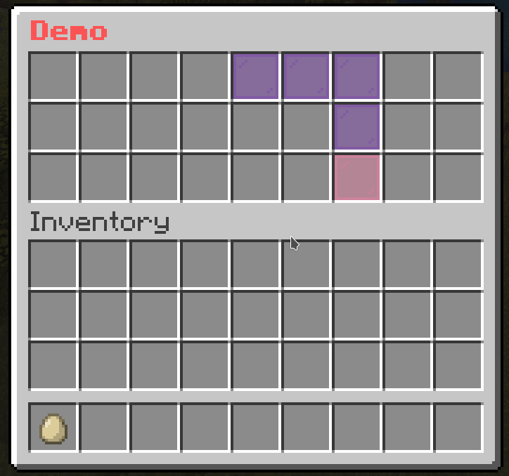
id: emeraldOr I can make a 3x3 grid in the middle of the menu by using slot: 4-2-6-4.
demo-slot:
  slot: 4-2-6-4
  id: emerald
Cool, right? But what if I want only the outer border of the grid?
You can put -o at the end of the slot to specify that you want the outer border of the grid.
demo-slot:
  slot: 1-1-9-6-o
  id: emerald
If you want to control the Slot interactively (i.e. use variables in the slot, add Math to the slot), you can use dynamic-slot instead of the traditional slot
level-slot:
  dynamic-slot: "{level} % 9" # Slot depends on the level of the player
  id: red_stained_glass_pane
  name: "&cDynamic Button"
  lore:
    - "&fLevel: {level}"

# Button to give XP
give-xp:
  slot: 9-17
  id:
    - EXPERIENCE_BOTTLE
    - EXP_BOTTLE
  name: "&eGive &f10 XP"
  lore:
    - "&fLevel: {level}"
  click-requirement:
    old-version:
      version: 13 # Check if the server is at 1.13.X
      success-action: "console: xp add {player} 10 points"
      fail-action: "console: xp 10 {player}"
This is a new component in which you can specify the logic on how the Buttons are displayed. This creates new possibilities to make more creative menus from your crazy ideas.
You can use this to make a simple menu
… or a more complex menu
This is the default mask if you don’t specify any mask. That means that all Buttons are Simple Mask by default.
multi-slot:
  mask: simple # You can omit this line. It's the default mask.
  slot: 0-8,45,46,47-52
  type: animated
  update: 10
  child:
    frame1:
      name: ' '
      id:
        - black stained glass pane
        - STAINED_GLASS_PANE:15
    frame2:
      name: ' '
      id:
        - gray stained glass pane
        - STAINED_GLASS_PANE:7
    frame3:
      name: ' '
      id:
        - white stained glass pane
- STAINED_GLASS_PANEIt’s the same as the Simple Mask but there is a special feature when you add multiple Buttons.
mask-name:
  mask: multislot
  slot: <slot>
  child:
    button-name-1:
      <button-settings>
    button-name-2:
      <button-settings>
...demo-slot:
mask: multislot
slot: 1-1-9-6
child:
emerald-button:
id: emerald
name: "&a&lEmerald"
demo-slot:
  mask: multislot
  slot: 1-1-9-6
  child:
    emerald-button:
      id: emerald
      name: "&a&lEmerald"
diamond-button:
id: diamond
name: "&b&lDiamond"
demo-slot:
  mask: multislot
  slot: 1-1-9-6
  child:
    emerald-button:
      id: emerald
      name: "&a&lEmerald"
    diamond-button:
      id: diamond
      name: "&b&lDiamond"
redstone-button:
id: redstone
name: "&c&lRedstone"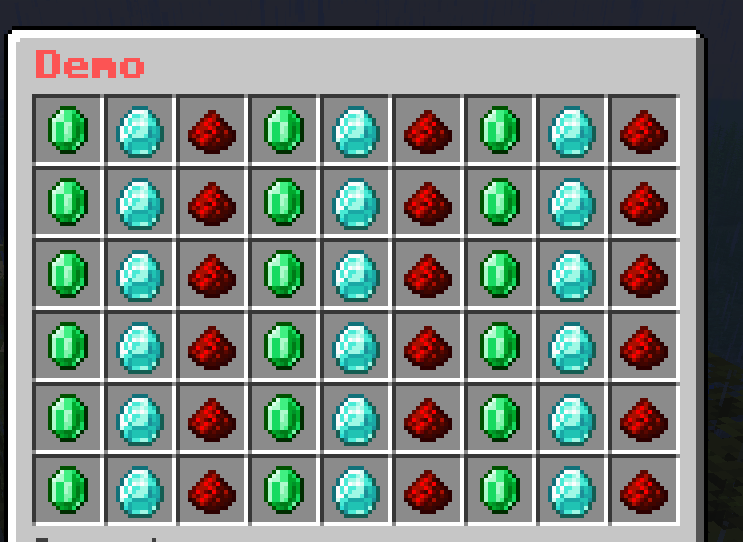
You may now understand what is the special feature of this mask. This mask will loop through the child buttons and display them for each slot in the slot section.
It is a mask that allows you to create a pattern of buttons. The Buttons are elements that can be used to draw on a grid-like pattern.
mask-name:
  mask: pattern
  pattern:
    - "xxxxxxxxx"
    - "x       x"
    - "x       x"
    - "x       x"
    - "xxxxxxxxx"
  child:
    button-name-1:
      <button-settings>
    button-name-2:
      <button-settings>
...pattern: The pattern that will be drawn. The pattern is a list of strings. Each string represents a row of the pattern. The length of each string must be the same. The character in the string represents the button that will be drawn on that position. The character must be unique.child section is the character that is used to draw on the pattern. The character must be unique.demo-slot:
mask: pattern
pattern:
- "xxxxxxxxx"
- "x x"
- "x x"
- "x x"
- "x x"
- "xxxxxxxxx"
child:
x:
id: emerald
name: "&a&lEmerald"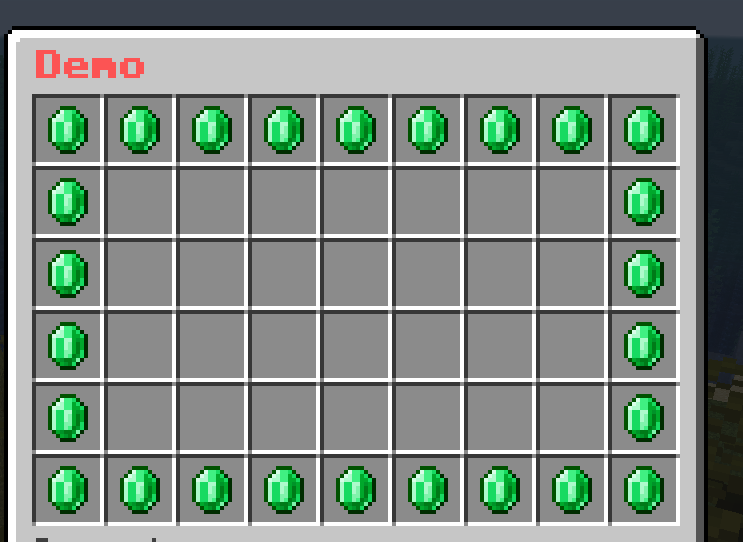
demo-slot:
  mask: pattern
  pattern:
    - "xxxxxxxxx"
    - "x       x"
    - "x 1 1 1 x"
    - "x  2 2  x"
    - "x       x"
    - "xxxxxxxxx"
  child:
    x:
      id: black_stained_glass_pane
      name: "&r"
    ' ':
      id: gray_stained_glass_pane
      name: "&r"
    1:
      id: emerald
      name: "&a&lEmerald"
    2:
      id: diamond
      name: "&b&lDiamond"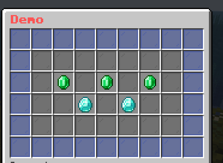
It is a mask that shows the progress of the player. It is useful for showing the progress of the player in a quest or a game.
mask-name:
  mask: progress
  slot: <slot>
  current: <current-value>
  max: <max-value>
  current-button:
    <button-settings>
  max-button:
<button-settings>current: The current value of the progress. It can be a number or a placeholder.max: The max value of the progress. It can be a number or a placeholder.current-button: The Button that represents the filled part of the progress.max-button: The Button that represents the empty part of the progress.demo-slot:
mask: progress
current: "{level}"
max: 45
slot: 1-1-9-5
current-button:
id: green_stained_glass_pane
name: "&a&lCurrent: &e{level}"
max-button:
id: red_stained_glass_pane
name: "&c&lMax: &e45"
Don’t worry about the weird last row. I’ll explain it later.
This mask is a combination of multiple masks. It is useful for grouping masks for better organization.
mask-name:
  mask: hybrid
  child:
    mask-1:
      <mask-settings>
    mask-2:
      <mask-settings>
...demo-slot:
mask: hybrid
child:
mask-1:
slot: 1-1-9-5
id: green_stained_glass_pane
name: "&a&lMask 1"
mask-2:
slot: 1-6-9-6
id: red_stained_glass_pane
name: "&c&lMask 2"
demo-slot:
  mask: hybrid
  child:
    progress-level:
      mask: progress
      current: "{level}"
      max: 45
      slot: 1-1-9-5
      current-button:
        id: green_stained_glass_pane
        name: "&a&lCurrent: &e{level}"
      max-button:
        id: red_stained_glass_pane
        name: "&c&lMax: &e45"
    give-xp:
      slot: "1-6-9-6"
      id:
        - EXPERIENCE_BOTTLE
        - EXP_BOTTLE
      name: "&eGive &f10 XP"
      lore:
        - ""
        - "&fLevel: {level}"
      click-requirement:
        old-version:
          version: 13
          success-action: "console: xp add {player} 10 points"
          fail-action: "console: xp 10 {player}"
To explain what was missed in the example of Progress Mask, the last row is the Simple Mask that gives the player 10 XP. I used the Hybrid Mask to group the Progress Mask and the Simple Mask together.
Similar to Animated Button, this mask iterates through a list of masks and displays them in a sequence to create an animation.
mask-name:
  mask: animated
  update: <ticks>
  child:
    mask-1:
      <mask-settings>
    mask-2:
      <mask-settings>
...update: The number of ticks between each frame.demo-slot:
mask: animated
update: 5
child:
frame1:
slot: 0-53
id: red_stained_glass_pane
name: "&c&lFrame 1"
frame2:
slot: 0-53
id: green_stained_glass_pane
name: "&a&lFrame 2"
frame3:
slot: 0-53
id: blue_stained_glass_pane
name: "&9&lFrame 3"
demo-slot:
  mask: animated
  update: 5
  child:
    frame1:
      slot: 0-8
      id: black_stained_glass_pane
      name: "&c&lFrame 1"
    frame2:
      slot: 9-17
      id: black_stained_glass_pane
      name: "&c&lFrame 2"
    frame3:
      slot: 18-26
      id: black_stained_glass_pane
      name: "&c&lFrame 3"
    frame4:
      slot: 27-35
      id: black_stained_glass_pane
      name: "&c&lFrame 4"
    frame5:
      slot: 36-44
      id: black_stained_glass_pane
      name: "&c&lFrame 5"
    frame6:
      slot: 45-53
      id: black_stained_glass_pane
      name: "&c&lFrame 6"
demo-slot:
  mask: animated
  update: 5
  child:
    frame1:
      slot: 1-1-9-6
      mask: multislot
      child:
        button1:
          id: red_stained_glass_pane
          name: "&r"
        button2:
          id: black_stained_glass_pane
          name: "&r"
    frame2:
      slot: 1-1-9-6
      mask: multislot
      child:
        button1:
          id: black_stained_glass_pane
          name: "&r"
        button2:
          id: red_stained_glass_pane
          name: "&r"
This is a special type of Animated Mask that only plays once. It will not loop back to the first frame after it reaches the last frame.
mask-name:
  mask: animated
  update: <ticks>
  async: <true/false>
  keep-last: <true/false>
  child:
    mask-1:
      <mask-settings>
    mask-2:
      <mask-settings>
...keep-last: Whether the last frame will be kept after the animation is finished. The default value is false.demo-slot:
mask: one-time-animated
update: 5
child:
frame1:
slot: 0-8
id: black_stained_glass_pane
name: "&c&lFrame 1"
frame2:
slot: 9-17
id: black_stained_glass_pane
name: "&c&lFrame 2"
frame3:
slot: 18-26
id: black_stained_glass_pane
name: "&c&lFrame 3"
frame4:
slot: 27-35
id: black_stained_glass_pane
name: "&c&lFrame 4"
frame5:
slot: 36-44
id: black_stained_glass_pane
name: "&c&lFrame 5"
frame6:
slot: 45-53
id: black_stained_glass_pane
name: "&c&lFrame 6"
This is a conditional mask. It will show the mask if the requirement is met. If not, it will show the fallback mask.
mask-name:
  mask: predicate
  view-requirement:
    <requirement-set>
    <requirement-set>
    <requirement-set>
    ...
  check-only-on-creation: <true/false>
  success:
    <mask-settings>
  fallback:
<mask-settings>success: The Mask that will be shown if the view-requirement is met. If you don’t set it, the mask will be empty.fallback: The Mask that will be shown if the view-requirement is not met. If you don’t set it, the mask will be empty.view-requirement: The Requirement that must be met for the success mask to be shown.check-only-on-creation: If this value is set to true, the plugin will only check the view-requirement when the player opens the menu.demo-slot:
mask: predicate
view-requirement:
test-level:
level:
value: 10
take: false
success:
mask: pattern
pattern:
- "...xxx..."
- "..x...x.."
- "..x...x.."
- "..x...x.."
- "...xxx..."
child:
x:
id: green_stained_glass_pane
name: "&a&lSuccess"
fallback:
mask: pattern
pattern:
- "..x...x.."
- "...x.x..."
- "....x...."
- "...x.x..."
- "..x...x.."
child:
x:
id: red_stained_glass_pane
name: "&c&lFail"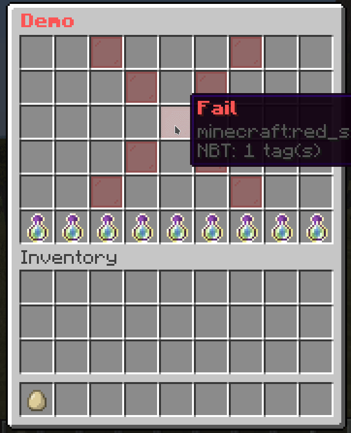
This is a conditional mask that loops through a list of masks and display a mask if it can be shown.
It can be used with Predicate Mask to make more complex checks.
mask-name:
  mask: list
  child:
    mask1:
      <mask-settings>
    mask2:
      <mask-settings>
...demo-slot:
mask: list
child:
level-10:
mask: predicate
view-requirement:
test-level:
level:
value: 10
take: false
success:
mask: pattern
pattern:
- "..x..xxx."
- ".xx..x.x."
- "..x..x.x."
- "..x..x.x."
- ".xxx.xxx."
child:
x:
id: green_stained_glass_pane
name: "&a&lYou have reached level 10!"
level-5:
mask: predicate
view-requirement:
test-level:
level:
value: 5
take: false
success:
mask: pattern
pattern:
- "...xxx..."
- "...x....."
- "...xxx..."
- ".....x..."
- "...xxx..."
child:
x:
id: green_stained_glass_pane
name: "&a&lYou have reached level 5!"
level-0:
mask: pattern
pattern:
- "...xxx..."
- "...x.x..."
- "...x.x..."
- "...x.x..."
- "...xxx..."
child:
x:
id: red_stained_glass_pane
name: "&c&lFail"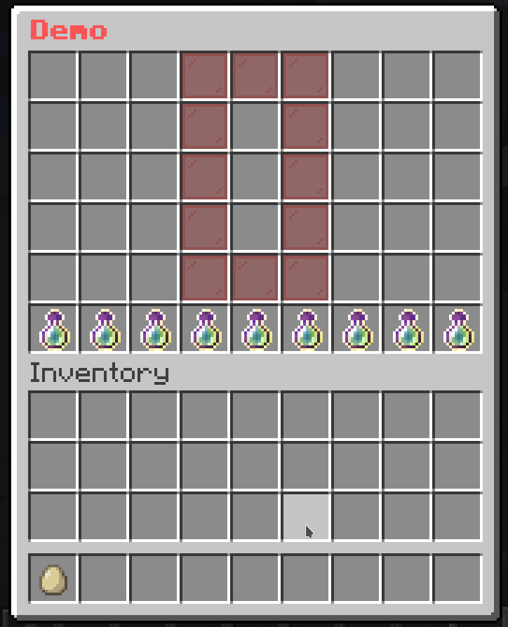
This is a mask that allows you to paginate Buttons. This is useful when you have a lot of buttons and you want to split them into multiple pages.
mask-name:
  mask: button-paginated
  slot: <slot>
  cycle: <true/false>
  signal: <signal>
  child:
    button-1:
      <button-settings>
    button-2:
      <button-settings>
...cycle: Whether the buttons should cycle when you reach the end of the page. If this is set to true, then when you reach the end of the page, it will go back to the first page. If this is set to false, then when you reach the end of the page, it will stop at the last page.signal: The signal name used by actions to change the page.next-page: <signal>: Changes the page to the next page.previous-page: <signal>: Changes the page to the previous page.set-page(<signal>): <page>: Changes the page to <page>.# The paginated mask
demo-slot:
mask: button-paginated
slot: 1-7
cycle: false
signal: demo-page-signal # This is the signal name used by actions to change the page.
child:
button1:
id: red_stained_glass_pane
name: "&c&lButton 1"
button2:
id: green_stained_glass_pane
name: "&a&lButton 2"
button3:
id: blue_stained_glass_pane
name: "&9&lButton 3"
button4:
id: yellow_stained_glass_pane
name: "&e&lButton 4"
button5:
id: purple_stained_glass_pane
name: "&5&lButton 5"
button6:
id: orange_stained_glass_pane
name: "&6&lButton 6"
button7:
id: pink_stained_glass_pane
name: "&d&lButton 7"
button8:
id: black_stained_glass_pane
name: "&0&lButton 8"
button9:
id: white_stained_glass_pane
name: "&f&lButton 9"
button10:
id: gray_stained_glass_pane
name: "&7&lButton 10"
button11:
id: light_gray_stained_glass_pane
name: "&8&lButton 11"
# The button to go to the previous page
previous-button:
slot: 0
id: arrow
name: "&c&lPrevious"
command: "previous-page: demo-page-signal" # The action to change the page
# The button to go to the next page
next-button:
slot: 8
id: arrow
name: "&a&lNext"
command: "next-page: demo-page-signal" # The action to change the page
This is the same as the Button Paginated Mask. The only difference is that this mask assumes each button as a page, so it will “shift” the buttons to the left or right depending on the page.
mask-name:
  mask: sequence-paginated
  slot: <slot>
  cycle: <true/false>
  signal: <signal>
  child:
    button-1:
      <button-settings>
    button-2:
      <button-settings>
...cycle: Whether the buttons should cycle when you reach the end of the page. If this is set to true, then when you reach the end of the page, it will go back to the first page. If this is set to false, then when you reach the end of the page, it will stop at the last page.signal: The signal name used by actions to change the page.next-page: <signal>: Changes the page to the next page.previous-page: <signal>: Changes the page to the previous page.set-page(<signal>): <page>: Changes the page to <page>.# The paginated mask
demo-slot:
mask: sequence-paginated
slot: 1-7
cycle: false
signal: demo-page-signal # This is the signal name used by actions to change the page.
child:
button1:
id: red_stained_glass_pane
name: "&c&lButton 1"
button2:
id: green_stained_glass_pane
name: "&a&lButton 2"
button3:
id: blue_stained_glass_pane
name: "&9&lButton 3"
button4:
id: yellow_stained_glass_pane
name: "&e&lButton 4"
button5:
id: purple_stained_glass_pane
name: "&5&lButton 5"
button6:
id: orange_stained_glass_pane
name: "&6&lButton 6"
button7:
id: pink_stained_glass_pane
name: "&d&lButton 7"
button8:
id: black_stained_glass_pane
name: "&0&lButton 8"
button9:
id: white_stained_glass_pane
name: "&f&lButton 9"
button10:
id: gray_stained_glass_pane
name: "&7&lButton 10"
button11:
id: light_gray_stained_glass_pane
name: "&8&lButton 11"
# The button to go to the previous page
previous-button:
slot: 0
id: arrow
name: "&c&lPrevious"
command: "previous-page: demo-page-signal" # The action to change the page
# The button to go to the next page
next-button:
slot: 8
id: arrow
name: "&a&lNext"
command: "next-page: demo-page-signal" # The action to change the page
Unlike Button Paginated Mask, this mask paginates Masks instead of Buttons.
mask-name:
  mask: mask-paginated
  cycle: <true/false>
  signal: <signal>
  child:
    mask-1:
      <mask-settings>
    mask-2:
      <mask-settings>
...cycle: Whether the buttons should cycle when you reach the end of the page. If this is set to true, then when you reach the end of the page, it will go back to the first page. If this is set to false, then when you reach the end of the page, it will stop at the last page.signal: The signal name used by actions to change the page.next-page: <signal>: Changes the page to the next page.previous-page: <signal>: Changes the page to the previous page.set-page(<signal>): <page>: Changes the page to <page>.# The paginated mask
demo-slot:
mask: mask-paginated
cycle: false
signal: demo-page-signal # This is the signal name used by actions to change the page.
child:
0:
mask: pattern
pattern:
- "...xxx..."
- "...x.x..."
- "...x.x..."
- "...x.x..."
- "...xxx..."
child:
x:
id: red_stained_glass_pane
name: "&c&l0"
1:
mask: pattern
pattern:
- "....x...."
- "...xx...."
- "....x...."
- "....x...."
- "...xxx..."
child:
x:
id: red_stained_glass_pane
name: "&a&l1"
2:
mask: pattern
pattern:
- "...xxx..."
- ".....x..."
- "...xxx..."
- "...x....."
- "...xxx..."
child:
x:
id: red_stained_glass_pane
name: "&b&l2"
3:
mask: pattern
pattern:
- "...xxx..."
- ".....x..."
- "...xxx..."
- ".....x..."
- "...xxx..."
child:
x:
id: red_stained_glass_pane
name: "&d&l3"
4:
mask: pattern
pattern:
- "...x.x..."
- "...x.x..."
- "...xxx..."
- ".....x..."
- ".....x..."
child:
x:
id: red_stained_glass_pane
name: "&e&l4"
5:
mask: pattern
pattern:
- "...xxx..."
- "...x....."
- "...xxx..."
- ".....x..."
- "...xxx..."
child:
x:
id: red_stained_glass_pane
name: "&f&l5"
# The button to go to the previous page
previous-button:
slot: 18
id: arrow
name: "&c&lPrevious"
command: "previous-page: demo-page-signal" # The action to change the page
# The button to go to the next page
next-button:
slot: 26
id: arrow
name: "&a&lNext"
command: "next-page: demo-page-signal" # The action to change the page
While you are creating menus with masks, you may find yourself repeating the same mask settings over and over again. This is where the template mask comes in handy. It allows you to create a template mask and use it in other masks.
mask-name:
  mask: template
  template: <name> # The name from template folder
  variable:
    <variable1>: <value1>
    <variable2>: <value2>
    ...
<mask-settings>The template folder (located at plugins/BetterGUI/addon/MaskedGUI/template) is a folder containing yml files defining common masks to use in all menus. That means you can create a template mask by simply creating a yml file in the template folder, add the common mask settings, and use it in other masks.
variable: The variable is a way to pass values to the template mask. Check out Use variable option for more information.# Template File
test-pattern:
mask: pattern
button:
"*":
id: purple_stained_glass_pane
name: "&b&lBody"
"x":
id: red_stained_glass_pane
name: "&c&lTarget"
"#":
id: pink_stained_glass_pane
name: "&a&lHead"demo-slot:
mask: animated
update: 3
child:
1:
mask: template
template: test-pattern
pattern:
- "......x.."
- "........."
- "........."
2:
mask: template
template: test-pattern
pattern:
- "......x.."
- "........."
- "#........"
3:
mask: template
template: test-pattern
pattern:
- "......x.."
- "........."
- "*#......."
4:
mask: template
template: test-pattern
pattern:
- "......x.."
- "........."
- "**#......"
5:
mask: template
template: test-pattern
pattern:
- "......x.."
- "..#......"
- "***......"
6:
mask: template
template: test-pattern
pattern:
- "..#...x.."
- "..*......"
- ".**......"
7:
mask: template
template: test-pattern
pattern:
- "..*#..x.."
- "..*......"
- "..*......"
8:
mask: template
template: test-pattern
pattern:
- "..**#.x.."
- "..*......"
- "........."
9:
mask: template
template: test-pattern
pattern:
- "..***#x.."
- "........."
- "........."
10:
mask: template
template: test-pattern
pattern:
- "..****#.."
- "........."
- "........."
11:
mask: template
template: test-pattern
pattern:
- "...****.."
- "......#.."
- "........."
12:
mask: template
template: test-pattern
pattern:
- "....***.."
- "......*.."
- "......#.."
13:
mask: template
template: test-pattern
pattern:
- ".....**.."
- "......*.."
- "......*#."
14:
mask: template
template: test-pattern
pattern:
- "......*.."
- "......*.."
- "......**#"
15:
mask: template
template: test-pattern
pattern:
- "........."
- "......*.."
- "......***"
16:
mask: template
template: test-pattern
pattern:
- "........."
- "........."
- "......***"
17:
mask: template
template: test-pattern
pattern:
- "........."
- "........."
- ".......**"
18:
mask: template
template: test-pattern
pattern:
- "........."
- "........."
- "........*"
19:
mask: template
template: test-pattern
pattern:
- "........."
- "........."
- "........."
This mask allows you to store a list of masks. Then you can make it switch to a specific mask from that list.
mask-name:
  mask: hybrid
  signal: <signal>
  default: <mask-name>
  child:
    mask-1:
      <mask-settings>
    mask-2:
      <mask-settings>
...signal: The signal name used by actions to switch the mask.default: The name of the mask from the child section used as a default mask. If it’s not set, the default mask will be empty.set-mask(<signal>): <mask>: Switch the mask to <mask>demo-slot:
mask: switch
signal: demo-page-signal # This is the signal name used by actions to switch the mask.
default: 0 # The default mask name
child:
0:
mask: pattern
pattern:
- "...xxx..."
- "...x.x..."
- "...x.x..."
- "...x.x..."
- "...xxx..."
child:
x:
id: red_stained_glass_pane
name: "&c&l0"
1:
mask: pattern
pattern:
- "....x...."
- "...xx...."
- "....x...."
- "....x...."
- "...xxx..."
child:
x:
id: red_stained_glass_pane
name: "&a&l1"
2:
mask: pattern
pattern:
- "...xxx..."
- ".....x..."
- "...xxx..."
- "...x....."
- "...xxx..."
child:
x:
id: red_stained_glass_pane
name: "&b&l2"
3:
mask: pattern
pattern:
- "...xxx..."
- ".....x..."
- "...xxx..."
- ".....x..."
- "...xxx..."
child:
x:
id: red_stained_glass_pane
name: "&d&l3"
4:
mask: pattern
pattern:
- "...x.x..."
- "...x.x..."
- "...xxx..."
- ".....x..."
- ".....x..."
child:
x:
id: red_stained_glass_pane
name: "&e&l4"
5:
mask: pattern
pattern:
- "...xxx..."
- "...x....."
- "...xxx..."
- ".....x..."
- "...xxx..."
child:
x:
id: red_stained_glass_pane
name: "&f&l5"
button-1:
slot: 47
name: "&e&l1"
id: arrow
command: "set-mask(demo-page-signal): 1"
button-2:
slot: 48
name: "&e&l2"
id: arrow
command: "set-mask(demo-page-signal): 2"
button-3:
slot: 49
name: "&e&l3"
id: arrow
command: "set-mask(demo-page-signal): 3"
button-4:
slot: 50
name: "&e&l4"
id: arrow
command: "set-mask(demo-page-signal): 4"
button-5:
slot: 51
name: "&e&l5"
id: arrow
command: "set-mask(demo-page-signal): 5"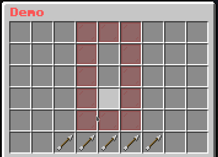
This mask is similar to Button Paginated Mask. The only difference is that this mask will fetch all online players and display each of them as a Button.
mask-name:
  mask: player-list
  slot: <slot>
  cycle: <true/false>
  signal: <signal>
  view-self: <true/false>
  view-offline: <true/false>
  player-update: 20
  viewer-update: 0
  player-condition:
  - condition1
  - condition2
  - condition3
  viewer-condition:
  - condition1
  - condition2
  - condition3
  button:
<button-settings>cycle: Whether the buttons should cycle when you reach the end of the page. If this is set to true, then when you reach the end of the page, it will go back to the first page. If this is set to false, then when you reach the end of the page, it will stop at the last page.signal: The signal name used by actions to change the page.view-self: Whether the mask will display the player that opens then menu.view-offline: Whether the mask will display all offline players instead of just online ones.player-condition: The list of Condition Requirement that the player must meet to appear in the list.viewer-condition: The list of Condition Requirement that the viewer must meet to see the player’s button.player-condition and viewer-condition is that the player-condition will be checked for each online players to gather the list of “passed” players to display in the menu, while viewer-condition will be checked between the viewer (who opens the menu) and the player in the “passed” players to determine if the viewer can see the player in the menu.button: The Button to be displayed for each players.player-update: The ticks to wait before the player list is refreshed.viewer-update: The ticks to wait before the “passed” player list from the viewer view is refreshed.next-page: <signal>: Changes the page to the next page.previous-page: <signal>: Changes the page to the previous page.set-page(<signal>): <page>: Changes the page to <page>.player-condition and button{current_player_<variable_name>} to fetch the variable <variable_name> of the target player{player} -> {current_player}{ping} -> {current_player_ping}{exp_to_level} -> {current_player_exp_to_level}{current_player_papi_<placeholder_name>} to fetch the PlaceholderAPI’s placeholder <placeholder_name> of the target playerdemo-slot:
mask: player-list
signal: demo-page-signal # This is the signal name used by actions to change the page.
slot: 2-1-8-1
view-self: true
button:
id: player_head
skull: "{current_player}"
name: "&c{current_player}"
lore:
- "&eX: &f{current_player_x}"
- "&eY: &f{current_player_y}"
- "&eZ: &f{current_player_z}"
command: "console: tp {player} {current_player}"
close-on-click: true
# The button to go to the previous page
previous-button:
slot: 0
id: arrow
name: "&c&lPrevious"
command: "previous-page: demo-page-signal" # The action to change the page
# The button to go to the next page
next-button:
slot: 8
id: arrow
name: "&a&lNext"
command: "next-page: demo-page-signal" # The action to change the page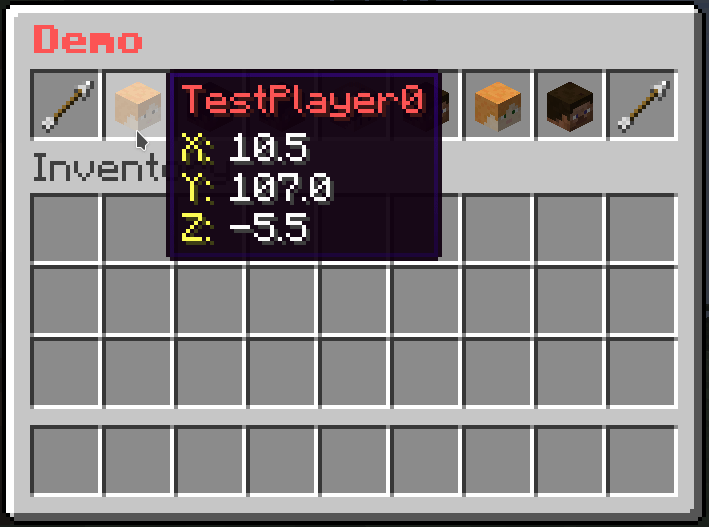
This mask is similar to Button Paginated Mask, but you can specify a list of values and display each of them as a Button.
mask-name:
  mask: value-list
  slot: <slot>
  cycle: <true/false>
  signal: <signal>
  value-update: 20
  viewer-update: 0
  viewer-condition:
  - condition1
  - condition2
  - condition3
  value:
  - value1
  - value2
  - value3
  button:
<button-settings>cycle: Whether the buttons should cycle when you reach the end of the page. If this is set to true, then when you reach the end of the page, it will go back to the first page. If this is set to false, then when you reach the end of the page, it will stop at the last page.signal: The signal name used by actions to change the page.viewer-condition: The list of Condition Requirement that the viewer must meet to see the button.value: The list of valuesbutton: The Button to be displayed for each values.value-update: The ticks to wait before the value list is refreshed.viewer-update: The ticks to wait before the “passed” value list from the viewer view is refreshed.next-page: <signal>: Changes the page to the next page.previous-page: <signal>: Changes the page to the previous page.set-page(<signal>): <page>: Changes the page to <page>.button, you can get the current value from the value list by using the variable {current_value}# The paginated mask
demo-slot:
mask: value-list
slot: 1-7
cycle: false
signal: demo-page-signal # This is the signal name used by actions to change the page.
value:
- red_stained_glass_pane
- green_stained_glass_pane
- blue_stained_glass_pane
- yellow_stained_glass_pane
- purple_stained_glass_pane
- orange_stained_glass_pane
- pink_stained_glass_pane
- black_stained_glass_pane
- white_stained_glass_pane
- gray_stained_glass_pane
- light_gray_stained_glass_pane
button:
id: "{current_value}"
name: "&c&lButton"
# The button to go to the previous page
previous-button:
slot: 0
id: arrow
name: "&c&lPrevious"
command: "previous-page: demo-page-signal" # The action to change the page
# The button to go to the next page
next-button:
slot: 8
id: arrow
name: "&a&lNext"
command: "next-page: demo-page-signal" # The action to change the page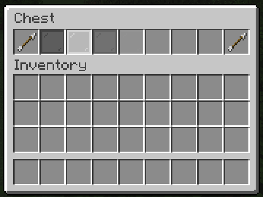
This mask is similar to Button Paginated Mask, but you can specify a list of map-like values and display each of them as a Button.
mask-name:
  mask: key-value-list
  slot: <slot>
  cycle: <true/false>
  signal: <signal>
  value-update: 20
  viewer-update: 0
  viewer-condition:
  - condition1
  - condition2
  - condition3
  value:
  - key1: value1
    key2: value2
    key3: value3
  - key1: value11
    key2: value12
    key3: value13
  - key1: value21
    key2: value22
    key3: value23
  button:
<button-settings>cycle: Whether the buttons should cycle when you reach the end of the page. If this is set to true, then when you reach the end of the page, it will go back to the first page. If this is set to false, then when you reach the end of the page, it will stop at the last page.signal: The signal name used by actions to change the page.viewer-condition: The list of Condition Requirement that the viewer must meet to see the button.value: The list of map-like valuesbutton: The Button to be displayed for each values.value-update: The ticks to wait before the value list is refreshed.viewer-update: The ticks to wait before the “passed” value list from the viewer view is refreshed.next-page: <signal>: Changes the page to the next page.previous-page: <signal>: Changes the page to the previous page.set-page(<signal>): <page>: Changes the page to <page>.button, you can use a key to get the value from the value list by using the variable {key_<name>}value listvalue:
- material: red_stained_glass_pane
name: "Button 1"
- material: green_stained_glass_pane
name: "Button 2"{key_material} to get the material part of the value{key_name} to get the name part of the value# The paginated mask
demo-slot:
mask: key-value-list
slot: 1-7
cycle: false
signal: demo-page-signal # This is the signal name used by actions to change the page.
value:
- material: red_stained_glass_pane
name: Button 1
- material: green_stained_glass_pane
name: Button 2
- material: blue_stained_glass_pane
name: Button 3
- material: yellow_stained_glass_pane
name: Button 4
- material: purple_stained_glass_pane
name: Button 5
- material: orange_stained_glass_pane
name: Button 6
- material: pink_stained_glass_pane
name: Button 7
- material: black_stained_glass_pane
name: Button 8
- material: white_stained_glass_pane
name: Button 9
- material: gray_stained_glass_pane
name: Button 10
- material: light_gray_stained_glass_pane
name: Button 11
button:
id: "{key_material}"
name: "&c&l{key_name}"
# The button to go to the previous page
previous-button:
slot: 0
id: arrow
name: "&c&lPrevious"
command: "previous-page: demo-page-signal" # The action to change the page
# The button to go to the next page
next-button:
slot: 8
id: arrow
name: "&a&lNext"
command: "next-page: demo-page-signal" # The action to change the page
This mask is similar to Button Paginated Mask, but you can filter out the buttons with specific requirements.
mask-name:
  mask: filtered-button-paginated
  slot: <slot>
  cycle: <true/false>
  signal: <signal>
  update: 20
  child:
    button-1:
      <button-settings>
      filter-requirement:
        <requirement-set>
        <requirement-set>
        <requirement-set>
        ...

    button-2:
      <button-settings>
      filter-requirement:
        <requirement-set>
        <requirement-set>
        <requirement-set>
        ...

    button-3:
      <button-settings>
      filter-requirement:
        <requirement-set>
        <requirement-set>
        <requirement-set>
        ...
...cycle: Whether the buttons should cycle when you reach the end of the page. If this is set to true, then when you reach the end of the page, it will go back to the first page. If this is set to false, then when you reach the end of the page, it will stop at the last page.signal: The signal name used by actions to change the page.update: The ticks to wait before the mask is refreshed.filter-requirement on the button to remove it from the list if the player doesn’t meet the requirements.view-requirement, but the difference is that, while buttons with view-requirement will leave an empty button on the list, those with filter-requirement will be removed from the list if the player doesn’t meet the requirements.next-page: <signal>: Changes the page to the next page.previous-page: <signal>: Changes the page to the previous page.set-page(<signal>): <page>: Changes the page to <page>.# The paginated mask
demo-slot:
mask: filtered-button-paginated
slot: 1-7
cycle: false
signal: demo-page-signal # This is the signal name used by actions to change the page.
child:
button1:
id: red_stained_glass_pane
name: "&c&lButton 1"
filter-requirement:
test-level:
level:
value: 1
take: false
button2:
id: green_stained_glass_pane
name: "&a&lButton 2"
filter-requirement:
test-level:
level:
value: 2
take: false
button3:
id: blue_stained_glass_pane
name: "&9&lButton 3"
filter-requirement:
test-level:
level:
value: 4
take: false
button4:
id: yellow_stained_glass_pane
name: "&e&lButton 4"
filter-requirement:
test-level:
level:
value: 5
take: false
button5:
id: purple_stained_glass_pane
name: "&5&lButton 5"
filter-requirement:
test-level:
level:
value: 6
take: false
button6:
id: orange_stained_glass_pane
name: "&6&lButton 6"
filter-requirement:
test-level:
level:
value: 10
take: false
button7:
id: pink_stained_glass_pane
name: "&d&lButton 7"
filter-requirement:
test-level:
level:
value: 11
take: false
button8:
id: black_stained_glass_pane
name: "&0&lButton 8"
filter-requirement:
test-level:
level:
value: 11
take: false
button9:
id: white_stained_glass_pane
name: "&f&lButton 9"
filter-requirement:
test-level:
level:
value: 11
take: false
button10:
id: gray_stained_glass_pane
name: "&7&lButton 10"
filter-requirement:
test-level:
level:
value: 12
take: false
button11:
id: light_gray_stained_glass_pane
name: "&8&lButton 11"
filter-requirement:
test-level:
level:
value: 12
take: false
# The button to go to the previous page
previous-button:
slot: 0
id: arrow
name: "&c&lPrevious"
command: "previous-page: demo-page-signal" # The action to change the page
# The button to go to the next page
next-button:
slot: 8
id: arrow
name: "&a&lNext"
command: "next-page: demo-page-signal" # The action to change the page
# Button to give XP
give-xp:
slot: 9-17
id:
- EXPERIENCE_BOTTLE
- EXP_BOTTLE
name: "&eGive &f10 XP"
lore:
- ""
- "&fLevel: {level}"
click-requirement:
old-version:
version: 13 # Check if the server is at 1.13.X
success-action: "console: xp add {player} 10 points"
fail-action: "console: xp 10 {player}"
This addon adds a new variable to get and set metadata of players. This can be used to store data for the player.
{meta_<key>} gets the value from the metadata of the player at the key <key>{meta_number_<key>} gets the value from the metadata of the player at the key <key> and converts it to a numbermete(<key>): <value> sets the value of the metadata of the player at the key <key> to <value>meta(<key>, number): <value> sets the value of the metadata of the player at the key <key> to <value> as a numbermeta(<key>) removes the value of the metadata of the player at the key <key>Note: In <value> you can use the variable {value} to get the previous value of the metadata.
T:
  id: diamond
  name: "&b&lMeta: &f{meta_number_diamond_count}"
  command:
    left: "meta(diamond_count, number): {value} + 1" # Requires EvalExtra to use expressions
right: "meta(diamond_count): 0"This addon add functions that only work on PaperMC and its forks.
Requirement: Paper 1.19.4 or newer is required for this addon to work.
Set the creator option of the menu-settings to be mini-title.
Then you can use MiniMessage formatting for the inventory title.
menu-settings:
  name: '<red><b>A inventory title generated by MiniMessage'

  creator: "mini-title"
# ...paper-skull: <skull>
paper-head: <skull>
skull$: <skull>
head$: <skull><skull> of the item<skull> accepts a player name or an UUID (unique id)skull:
position-x: 1
position-y: 1
name: "&bSkull"
id: player_head
paper-skull: "HSGamer"
# paper-skull: "7acc67dc-8b84-4f8d-b7ad-ec81e758f5a1"
per-player-skull:
position-x: 2
position-y: 1
name: "&bPer Player Skulls"
id: player_head
paper-skull: "{player}"mini-name: <minimessage formatting text>
mini-lore:
- <minimessage formatting text>
- <minimessage formatting text>
- ...You can use MiniMessage formatting for the name and lore of your menu items. Just make sure you use the new format above instead of the original name and lore modifiers.
There are aliases for the modifiers. You can also use:
name$ for the mini-name modifierlore$ for the mini-lore modifierNote that the legacy color codes (&c, &3) does not work in the new format.
minimessage:
  position-x: 1
  position-y: 1
  mini-name: "<rainbow>Rainbow Name"
  mini-lore:
    - "<b>Bold text"
    - "<aqua>Simple color!"
    - "<#00ff00>R G B color!"
    - "<gradient:green:blue>Gradient color!"
    - "<transition:#00ff00:#ff0000:0>Transition color!"
    - "<font:myfont:custom_font>Uses a custom font from a resource pack"
    - "<lang:block.minecraft.diamond_block> <- this is a translatable text"
<type>: The type of the component (json,minimessage,legacy)
paper-tell(<type>): <text>: send the component text to the playerpaper-broadcast(<type>): <text>: send the component text to all playerspaper-tell(<type>, bar): <text>: send the component text as an action bar to the playerpaper-broadcast(<type>, bar): <text>: send the component text as an action bar to all playersMiniPlaceholders is supported in all settings that involve MiniMessage formatting
mini-tps:
  position-x: 1
  position-y: 1
  mini-name: "<rainbow>TPS"
  mini-lore:
    - "<white><b>1m: <green><server_tps_1>" # <server_tps_1> is a MiniPlaceholders placeholder
- "<white><b>5m: <green><server_tps_5>" # <server_tps_5> is a MiniPlaceholders placeholderDepend: PlayerPoints
{points} gets the points the player havinggive-point: <point>This action gives <point> to the player
give-point:
  slot: 1
  id: emerald
  name: "&cGive points"
command: "give-point: 10"point: <value>point:
value: <value>
take: <true/false><value> pointstake value (true or false) to allow/disallow the plugin to take the points of the player alter checking successfullycheck-points:
slot: 1
id: emerald
name: "&cTake Points"
click-requirement:
left:
take-point: # Take 10 points
point: 10
right:
check-point: # Check if the players has 10 points
point:
value: 10
take: false
success-action: "tell: &a You have enough points"
fail-action: "tell: &a You don't have enough points"button-name:
type: switch
child:
button1:
<button-settings>
button2:
<button-settings>
button3:
<button-settings>
...This is a button that changes everytime the user clicks
switch-icon:
  type: switch
  child:
    frame_icon1:
      name: "&cFrame 1"
      id: red_wool
    frame_icon2:
      name: "&aFrame 2"
      id: green_wool
    frame_icon3:
      name: "&bFrame 3"
id: light_blue_woolDepend: TokenManager
{tokens} gets the tokens the player havinggive-token: <token>This action gives <token> to the player
give-token:
  slot: 1
  id: emerald
  name: "&cGive tokens"
command: "give-token: 10"token: <value>token:
value: <value>
take: <true/false><value> tokenstake value (true or false) to allow/disallow the plugin to take the tokens of the player alter checking successfullycheck-tokens:
slot: 1
id: emerald
name: "&cTake tokens"
click-requirement:
left:
take-token: # Take 10 tokens
token: 10
right:
check-token: # Check if the players has 10 tokens
token:
value: 10
take: false
success-action: "tell: &a You have enough tokens"
fail-action: "tell: &a You don't have enough tokens"This is an addon to add Villager-like GUI for item trading.
menu-settings:
  menu-type: trade

  # The actions when the player opens the menu
  open-action:
  - action
  - action
  - action
  ...

  # The actions when the player closes the menu
  close-action:
  - action
  - action
  - action
  ...

  # The requirement before the player can open the menu
  view-requirement:
    <requirement-set>
    <requirement-set>
    <requirement-set>
    ...

  # The requirement before the player can close the menu
  close-requirement:
    <requirement-set>
    <requirement-set>
    <requirement-set>
    ...

  # The permission required to open the menu
  permission: bettergui.test

  # The command to open the menu
  command:
  - command1
  - command2
  ...

  # The title of the inventory
  title: <name>
  #name: <name>

  # The list of argument processors to process the arguments of the command to open the menu
  argument-processor:
  - <argument-processor>
  - <argument-processor>

trade-name1:
  item1:
    <button-settings>
  item2:
    <button-settings>
  result:
    <button-settings>

trade-name2:
  item1:
    <button-settings>
  item2:
    <button-settings>
  result:
    <button-settings>
...open-action: the Action when the menu is opened.close-action: the Action when the menu is closed.view-requirement: the Requirement to check before opening the menu. If it is not met, the menu will not be opened.close-requirement: the Requirement to check before closing the menu. If it is not met, the menu will not be closed.argument-processor: the Argument Processor to handle the arguments of the command to open the menu.trade-name:
item1:
<button-settings>
item2:
<button-settings>
result:
<button-settings>
max-uses: <number>item1: The first item to trade. REQUIREDitem2: The second item to trade. OPTIONALresult: The result item. REQUIREDmax-uses: The maximum uses of a trade. OPTIONALmenu-settings:
menu-type: trade
title: "&c&lTest Trade"
command: trade
trade1:
item:
id: diamond
item2:
id: redstone
result:
id: piston
trade2:
item:
id: diamond_block
amount: 64
result:
id: paper
name: "&b&lRich Cerificate"
trade3:
item:
id: paper
name: "&b&lRich Cerificate"
item2:
id: emerald
amount: 64
result:
id: paper
name: "&a&lVillage Cerificate"
lore:
- ""
- "&7Signed by {player}"Depend: Vault
{money} gets the money the player having{money_formatted} gets the money the player having (formatted){group} gets the group the player is currently ingive-money: <money>This action gives <money> to the player
give-money:
  slot: 1
  id: emerald
  name: "&cGive money"
command: "give-money: 10"money: <value>money:
value: <value>
take: <true/false><value>take value (true or false) to allow/disallow the plugin to take the money of the player alter checking successfullycheck-money:
slot: 1
id: emerald
name: "&cTake money"
click-requirement:
left:
take-money: # Take 10 money
money: 10
right:
check-money: # Check if the players has 10 money
money:
value: 10
take: false
success-action: "tell: &a You have enough money"
fail-action: "tell: &a You don't have enough money"group: <name>This requirement checks if the player is in the group <name>
check-group:
  slot: 1
  id: stone
  name: "&cStone Group"
  click-requirement:
    default:
      stone-group: # Check if the player is in the "stone" group
        group: stone
        success-action: "tell: &aYou are welcome"
fail-action: "tell: &cGet out of here"Depend: WorldGuard (for Region & Flag)
{region} gets the name of the region the user standing on{flag_<flag_name>} gets the status of the flag <flag_name> at the region the user standing onworld: <world_name>world:
- <world_name>
- <world_name>This requirement checks if the player is at the world <world_name>
region: <region_name>region:
- <region_name>
- <region_name>This requirement checks if the player is at the region <region_name>
region-owner: <region_name>region-owner:
- <region_name>
- <region_name>This requirement checks if the player is the owner of the region <region_name>
region-user: <region_name>region-user:
- <region_name>
- <region_name>This requirement checks if the player is the user of the region <region_name>
flag:
  flag1: <value1>
  flag2: <value2>
  flag3: <value3>
...This requirement checks if the status of the flag at the region the player standing on matches the value
This addon integrates XSeries so that you can use version-independent values in some item modifiers & actions.
xmaterial: <material>
xid: <material>
xmat: <material><material> of the itemstone-button:
slot: 1
xid: stoneplayer-head:
slot: 2
xid: player_headxenchantment:
- <enchantment>, [level]
- <enchantment>, [level]
- <enchantment>, [level]
...xenchant:
- <enchantment>, [level]
- <enchantment>, [level]
- <enchantment>, [level]
...xenc:
- <enchantment>, [level]
- <enchantment>, [level]
- <enchantment>, [level]
...<enchantment>s to the item[level] of the <enchantment>. It’s optional.enchanted-sword:
NAME: '&aEnchanted sword'
LORE:
- 'This sword is glowing.'
ID: diamond_sword
XENCHANTMENT:
- "durability, 1"
POSITION-X: 1
POSITION-Y: 1xpotion:
- <potion>, [duration], [amplifier]
- <potion>, [duration], [amplifier]
- <potion>, [duration], [amplifier]
...xeffect:
- <potion>, [duration], [amplifier]
- <potion>, [duration], [amplifier]
- <potion>, [duration], [amplifier]
...<potion> effect to the item.[duration] and [amplifier] of the <potion> effect. These are optional.potion:
position-x: 1
position-y: 1
name: "&bPotion"
id: potion
xpotion:
- "SPEED"
- "WEAKNESS, 30, 1"xskull: <skull>
xhead: <skull><skull> of the item<skull> accepts a player name, an UUID (unique id), an Base64 value, or a texture.minecraft.net URLskull:
position-x: 1
position-y: 1
name: "&bSkull"
id: player_head
xskull: "HSGamer"
#xskull: "7acc67dc-8b84-4f8d-b7ad-ec81e758f5a1"
#xskull: "http://textures.minecraft.net/texture/ffcdae586b52403b92b1857ee4331bac636af08bab92ba5750a54a83331a6353"
#xskull: "eyJ0ZXh0dXJlcyI6eyJTS0lOIjp7InVybCI6Imh0dHA6Ly90ZXh0dXJlcy5taW5lY3JhZnQubmV0L3RleHR1cmUvZmZjZGFlNTg2YjUyNDAzYjkyYjE4NTdlZTQzMzFiYWM2MzZhZjA4YmFiOTJiYTU3NTBhNTRhODMzMzFhNjM1MyJ9fX0="
per-player-skull:
position-x: 2
position-y: 1
name: "&bPer Player Skulls"
id: player_head
xskull: "{player}"xsound: <sound>, [volume], [pitch]xsound: <sound> [volume] [pitch]<sound> to the player[volume] and the [pitch] of the <sound>. Those are optionalxsound: BLOCK_NOTE_BLOCK_PLINGxsound: BLOCK_NOTE_BLOCK_PLING 1 2